Seaborn Theme
In Python, the “seaborn” library is utilized for drawing statistical plots. It has multiple default styles to change the color of the axes, enables the grid, and customized the theme by using the default values of the style according to need, including “white”, “whitegrid”, “dark”, “darkgrid” and “ticks” theme styles. To perform this corresponding operation, the “sns.set_theme()” method is used.
This guide will discuss:
How to Draw a Seaborn Line Graph and Set its Theme in Python?
To draw a seaborn line graph in Python, first, import the “matplotlib.pyplot” and “seaborn” libraries:
import seaborn as sns
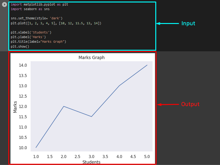
Then, use the “set_theme()” method to customize the theme of the bar plot and pass the “style” parameter with the value “dark”. After that, invoke the “plt.plot()” function to draw the graph points:
plt.plot([1, 2, 3, 4, 5], [10, 12, 11.5, 13, 14])
Next, apply the “plt.xlabel” and “ylabel()” methods to specify the x-axis and y-axis labels. After that, call the “title()” function and pass the “label” parameter with the value “Marks Graph”. To display the graph, invoke the “plt.show()” method:
plt.ylabel('Marks')
plt.title(label="Marks Graph")
plt.show()
As you can see, the theme of the plotted line graph has been customized successfully:
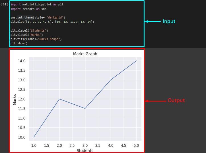
If you want to add the grid lines in the bar plot as a theme, then use the “darkgrid” as the value of the “style” parameter:
Output
How to Draw a Seaborn Bar Plot and Customize its Theme in Python?
To generate the seaborn bar plot, import the required libraries, such as “pandas”, “matplotlib.pyplot”, and “seaborn”:
import matplotlib.pyplot as plt
import seaborn as sns
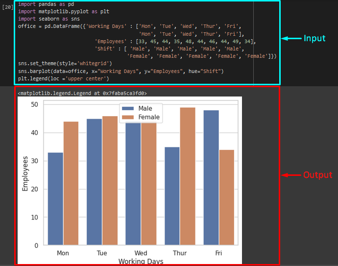
Now, create a new dataset by using the “DataFrame()” method along with the values. Then, pass it to the variable. In our case, we have initialized the “office” variable:
'Mon', 'Tue', 'Wed', 'Thur', 'Fri'],
'Employees' : [33, 45, 44, 35, 48, 44, 46, 44, 49, 34],
'Shift' : [ 'Male', 'Male', 'Male', 'Male', 'Male',
'Female', 'Female', 'Female', 'Female', 'Female']})
After that, invoke the “set_theme()” method to set the theme of the plotted graph by passing the “style” parameter with its value. Here, we have specified the “whitegrid” style. Then, call the “sns.barplot()” method with required arguments as “data” for a dataset, “x” for the x-axis label, “y” for the y-axis label, and “hue”. Lastly, apply the “plt.legend()” method for setting the location of the legend box with the “loc” argument:
sns.barplot(data=office, x="Working Days", y="Employees", hue="Shift")
plt.legend(loc ='upper center')
It can be seen that the theme of the plotted bar graph has been customized successfully:
That’s it! We have compiled the easiest way to customize the seaborn theme in Python.
Conclusion
In Python, users can customize the theme of any plot according to their needs by using the method. To add the seaborn theme, the “sns.set_theme()” method can be used along with the “style” parameter and its value. In this guide, we have demonstrated the seaborn theme in Python.
Source: linuxhint.com