Matplotlib Spectrogram
A “Spectrogram” shows the frequency spectrum of a signal over the course of time. “Spectrograms” are frequently used in signal processing, especially in audio and speech processing. The “Matplotlib”, a scientific computing library for Python provides the “matplotlib.pyplot.specgram()” function to create a spectrogram.
This guide describes how to draw/plot a “Spectrogram” in Python utilizing “Matplotlib”.
This tutorial presents the following topics:
- What is a Spectrogram in Python?
- How to Draw a Matplotlib Spectrogram in Python?
- How to Customize the Matplotlib Spectrogram in Python?
What is a Spectrogram in Python?
The “Spectrograms” illustrate the frequency spectrum of a signal as it varies over time. It is such that time is represented by the “x-axis” and frequency by the “y-axis“. The color intensity at each point in the plot indicates the magnitude of the frequency spectrum at that point in time.
How to Draw/Create a Matplotlib Spectrogram in Python?
For drawing a spectrogram, the “specgram()” function of the “pyplot” module is utilized in Python.
Example
This code is utilized to draw a spectrogram in Python:
import numpy
t = numpy.linspace(0, 20, 200*20)
x = numpy.sin(2*numpy.pi*10*t) + numpy.sin(2*numpy.pi*20*t)
# Plot the spectrogram
plt.specgram(x, Fs=200)
plt.xlabel('Time (s)')
plt.ylabel('Frequency (Hz)')
plt.colorbar(label='Intensity (dB)')
plt.show()
In the above code:
- The “matplotlib” and “numpy” libraries are imported, respectively.
- The “linspace()” function returns an array of “4000” equally spaced values between “0” and “20”, and stores them in “t”. This represents the time axis of the specified signal.
- The “sin()” function is used to create an array of values by adding two sinusoidal functions with the frequencies of “10 Hz” and “20 Hz”, respectively. This represents the signal to be analyzed.
- The “specgram()” function plots the spectrogram of the signal “x”, using a sampling frequency of “200 Hz”. The spectrogram shows the intensity of different frequency components as they vary with time, using colors to indicate the magnitude in decibels (dB).
Output
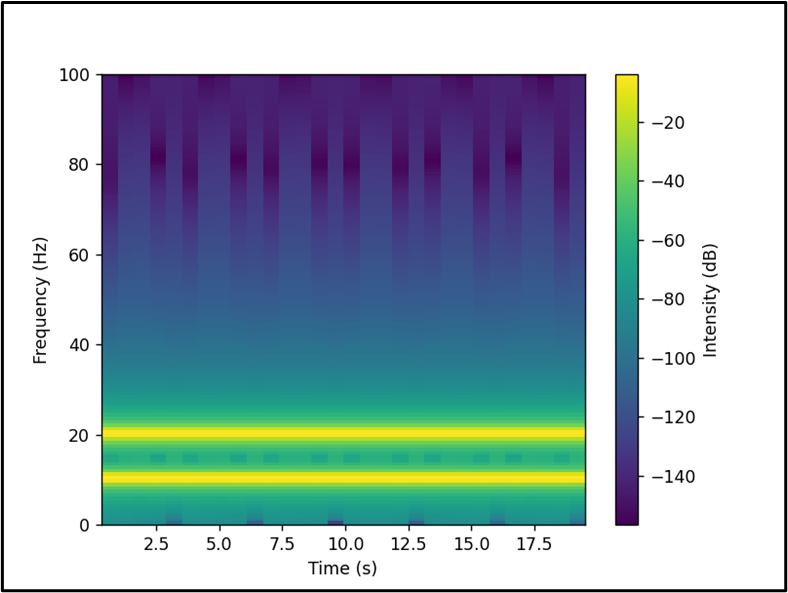
The spectrogram has been displayed in the above output.
How to Customize the Matplotlib Spectrogram in Python?
“Matplotlib” offers many customization options to create visually appealing spectrograms. Following is an example:
Example: Changing the Color Map of the Spectrogram
The below-provided code is used to change the color map of the spectrogram:
import numpy
t = numpy.linspace(0, 20, 200*20)
x = numpy.sin(2*numpy.pi*10*t) + numpy.sin(2*numpy.pi*20*t)
# Plot the spectrogram
plt.specgram(x, Fs=200, cmap='plasma')
plt.xlabel('Time (s)')
plt.ylabel('Frequency (Hz)')
plt.colorbar(label='Intensity (dB)')
plt.show()
In the above code snippet, the “cmap” parameter of the “plt.specgram()” function is used to change the color map of the spectrogram.
Output
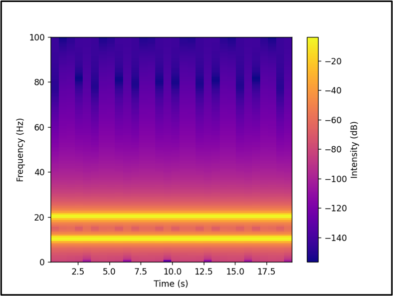
In the above output, the color map of the created spectrogram has been customized accordingly.
Note: To change the time and frequency resolution, the “NFFT” and “noverlap” parameters of the “plt.specgram()” function is used in Python, respectively.
Conclusion
Python’s “Matplotlib” library provides the “matplotlib.pyplot.specgram()” function that is used to draw a spectrogram in Python. To customize the spectrogram, various parameters such as “cmap”, “NFFT”, and “noverlap”, etc. of the “plt.specgram()” function are used to change the colormap, time, and frequency resolution of the spectrogram, respectively. This guide presented an in-depth tutorial on “Matplotlib Spectrogram” using numerous examples.
Source: linuxhint.com