How to Rotate Animation in CSS
On the web, animation plays a key role to attract users. A user is more likely to have an interest in an animated website than a static one. With the use of the CSS “animation” property, we can animate any element. This property allows us to make the website more attractive and elegant. It changes the styles of elements gradually.
In this manual, we are going to learn about rotating animations in CSS.
How to Rotate Animation in CSS?
Rotating animation allows an element to change its appearance for a center period. For rotating animation, the “animation” property of CSS is used. We can apply this property in any element of HTML like image, SVG, text, and many more.
Now, we will discuss the following points:
-
- animation property
- Syntax of animation property
- How to perform a rotating animation using CSS?
How to Use “animation” Property in CSS?
The “animation” property allows changing element style from one to another. For this, specify the animation name, speed, animation count, and direction of rotation according to the following syntax.
Syntax
-
- animation-name: It represents the name of an animation (built-in or custom (using keyframes)).
- speed: It is used to slow down and speed up the animation. For example, “2s” (for two seconds).
- iteration-count: It denotes how many times you want your animation to continue.
- direction: It specifies how an animation will play, such as forward, backward, or alternately.
After understanding the basic syntax of animation property, let us jump into the practical work and understand how to create a rotating animation using CSS.
Example: Rotating Image HTML Object in CSS
In HTML, write the code of the element you want to rotate. Here we will rotate an SVG icon:
<div class="container">
<img src="img.svg" class="rotate"/>
</div>
</body>
Let’s apply the rotation animation in CSS. Here, the “.rotate” is used to access the class assigned to the selected image to which we want to rotate in CSS. Next, we will set the width of the image to “100px” and rotate it in 2 seconds for an infinite number of times in a linear pattern. However, you can change the speed, iteration-count, and direction as per your choice:
width: 100px;
animation: rotation 2s infinite linear;
}
The @keyframes is used for defining the starting and ending point of the animation (using “from” and “to” keywords). Moreover, provide the animation name “rotation” followed by the @keyframes to which you want to animate. Since we want to move the animation circularly, so use the “rotate()” function of the transform property in which we will start from “0 degrees” and end at “359 degrees”:
from {
transform: rotate(0deg);
}
to {
transform: rotate(359deg);
}
}
After the implementation of the CSS code, go to the HTML file and run it for getting the following outcome:
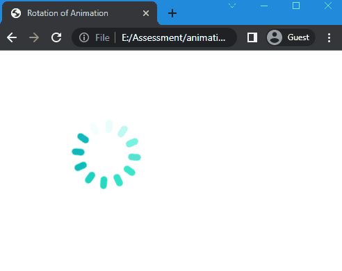
With the use of the “animation” property, we have successfully rotated an element over a defined period.
Conclusion
To create a rotating animation in CSS, use the animation property and set the value of animations like duration, direction, and speed. Moreover, the rotate() CSS function is being used to rotate an element circularly in the transform property. This article explained the animation property in detail to rotate an animation for an infinite number of times.
Source: linuxhint.com