How to Apply Flexbox for Simple Responsive Layouts
The flexbox is a CSS one-dimensional web layout model. It lets users build one-dimensional layouts, which are either a row or a column. The flexbox layout has replaced the float layout. It gives the container the ability to shrink and expand the elements to use the available space. Moreover, it allows the responsive elements within the container to be automatically arranged within the container easily. To convert the <div> container into the flexbox layout, simply apply the “display: flex” property.
This guide will help the users to apply Flexbox for responsive layouts that are simple.
How to Apply Flexbox for Simple Responsive Layouts?
Here, we have presented two examples to give the users a better understanding of creating simple responsive layouts:
Method 1: Create a Simple Horizontal Navigation Menu
The first method that can be used to create a simple horizontal navigation menu. The horizontal navigation menu is the list of links at the top of each page in the horizontal form. For that purpose, go through the provided steps:
Step 1: Create an HTML Structure
First, create an HTML structure and add Bootstrap in the head section. After that, create a div container “nav-bar” and add navigation links inside it:
<a href = "#">Home</a>
<a href = "#">About Us</a>
<a href = "#">Our Services</a>
<a href = "#">Contact Us</a>
</div>
Note: To learn about the addition of Bootstrap in HTML, read this article.
Step 2: Apply CSS
On the “nav-bar” container:
- Set the “display” property to the “flex” value to create a flexbox.
- Distribute the items evenly by specifying the “space-around” value to the “Justify-content” property.
- Set the padding to “8px” and “background-color” to black by specifying its hex color code:
display: flex;
justify-content: space-around;
background-color: #000000;
padding: 8px;
}
.nav-bar a {
color: pink;
text-decoration: none;
}
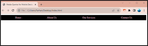
Output
The below output confirms that the layout design is responsive:
Method 2: Create a Responsive Card Grid
Users can also create a responsive card grid by applying the flexbox. To create such a grid, follow the provided stepwise instructions:
Step 1: Create an HTML Structure
Start with creating a div container with the class name “section-container”. Then, create three divs inside it with the class name of “section”:
<div class = "container">
<div class = "section">Section 1</div>
<div class = "section">Section 2</div>
<div class = "section">Section 3</div>
</div>
</body>
Step 2: Apply CSS
On “section-container” div:
- Set the “flex-wrap” property value to “wrap”, in order to allow the wrapping of items in the next row.
- Then, specify the value “space-between” value to the “justify-content” property, in order to create the space between the items evenly.
On “section” div:
- Set the “width” property value to “8px” to adjust it for spacing. Furthermore, set the background color, margin, padding, and box sizing:
display: flex;
}
.section {
flex: 1;
padding: 20px;
border: 2px solid green;
margin: 10px;
}
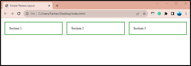
Output
It can be observed from the below output that the responsive card grid has been created:
Conclusion
To apply Flexbox for simple responsive layouts, first, create an HTML structure, having <viewport> and stylesheet linked in its head tag. Then, apply CSS, which sets the “display” property to the value “flex” to apply flexbox for simple responsive layouts. This article has presented a complete guide to applying Flexbox for simple responsive layouts.
Source: linuxhint.com