Bootstrap | Badges and Labels
This article will cover the following perspectives to demonstrate the usage of Bootstrap badges:
- How to Use Bootstrap Badge for Additional Information?
- How to Use Bootstrap Badge for Contextual Information?
- How to Add Custom Styles to Bootstrap Badge?
- How to Add Icons to the Bootstrap Badge?
- How to Link Bootstrap Badge to Another Source?
- How to Make Badges Rounded?
- How to Use Bootstrap Badge as a Counter?
What are Bootstrap Badges?
Badges are the basic components that are used to show an indicator. For instance, they can be used as a numeric counter to show the number of notifications or messages:

They can also be utilized to display additional information, such as shown in the given image:

How to Use Bootstrap Badge for Additional Information?
Bootstrap badges can be added within the HTML elements to use as additional information. Check out the example mentioned below for the demonstration.
Example
To use Bootstrap badge for addition information, firstly:
- Add “<h5>” and “<h6>” elements.
- Place the “<span>” element with the “badge” and “badge-*” classes. The “badge-*” class refers to the badge with the specified color:
It can be observed that two badges are added to the relevant headings:

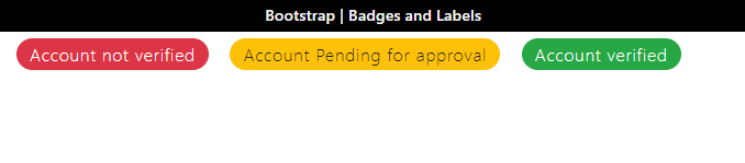
How to Use Bootstrap Badge for Contextual Information?
Bootstrap badges can also be used to provide contextual information like “badge-danger” displays the badge in red color and can be used to show some failed messages like cancel, invalid, or more. The “badge-success” is used where we want to show some success message.
Example
Look at the given code to understand the discussed scenario:
Output

How to Add Custom Styles to Bootstrap Badge?
You can also use CSS to add some unique styling to the Bootstrap badges. For a better understanding, a class with the name “custom” is added within the “<span>” element. Then, the following properties are applied:
Style “custom” class
font-size: 18px;
font-weight: 100;
letter-spacing: 1px;
padding: 8px 15px;
}
The “.custom” is used to access the “custom” class. The following properties are applied to it:
- “font-size” adjusts the font size.
- “font-weight” states the thickness of the font.
- “letter-spacing” adds space between the letters.
- “padding” provides space around the element’s content.
Output

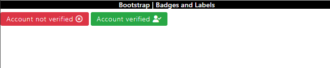
How to Add Icons to the Bootstrap Badge?
We can add different icons to the badges as well. To do so, there are several classes that can be utilized for this cause. For more information, visit the Font Awesome website.
Example
In HTML, add a “<span>” element. Within this element, place the inline element “<i>” or “<span>” to insert the icon class:
Output
How to Link Bootstrap Badge to Another Source?
To make the Bootstrap badges clickable, place the “badge” classes within the HTML “<a>” tag and provide the reference of the linked page in the “href” attribute:
Output

How to Make Badges Rounded?
To make the badge edges more rounded, add a class “badge-pill”. This class supports a larger “border-radius” and horizontal “padding” properties:
Output
How to Use Bootstrap Badge as a Counter?
To create a button with a counter, add an HTML “<button>” tag with type “button” and assign it the button classes “btn” and “btn-success”. Then, include the “<span>” element to place a counter:
Output

That was all about Bootstrap badges and their relevant labels in Bootstrap.
Conclusion
The Bootstrap “badge” class is utilized to add badges to the website. For instance, classes like “badge-danger”, “badge-info”, and more can be used to add contextual information to the badges as their label. Some classes are applied to add icons to the badges, such as “far fa-times-circle” to place a cross-circle icon. This post has provided a comprehensive guide on Bootstrap badges and labels.
Source: linuxhint.com