Bootstrap 4 Modal Video Autoplay and Stop When Closed
This write-up will describe the Bootstrap 4 modal video autoplay and stop when closed.
Bootstrap 4 Modal Video Autoplay and Stop When Closed
The video modal can be created using the Bootstrap modal class. The modal video popup consists of a video in a dialog box.
Prerequisite: Create a Modal
To create a modal, add the following code:
- First, add a “<div>” element with the class “container”.
- Inside it, add an “<img>” element with the “src”, “width”, “data-toggle”, “data-src”, and “data-target” attributes.
- After that, include a “<div>” element with the classes “modal” and “fade”. The “modal” class creates the modal window and the “fade” class adds fade animation
- Add a “<div>” element with the class “modal-dialog”.
- Then, specify a “<div>” element with the class “modal-content”.
- Use the class “modal-body” for the modal body.
- Add the close button by using the class “close”. The “×” entity code is utilized to add a cross symbol.
- Then, add the “<iframe>” element in the “<div>” tag and assign the class “embed-responsive” and “embed-responsive-16by9” for responsive video.
- Associate the “id”, “width”, “height”, “src”, “title”, “frameborder”, “allow”, and “allowfullscreen” attributes with the “<iframe>” element. The “autoplay” keyword is utilized to start the video automatically:
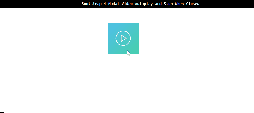
<img src="/img/play-2297762_1280.png" width="100" class="video-play-btn" data-toggle="modal" data-src="https://www.youtube.com/embed/f4pXmHmqE7Y?autoplay=1" data-target="#myModal">
<div class="modal fade" id="myModal">
<div class="modal-dialog">
<div class="modal-content">
<div class="modal-body">
<button type="button" class="close" data-dismiss="modal">
<span aria-hidden="true">×</span></button>
<div class="embed-responsive embed-responsive-16by9">
<iframe id="video" width="640" height="360" src="" title="Futuristic HUD" frameborder="0" allow="accelerometer; autoplay; clipboard-write; encrypted-media; gyroscope; picture-in-picture; web-share" allowfullscreen></iframe>
</div>
</div>
Add the JavaScript Code
To add proper functionality, add the JavaScript code by following the instructions:
- Add a “<script>” element.
- Inside it, add a “$(document).ready()” which runs only once the DOM executes the JavaScript.
- Create a variable “videoPath” and assign the “src” of the data to the variable on click.
- Then, access the element by id and apply “shown.bs.modal”. This will display the modal and trigger the function. The function assigns the src of the “videoPath” variable to the “<iframe>” element’s id. In our scenario, the “src” of the “videoPath” variable is assigned to the id “video”.
- To hide the modal window, the “hide.bs.modal” is used with the function. This function assigns the empty value to the “<iframe>” element’s id “video”:
$(document).ready(function () {
var videoPath;
$(".video-play-btn").click(function () {
videoPath = $(this).data("src");
});
$("#myModal").on("shown.bs.modal", function (e) {
$("#video").attr("src", videoPath);
});
$("#myModal").on("hide.bs.modal", function (e) {
$("#video").attr("src", "");
});
});
</script>
Output
You have successfully learned how to create video modal autoplay and stop when closed.
Conclusion
To create a video modal, the Bootstrap “modal” class is utilized. The classes “embed-responsive” and “embed-responsive-16by9” are used to create a responsive video. The later class indicates the aspect ratio of the video. JavaScript is utilized for the manipulation of the video. This write-up has demonstrated the procedure on how to autoplay video and stop it when closed using Bootstrap 4.
Source: linuxhint.com