Creating Your First Bar Plot with D3.js
Bar Plot
A bar plot is used to summarize a set of categorical data. In D3.js, bar plot is built using rectangles (rect) with one per group in the categorical variable.
- In the horizontal bar plot, the x-axis holds the discrete values and the y-axis holds the categorical data.
- In the vertical bar plot, the x-axis holds the categorical data and the y-axis holds the discrete values.
1. Building a Basic Bar Plot (Vertical Plot)
Let’s build a basic bar plot by following the given steps. At each step, a syntax is provided like an example. Mostly, each step includes selecting SVG, passing the attributes to the functions that we use at each step.
Place this script inside your head tag in the HTML template.
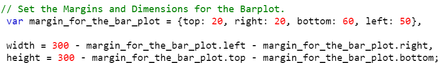
Step 1: Set the Margins and Dimensions for the Bar Plot
The first step is to set up the margins and dimensions to the bar plot that is going to be created.
Create a variable of dictionary type that holds four entries. Let them be
Create the width and height using the previous keys from the dictionary.
- width = value – dictionary.left – dictionary.right,
- height = value – dictionary.top – dictionary.bottom;
Example:
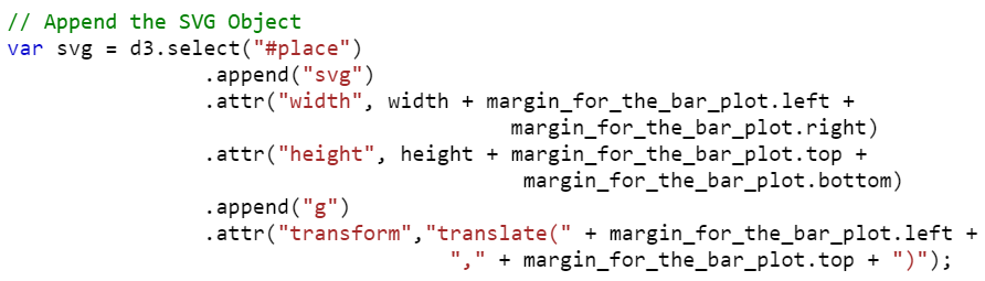
Step 2: Append the SVG (Scalable Vector Graphics) Object
In this step, we need to append the SVG by creating the “div” container. Then, select the container to inject the SVG.
Create a div (with the following syntax) container in the body of the HTML template by passing the ID (this holds the svgContainer).
Select the container (svgContainer) to inject the SVG element and append the SVG. Adjust the width and height of the svgContainer by passing the width and height attributes.
Example: We can also transform the SVG. Appending the “g” element groups the shapes together.
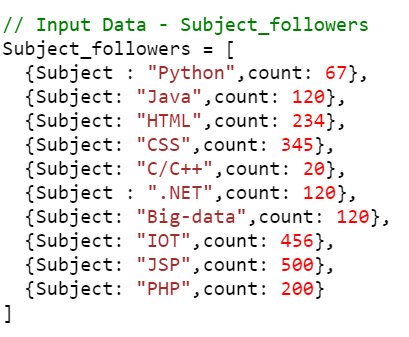
Step 3: Define the Data
Next, we have to declare the data for the bar plot. Basically, for a bar plot, we can pass the data from the CSV for an array of dictionaries.
Example: Create the Subject_followers array of dictionaries with 10 entries.
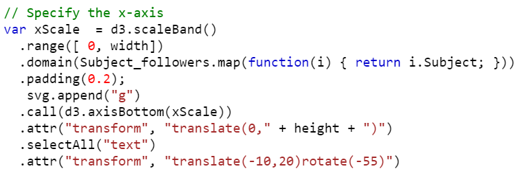
Step 4: Set Up the Scales (xScale and yScale)
Use the scaleBand() function to construct a band scale for the x-axis.
1. It takes the input_data as a domain. We can use the “map” function to choose a specific key for the x-axis.
2. The range is the output. Make sure that it should be the width of the svgContainer.
3. Padding can be provided in between two bars by passing the padding property.
4. Call the axisBottom() function to place the axis at the bottom of the line. It takes the “x” point as a parameter.
5. Here, we place the categorical elements. To display them, specify the text using the selectAll(“text”) function.
Example:
Use the scaleLinear() function to represent the discrete numeric data.
1. The height must be equal to the svgContainer. Pass the height to the range().
2. Call the axisLeft() function to place the axis on the left of the line. It takes the “y” point as a parameter.
Example:
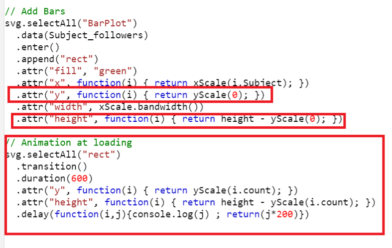
Step 5: Add the Bars
The final and most important step is to add the bars to the axes.
1. Get the data.
2. Append the rect figure to the SVG. The bars will be in rectangular shape.
3. It is optional to fill the color for the bars. Use attr(“fill”,”color”) to fill the color.
4. Return the categorical key from the data set and pass it to the x-axis by specifying the attr(“x”, function).
5. Return the discrete numerical key from the data set and pass it to the y-axis by specifying the attr(“y”, function).
6. Set the height and width based on your requirement using the width and height properties.
Example:
Example:
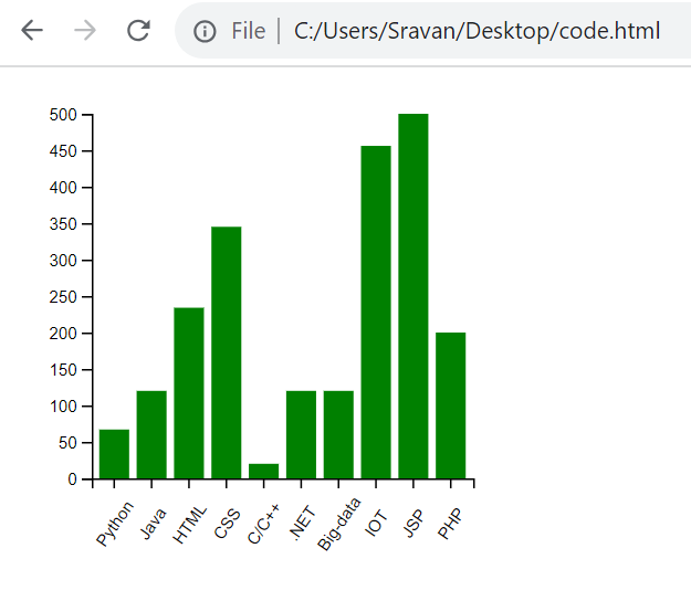
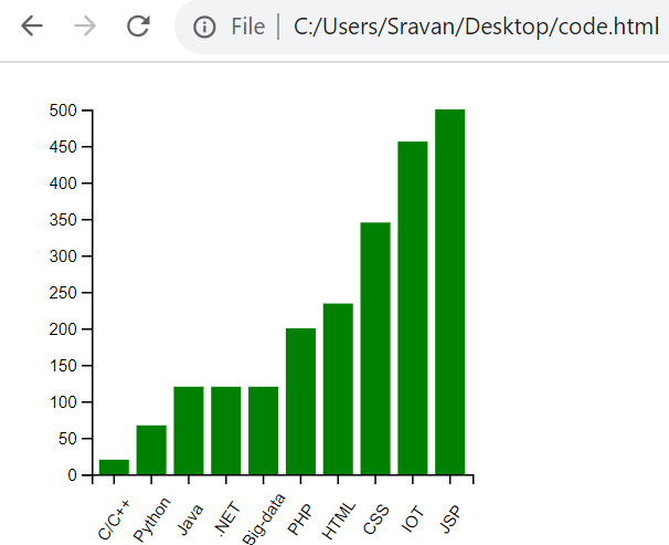
Create a bar plot related to the subject followers. The Subject_followers (array of 10 dictionaries) data that we are considering holds two keys in each dictionary – subject and count.
1. Subject is of categorical type that lies on the x-axis.
2. Count is of discrete numeric type that lies on the y-axis.
<head>
<script src="https://d3js.org/d3.v4.js"></script>
</head>
<body>
<script>
// Set the Margins and Dimensions for the Barplot.
var margin_for_the_bar_plot = {top: 20, right: 20, bottom: 60, left: 50},
width = 300 – margin_for_the_bar_plot.left – margin_for_the_bar_plot.right,
height = 300 – margin_for_the_bar_plot.top – margin_for_the_bar_plot.bottom;
var svg = d3.select("#place")
.append("svg")
.attr("width", width + margin_for_the_bar_plot.left + margin_for_the_bar_plot.right)
.attr("height", height + margin_for_the_bar_plot.top + margin_for_the_bar_plot.bottom)
.append("g")
.attr("transform","translate(" + margin_for_the_bar_plot.left + "," + margin_for_the_bar_plot.top + ")");
// Input Data – Subject_followers
Subject_followers = [
{Subject : "Python",count: 67},
{Subject: "Java",count: 120},
{Subject: "HTML",count: 234},
{Subject: "CSS",count: 345},
{Subject: "C/C++",count: 20},
{Subject : ".NET",count: 120},
{Subject: "Big-data",count: 120},
{Subject: "IOT",count: 456},
{Subject: "JSP",count: 500},
{Subject: "PHP",count: 200}
]
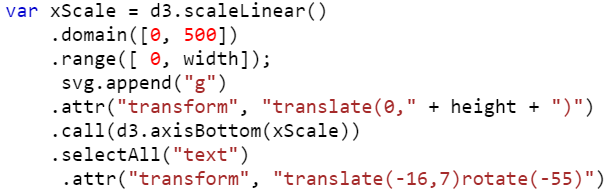
// Specify the x-axis
var xScale = d3.scaleBand()
.range([ 0, width])
.domain(Subject_followers.map(function(i) { return i.Subject; }))
.padding(0.2);
svg.append("g")
.call(d3.axisBottom(xScale))
.attr("transform", "translate(0," + height + ")")
.selectAll("text")
.attr("transform", "translate(-10,20)rotate(-55)")
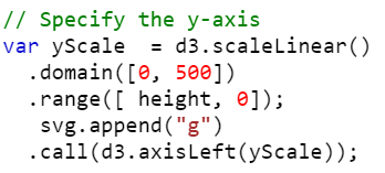
// Specify the y-axis
var yScale = d3.scaleLinear()
.domain([0, 500])
.range([ height, 0]);
svg.append("g")
.call(d3.axisLeft(yScale));
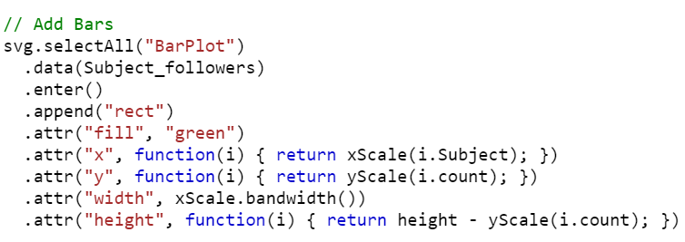
// Add Bars
svg.selectAll("BarPlot")
.data(Subject_followers)
.enter()
.append("rect")
.attr("fill", "green")
.attr("x", function(i) { return xScale(i.Subject); })
.attr("y", function(i) { return yScale(i.count); })
.attr("width", xScale.bandwidth())
.attr("height", function(i) { return height – yScale(i.count); })
</script>
</body>
</html>
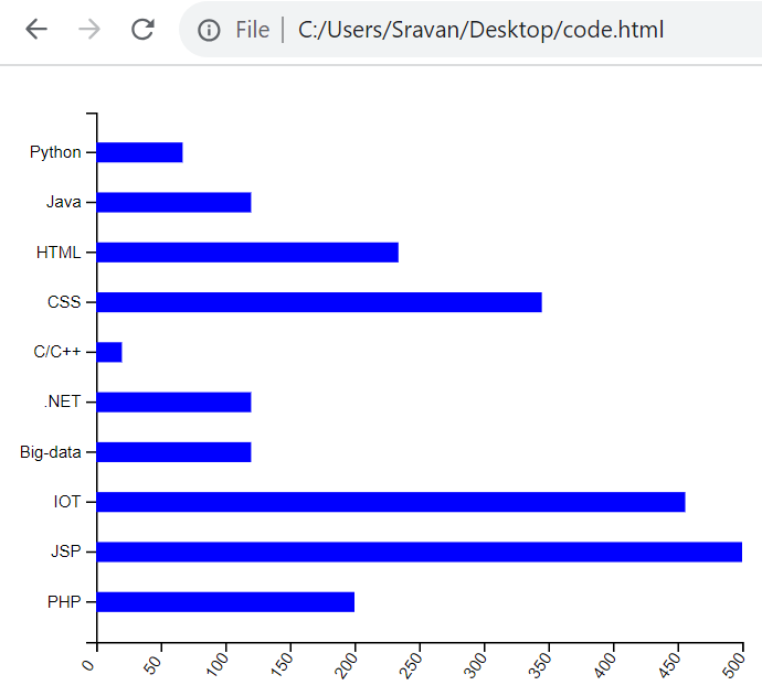
Output:
2. Building a Basic Bar Plot (Horizontal Plot)
We can follow the same steps to build the horizontal bar plot but the functions and attributes vary in the scales.
xScale
The xScale takes the scaleLinear() function and the domain holds the discrete data.
Example:
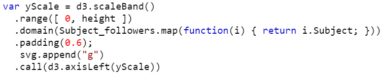
yScale
The yScale takes the scaleband() function and the categorical data is passed to the domain(). Also, the range() takes (0, height) instead of (height, 0).
Example:
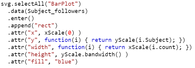
1. Adding Bars
2. attr(“x”, x(0)) – position the left of the rectangle
3. attr(“y”, function(d) { return y(d.Subject); }) – position the top of the rectangle with categorical key
4. attr(“width”, function(d) { return x(d.count); }) – set the width (values from the count key)
5. attr(“height”, y.bandwidth()) – set the height
Example:
Example: Complete Code
Create a bar plot related to subject followers. The Subject_followers (array of 10 dictionaries) data that we are considering holds two keys in each dictionary – subject and count.
1. Subject is of categorical type that lies on the y-axis.
2. Count is of discrete numeric type that lies on the x-axis.
<head>
<script src="https://d3js.org/d3.v4.js"></script>
</head>
<body>
<script>
// Set the Margins and Dimensions for the Barplot.
var margin_for_the_bar_plot = {top: 20, right: 20, bottom: 60, left: 50},
width = 460 – margin_for_the_bar_plot.left – margin_for_the_bar_plot.right,
height = 400 – margin_for_the_bar_plot.top – margin_for_the_bar_plot.bottom;
var svg = d3.select("#place")
.append("svg")
.attr("width", width + margin_for_the_bar_plot.left + margin_for_the_bar_plot.right)
.attr("height", height + margin_for_the_bar_plot.top + margin_for_the_bar_plot.bottom)
.append("g")
.attr("transform","translate(" + margin_for_the_bar_plot.left + "," + margin_for_the_bar_plot.top + ")");
// Input Data – Subject_followers
Subject_followers = [
{Subject : "Python",count: 67},
{Subject: "Java",count: 120},
{Subject: "HTML",count: 234},
{Subject: "CSS",count: 345},
{Subject: "C/C++",count: 20},
{Subject : ".NET",count: 120},
{Subject: "Big-data",count: 120},
{Subject: "IOT",count: 456},
{Subject: "JSP",count: 500},
{Subject: "PHP",count: 200}
]
// Specify the x-axis
var xScale = d3.scaleLinear()
.domain([0, 500])
.range([ 0, width]);
svg.append("g")
.attr("transform", "translate(0," + height + ")")
.call(d3.axisBottom(xScale))
.selectAll("text")
.attr("transform", "translate(-16,7)rotate(-55)")
// Specify the y-axis
var yScale = d3.scaleBand()
.range([ 0, height ])
.domain(Subject_followers.map(function(i) { return i.Subject; }))
.padding(0.6);
svg.append("g")
.call(d3.axisLeft(yScale))
// Add Bars
svg.selectAll("BarPlot")
.data(Subject_followers)
.enter()
.append("rect")
.attr("x", xScale(0) )
.attr("y", function(i) { return yScale(i.Subject); })
.attr("width", function(i) { return xScale(i.count); })
.attr("height", yScale.bandwidth() )
.attr("fill", "blue")
</script>
</body>
</html>
Output:
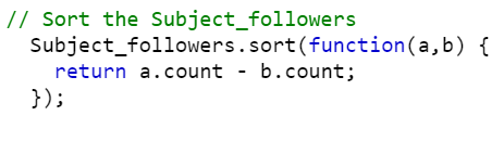
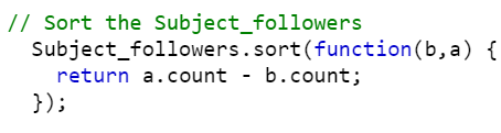
Bar Plot by Ordering the Groups
If you want to order the groups in a bar plot, use the sort() function. Look at the following snippets that sorts the groups in ascending and descending order such that the rectangles in the graph are displayed based on the sorted order. Pass the function with two parameters to the sort() function. It returns the data in ascending order by comparing two values at a time.
Ascending Order:
Descending Order:
Example:
Use the same script that is created in Example 1. Order the data based on the count key in ascending order.
<head>
<script src="https://d3js.org/d3.v4.js"></script>
</head>
<body>
<script>
// Set the Margins and Dimensions for the Barplot.
var margin_for_the_bar_plot = {top: 20, right: 20, bottom: 60, left: 50},
width = 300 – margin_for_the_bar_plot.left – margin_for_the_bar_plot.right,
height = 300 – margin_for_the_bar_plot.top – margin_for_the_bar_plot.bottom;
var svg = d3.select("#place")
.append("svg")
.attr("width", width + margin_for_the_bar_plot.left + margin_for_the_bar_plot.right)
.attr("height", height + margin_for_the_bar_plot.top + margin_for_the_bar_plot.bottom)
.append("g")
.attr("transform","translate(" + margin_for_the_bar_plot.left + "," + margin_for_the_bar_plot.top + ")");
// Input Data – Subject_followers
Subject_followers = [
{Subject : "Python",count: 67},
{Subject: "Java",count: 120},
{Subject: "HTML",count: 234},
{Subject: "CSS",count: 345},
{Subject: "C/C++",count: 20},
{Subject : ".NET",count: 120},
{Subject: "Big-data",count: 120},
{Subject: "IOT",count: 456},
{Subject: "JSP",count: 500},
{Subject: "PHP",count: 200}
]
// Sort the Subject_followers
Subject_followers.sort(function(a,b) {
return a.count – b.count;
});
// Specify the x-axis
var xScale = d3.scaleBand()
.range([ 0, width])
.domain(Subject_followers.map(function(i) { return i.Subject; }))
.padding(0.2);
svg.append("g")
.call(d3.axisBottom(xScale))
.attr("transform", "translate(0," + height + ")")
.selectAll("text")
.attr("transform", "translate(-10,20)rotate(-55)")
// Specify the y-axis
var yScale = d3.scaleLinear()
.domain([0, 500])
.range([ height, 0]);
svg.append("g")
.call(d3.axisLeft(yScale));
// Add Bars
svg.selectAll("BarPlot")
.data(Subject_followers)
.enter()
.append("rect")
.attr("fill", "green")
.attr("x", function(i) { return xScale(i.Subject); })
.attr("y", function(i) { return yScale(i.count); })
.attr("width", xScale.bandwidth())
.attr("height", function(i) { return height – yScale(i.count); })
</script>
</body>
</html>
Output:
Animation at Loading
For good UI (User Interface) experience, animating the bar plot is one of the best techniques such that the users look and feel about the data very clearly.
1. When the bar plot is loading, the bars start from 0 and reach their actual value. This can be done using the transition() function.
2. The duration can be specified using the duration() by passing the milliseconds as a parameter.
3. The delay() function is used to delay the time after each bar is created.
Complete Example:
Use the same script that is created in Example 1 and animate the bar plot.
<head>
<script src="https://d3js.org/d3.v4.js"></script>
</head>
<body>
<script>
// Set the Margins and Dimensions for the Barplot.
var margin_for_the_bar_plot = {top: 20, right: 20, bottom: 60, left: 50},
width = 300 – margin_for_the_bar_plot.left – margin_for_the_bar_plot.right,
height = 300 – margin_for_the_bar_plot.top – margin_for_the_bar_plot.bottom;
var svg = d3.select("#place")
.append("svg")
.attr("width", width + margin_for_the_bar_plot.left + margin_for_the_bar_plot.right)
.attr("height", height + margin_for_the_bar_plot.top + margin_for_the_bar_plot.bottom)
.append("g")
.attr("transform","translate(" + margin_for_the_bar_plot.left + "," + margin_for_the_bar_plot.top + ")");
// Input Data – Subject_followers
Subject_followers = [
{Subject : "Python",count: 67},
{Subject: "Java",count: 120},
{Subject: "HTML",count: 234},
{Subject: "CSS",count: 345},
{Subject: "C/C++",count: 20},
{Subject : ".NET",count: 120},
{Subject: "Big-data",count: 120},
{Subject: "IOT",count: 456},
{Subject: "JSP",count: 500},
{Subject: "PHP",count: 200}
]
// Specify the x-axis
var xScale = d3.scaleBand()
.range([ 0, width])
.domain(Subject_followers.map(function(i) { return i.Subject; }))
.padding(0.2);
svg.append("g")
.call(d3.axisBottom(xScale))
.attr("transform", "translate(0," + height + ")")
.selectAll("text")
.attr("transform", "translate(-10,20)rotate(-55)")
// Specify the y-axis
var yScale = d3.scaleLinear()
.domain([0, 500])
.range([ height, 0]);
svg.append("g")
.call(d3.axisLeft(yScale));
// Add Bars
svg.selectAll("BarPlot")
.data(Subject_followers)
.enter()
.append("rect")
.attr("fill", "green")
.attr("x", function(i) { return xScale(i.Subject); })
.attr("y", function(i) { return yScale(0); })
.attr("width", xScale.bandwidth())
.attr("height", function(i) { return height – yScale(0); })
// Animation at loading
svg.selectAll("rect")
.transition()
.duration(600)
.attr("y", function(i) { return yScale(i.count); })
.attr("height", function(i) { return height – yScale(i.count); })
.delay(function(i,j){console.log(j) ; return(j*200)})
</script>
</body>
</html>
Output:

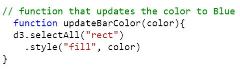
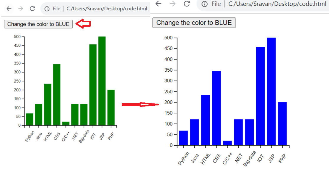
Bonus Example
Let’s change the color of the bars. Upon clicking on the button, add the button and pass the updateBarColor(‘blue’) function to the onclick() method. Write the function by passing the color parameter. This function selects all the rectangles (bars) and updates their color using the “fill” attribute that is passed inside the style() function.
Complete Code: Updating the Color to Blue
<head>
<script src="https://d3js.org/d3.v4.js"></script>
</head>
<body>
<button onclick="updateBarColor(‘blue’)">Change the color to BLUE</button>
<script>
// Set the Margins and Dimensions for the Barplot.
var margin_for_the_bar_plot = {top: 20, right: 20, bottom: 60, left: 50},
width = 300 – margin_for_the_bar_plot.left – margin_for_the_bar_plot.right,
height = 300 – margin_for_the_bar_plot.top – margin_for_the_bar_plot.bottom;
var svg = d3.select("#place")
.append("svg")
.attr("width", width + margin_for_the_bar_plot.left + margin_for_the_bar_plot.right)
.attr("height", height + margin_for_the_bar_plot.top + margin_for_the_bar_plot.bottom)
.append("g")
.attr("transform","translate(" + margin_for_the_bar_plot.left + "," + margin_for_the_bar_plot.top + ")");
// Input Data – Subject_followers
Subject_followers = [
{Subject : "Python",count: 67},
{Subject: "Java",count: 120},
{Subject: "HTML",count: 234},
{Subject: "CSS",count: 345},
{Subject: "C/C++",count: 20},
{Subject : ".NET",count: 120},
{Subject: "Big-data",count: 120},
{Subject: "IOT",count: 456},
{Subject: "JSP",count: 500},
{Subject: "PHP",count: 200}
]
// function that updates the color to Blue
function updateBarColor(color){
d3.selectAll("rect")
.style("fill", color)
}
// Specify the x-axis
var xScale = d3.scaleBand()
.range([ 0, width])
.domain(Subject_followers.map(function(i) { return i.Subject; }))
.padding(0.2);
svg.append("g")
.call(d3.axisBottom(xScale))
.attr("transform", "translate(0," + height + ")")
.selectAll("text")
.attr("transform", "translate(-10,20)rotate(-55)")
// Specify the y-axis
var yScale = d3.scaleLinear()
.domain([0, 500])
.range([ height, 0]);
svg.append("g")
.call(d3.axisLeft(yScale));
// Add Bars
svg.selectAll("BarPlot")
.data(Subject_followers)
.enter()
.append("rect")
.attr("fill", "green")
.attr("x", function(i) { return xScale(i.Subject); })
.attr("y", function(i) { return yScale(i.count); })
.attr("width", xScale.bandwidth())
.attr("height", function(i) { return height – yScale(i.count); })
</script>
</body>
</html>
Output:
The existing color is green. Upon clicking on the button, the bars are changed to blue.
Conclusion
First, we provided the steps for creating a basic bar plot in D3.js with proper functions and syntax. Then, we used the same data for plotting the horizontal bar plot. Lastly, we animated the bar plot visualization and changed the color with the HTML button onclick() functionality.
Source: linuxhint.com