Seaborn Time Series Plot
Time series is a type of data in which we see a set of measurements over a period. Every observation has its timestamp. Stock prices, sensor readings, program-observed data, and other types of data are examples of this type of data. In this tutorial, we will use the Seaborn and Pandas module to plot the time series analysis in Python. Before constructing a time series plot, let us examine a few concepts.
A time plot (also known as a statistical graph) shows values as they change over time. They’re like x-y graphs. However, time plots can only represent time on the x-axis. Whereas x-y graphs can plot various “x” variables, such as height, weight, and age. These plots do not include categories, unlike pie charts and bar charts. Time plots are useful in displaying the progression of data across time. For example, this type of chart might be useful if you were analyzing data at odd intervals.
Suppose we are plotting time plots with the Panda module. Pandas is a NumPy-based open-source library. A Python module provides numerous data structures and methods for processing numerical and statistical data. It’s most well-known for making data import and analysis significantly simpler. Pandas is quick, high-performing, and user-friendly.
Example 1: Creating a Simple Time Series Plot Using a Line Plot
We have used Python modules for constructing the time series plots. These modules include Seaborn, Pandas, and matplotlib modules. After adding these modules, we have created data by calling the Panda’s data frame function and inserted the field ‘Date’ for the x-axis and three more fields for the y-axis. The Date field has time-series data, and other fields have just random number lists.
Then, we have a Seaborn line plot function where the x and y variable parameters are set and pass the entire data frame inside it, which is stored inside a variable “df”. This line plot creates a time series plot, and we have defined the xticks location with the specified angle.
|
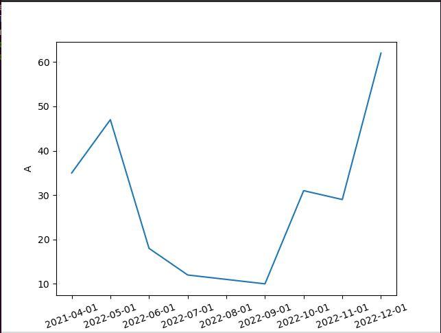
1
2 3 4 5 6 7 8 9 10 11 12 13 14 15 16 17 18 19 20 21 22 23 |
import matplotlib.pyplot as plt
import seaborn as sns import pandas as pd df = pd.DataFrame({'Date': ['2021-04-01', '2022-05-01', plt.xticks(rotation = 20) plt.show() |
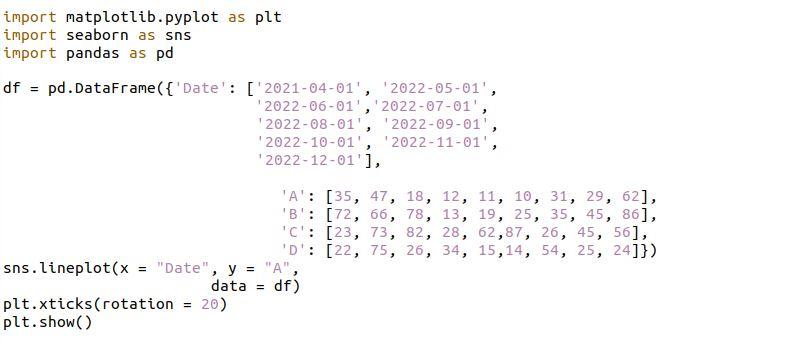
The times series plot is rendered inside the following figure. This figure is the single-column time series plot:
Example 2: Creating a Time Series Plot With Numerous Columns by Using a Line Plot
The preceding time series graph is rendered with a single column. Here, we have imported the Seaborn, Panda, and matplotlib modules for rendering the time series plot. Then, we have created data that has four fields defined. The first field is set with the dates and sets the name Date. In the other fields, we have set the car’s name, which shows the sales of the car on a specific date.
After that, we called the Seaborn line plot two times but with the different fields’ names. The x-axis is assigned with the field date, and the y-axis is assigned with the BMW and Alto field. We set the label for the y-axis and the tricks rotation for the x-axis with an angle of 20.
|
1
2 3 4 5 6 7 8 9 10 11 12 13 14 15 16 17 18 19 20 21 22 23 24 25 26 27 28 |
import matplotlib.pyplot as plt
import seaborn as sns import pandas as pd df = pd.DataFrame({'Date': ['2021-04-01', '2022-05-01', '2022-06-01','2022-07-01', sns.lineplot(x = "Date", y = "BMW", data = df) sns.lineplot(x = "Date", y = "Alto", data = df) plt.ylabel("BMW and Alto") plt.xticks(rotation = 20) plt.show() |
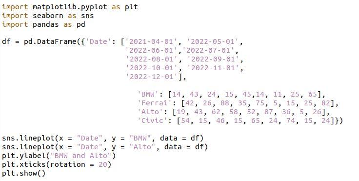
The time series plot is visualized with the multiple fields in the following graph figure:
Example 3: Create Multiple Time Series Plots Using a Line Plot
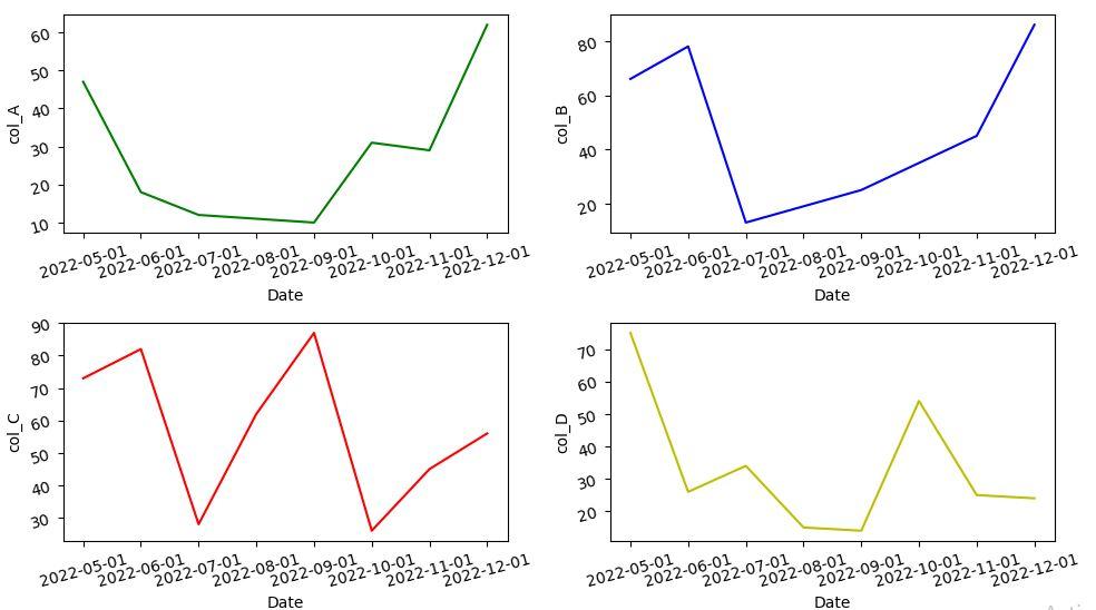
We can create multiple time series plots with several columns. Here, we have an example illustration where we have created the four time series plots with the line plot function. First, we have created data inside a variable represented by the name df. Then, we have created subplots for the time series graph, where we have also set the figure size inside the subplot function.
For each subplot, we have set the rotation of ticks. Within the line plot, we have assigned the columns for x and y parameters and set the color of each subplot by providing the color names. There is one additional parameter; tight_layout is set with the value that adjusts the padding of the subplots.
|
1
2 3 4 5 6 7 8 9 10 11 12 13 14 15 16 17 18 19 20 21 22 23 24 25 26 27 28 29 30 31 32 33 34 35 36 37 38 39 40 41 42 43 44 |
import seaborn as sns
import pandas as pd import matplotlib.pyplot as plt df = pd.DataFrame({'Date': ['2022-05-01','2022-06-01', '2022-07-01','2022-08-01', fig,ax = plt.subplots( 2, 2, figsize = ( 10, 6)) sns.lineplot( x = "Date", y = "col_A", ax[0][0].tick_params(labelrotation = 15) ax[0][1].tick_params(labelrotation = 15) ax[1][0].tick_params(labelrotation = 15) sns.lineplot(x = "Date", y = "col_D", ax[1][1].tick_params(labelrotation = 15) fig.tight_layout(pad = 1.25) plt.show() |
Here, we have multiple time series plot representations with the different columns and the different color lines by using the line plot.
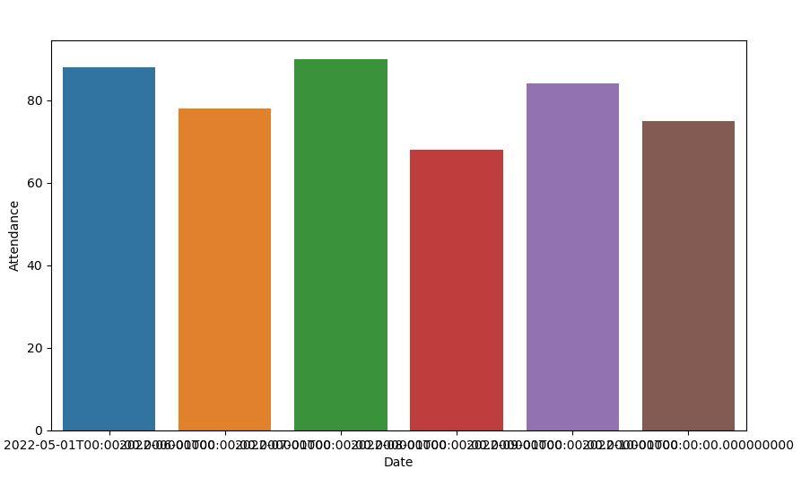
Example 4: Create a Time Series Plot by Using a Bar Plot
The observed values are depicted in rectangular bars using a bar plot. The Seaborn barplot() technique is used to construct bar graphs in Python’s Seaborn module. When displaying continuous time-series data, a bar plot can be utilized.
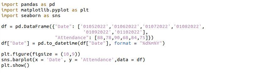
Then, we have set the data for the time series plot with the help of the Panda module function called a data frame. Inside the data frame, we set the dates and created a list of numbers representing the attendance percentage. With the to_datetime() function, we have set the date format for the time series plots. We have also defined the size of the figure of the time series plot. After that, we have a barplot() function that takes the values for the x and y parameters for the time series plot.
|
1
2 3 4 5 6 7 8 9 10 11 12 13 14 15 16 17 18 19 |
import pandas as pd
import matplotlib.pyplot as plt import seaborn as sns df = pd.DataFrame({"Date": ['01052022','01062022','01072022','01082022', '01092022','01102022'], df["Date"] = pd.to_datetime(df["Date"], format = "%d%m%Y") plt.figure(figsize = (10,9)) sns.barplot(x = 'Date', y = 'Attendance',data = df) plt.show() |
For time-series data, the following graph provides an alternate visualization:
Conclusion
This is a basic rundown of how to generate time series plots for time-related input. When you have several data points in a specified time span, a time series plot is an excellent approach to represent your data. From creating a small dataset with Pandas Sequence to integrating a real-world dataset and plotting time series plots dependent on your needs, this article guides you through everything you need to know.
Source: linuxhint.com