Seaborn Swarmplot
In this guide, we will provide the process of generating a Seaborn “swarmplot()” method in Python.
How to Draw Seaborn Swarmplot in Python?
To draw a swarmplot in Python, first, import the “pandas”, “matplotlib.pyplot”, and “seaborn” libraries:
import matplotlib.pyplot as plt
import seaborn as sns
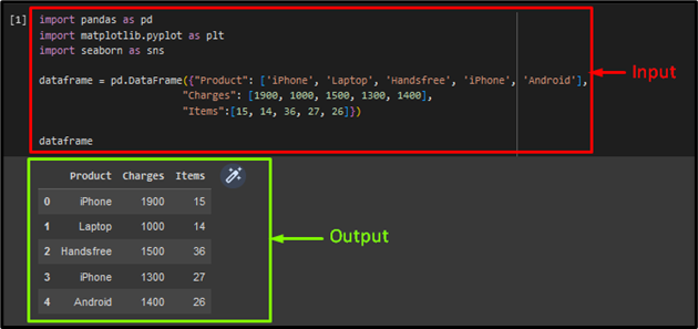
Then, call the “pd.DataFrame()” method that is associated with the Pandas module “pd” to specify a new dataset. Here, we generated three different arrays, such as the first array containing the product’s name, the second holding the charges of the products, and the last array representing the item’s quantity:
"Charges": [1900, 1000, 1500, 1300, 1400],
"Items":[15, 14, 36, 27, 26]})
Now, display the generated data set:
As you can see, the specified data set has been displayed successfully:
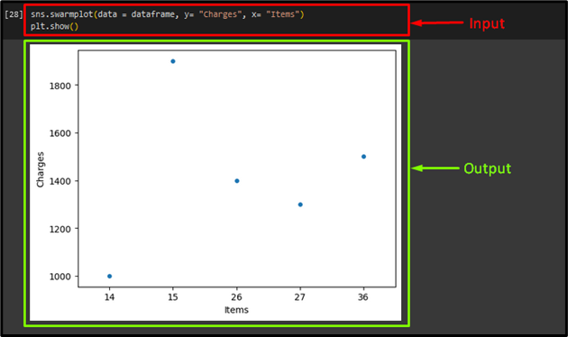
Next, generate the swarm plot by using the “sns.swarmplot()” method that takes the generated data set, x-axis, and y-axis labels as an argument. Lastly, apply the “plt.show()” method to show the resultant plot:
plt.show()
Output
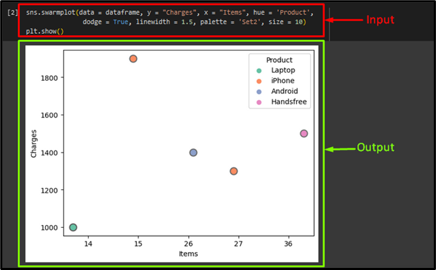
We can use additional parameters, such as “hue”, “dodge”, “linewidth”, “palette”, “size” and many more to make the swarm graph more understandable. As follows:
dodge = True, linewidth = 1.5, palette = 'Set2', size = 10)
plt.show()
Here:
- “data” parameter for input dataset.
- “y = “Charges”” argument denotes the y-axis label.
- “x = “Items”” parameter denotes the x-axis label.
- “hue = “Product”” parameter indicates which column decides the type of color.
- “dodge = True” argument with the “True” value is used to segregate the product items.
- “linewidth = 1.5” parameter is used to give a unique description or visual to an input dataset in the graph.
- “palette” argument indicates the color palette.
- “size” parameter is utilized to adjust the element’s size.
- “show()” function is used to display the final plot on the screen. It is the “matplotlib.pyplot” library’s function.
Output
That’s it! We have described the seaborn swarmplot in Python.
Conclusion
In Python, the Seaborn “swarmplot()” method is utilized for drawing a scatter graph that includes one of the variables as a categorical variable. It is similar to the Seaborn “stripplot()” method having a quiet difference, such as edges are adjusted for not intersecting with each other. That’s all about the seaborn swarmplot in Python.
Source: linuxhint.com