Seaborn Pairplot
“Seaborn” is a data visualization Python library that offers a wide range of tools for creating appealing and informative plots. The “seaborn.pairplot()” method of the “seaborn” library allows its user to quickly visualize relationships between multiple variables in a dataset. This article presents an in-depth guide on the “seaborn.pairplot()” method using appropriate examples including syntax, parameters, and code explanation.
What is the “seaborn.pairplot()” Method in Python?
The “seaborn.pairplot()” method creates a grid of scatter plots, showing the relationships between all possible pairs of variables in a given dataset. This method is particularly useful when dealing with multivariate data since it provides insights into the correlations and distributions between variables.
Syntax
Parameters
In the above syntax:
-
- The “data” parameter specifies the input data for creating the pairplot.
- The “hue” parameter is an optional parameter that enables you to determine a categorical variable in the dataset. It adds a different color to the scatterplots based on the unique values of the specified variable, making it easy to differentiate between different groups.
- The “palette” parameter is utilized to specify/determine the color palette for the scatterplots.
- The “markers” parameter allows you to specify different markers for the scatterplots based on the levels of the hue variable.
- The “height” parameter determines the height (in inches) of each facet in the grid.
- The “aspect” parameter determines the aspect ratio of each facet and basically, it is the ratio between the width and height of each facet.
- The “diag_kind” parameter determines the type of plot to utilize on the diagonal. It can take values like “auto“, “hist“, “kde“, or “callable”.
Return Value
This method returns a seaborn “PairGrid” object, which can be further customized and used for additional analysis or plotting.
Example 1: Creating a Pair Plot Using the “seaborn.pairplot()” Method
This code illustrates the usage of the “seaborn.pairplot()” method:
import matplotlib.pyplot as plt
data_set = seaborn.load_dataset("iris")
seaborn.pairplot(data=data_set)
plt.show()
According to the above code:
-
- The “seaborn” and “matplotlib” libraries are imported.
- The famous “iris” dataset is loaded using the “sns.load_dataset()” function. This dataset contains measurements of various “iris” flowers.
- The “seaborn.pairplot()” method is called on the “iris” dataset and displays the resulting plot using the “plt.show()” function.
Output
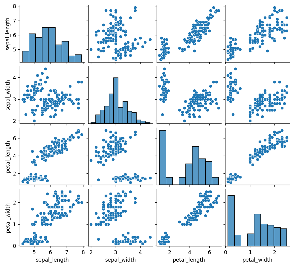
The above output shows a grid of scatter plots, with each plot showing the relationship between two variables in the “iris” dataset.
Example 2: Creating a Seaborn Pair Plot With Categorical Variables
The following code block uses the “seaborn.pairplot()” method with the “hue” parameter to handle categorical variables:
import matplotlib.pyplot as plt
data_set = seaborn.load_dataset("tips")
seaborn.pairplot(data=data_set, hue="sex")
plt.show()
In this example:
-
- The “sns.load_dataset()” function is used to load the “tips” dataset. This dataset contains information about tips given in a restaurant.
- The “seaborn.pairplot()” method takes the “dataset” and the allocated “hue” parameter. This “hue” parameter will add different colors to the scatterplots based on the gender of the individuals who gave the tips.
Output

The seaborn pairplot has been created with categorical variables.
Note: To customize the appearance of the scatterplots, the “palette” and “markers” parameters of the “seaborn.pairplot()” method is used in Python.
Conclusion
The “seaborn.pairplot()” method of the “seaborn” library is used for visualizing relationships between multiple variables in a dataset. It provides a quick and intuitive way to gain insights into the correlations and distributions between variables. This method takes the “hue” parameter to handle categorical variables and accepts other parameters such as “palette” and “markes” for customization of the given plots. This Python article offered/presented a detailed guide on “Seaborn Pairplot” accompanied by several examples.
Source: linuxhint.com