Seaborn Kdeplot() Method
“KDE” plots are similar to histograms in how they visualize a dataset’s observations. Instead of counting the frequencies of values using bins, “KDE” uses a smooth curve that represents the probability density function of the variable. By doing this, the distribution’s shape and characteristics can be more accurately revealed.
This Python post presents a comprehensive guide on the Seaborn “kdeplot()” method using numerous examples:
- What is the Seaborn “kdeplot()” Method in Python?
- Creating a Simple Univariate KDE Plot.
- Creating a Complex KDE Plot With Multiple Parameters.
What is the Seaborn “kdeplot()” Method in Python?
The Seaborn “kdeplot()” method plots the KDE of a continuous variable on a graph. It can be used to visualize univariate or bivariate distributions, as well as conditional distributions based on a third variable. It can also be used to create “joint”, “marginal”, “rug”, and “contour” plots.
Syntax
The Seaborn “kdeplot()” method accepts multiple specified arguments that control various aspects of the plot. This method retrieves an axis object with the “KDE” plot displayed.
Example 1: Creating a Simple Univariate KDE Plot
In this example, we will create a simple univariate “KDE” plot utilizing the Seaborn “kdeplot()” method:
import numpy
from matplotlib import pyplot as plt
data = numpy.random.normal(size=1000)
sb.kdeplot(data, color='red', fill='True')
plt.show()
In the above code:
- The “seaborn”, “numpy” and “matplotlib” libraries are imported at the start, respectively.
- The “random.normal()” function is used to create some random data.
- Lastly, the “kdeplot()” method is utilized to plot the “KDE” curve for this data based on the specified parameters.
Output
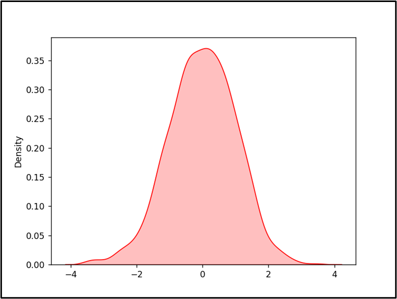
In the above output, the KDE graph has been displayed in accordance with the specified parameters successfully.
Note: The above graph can be inverted using the “vertical=True” parameter in the “seaborn.kdeplot()” method.
Example 2: Creating a Complex KDE Plot With Multiple Parameters
The below code is used to plot a multivariate regression “KDE” plot using the “kdeplot()” method:
import numpy
from matplotlib import pyplot as plt
data = numpy.random.randn(1000)
data1 = numpy.random.randn(1000)
sb.kdeplot(x=data, y=data1, color='red', fill='True', linewidth=3)
plt.show()
In this code:
- The “random.randn()” function is used to create a numpy array of “1000” random numbers and assign them to the variable “data” and “data1”, respectively.
- These variables are considered the datasets for the “x-axis” and “y-axis”.
- Now, the “kdeplot()” method is used to create a kernel density estimate (KDE) plot of the given two variables “data” and “data1”.
- The KDE plot parameters “color”, “fill” and “linewidth” are used to customize the kernel density estimate (KDE) plot, respectively.
Output
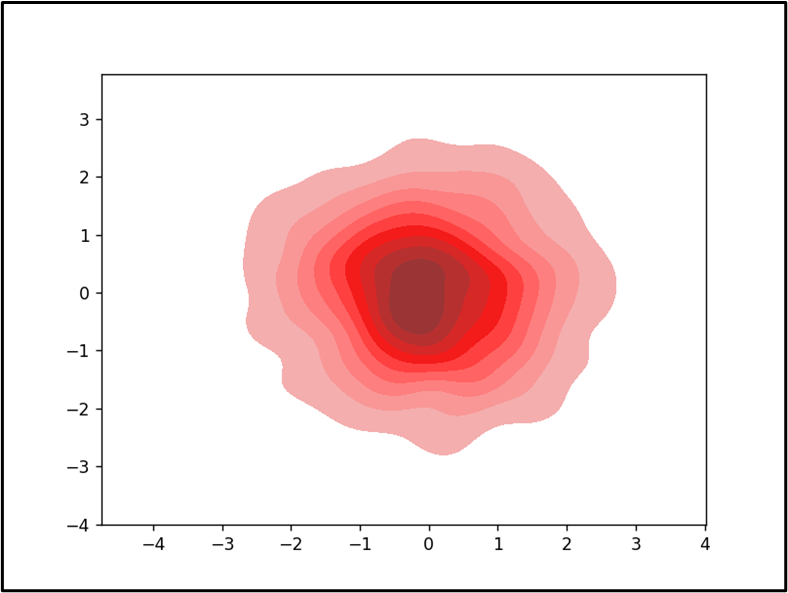
In this outcome, the multivariate regression “KDE” plot has been displayed appropriately.
Conclusion
The “kdeplot()” method in Python is used to create “KDE” plots that show the distribution of continuous variables in one or more dimensions. This method can be used to create a simple as well as complex “KDE” plot with different parameters. This method also helps to visualize and analyze the data, as well as to compare and test different models. This article explained the use of the Seaborn “kdeplot()” method in Python.
Source: linuxhint.com