Seaborn Horizontal Bar Plot
In Data Visualization, the “bar plots” are among the most widely used types of charts. A “bar plot” is a visual representation of numerical data where bars of equal width are drawn for each category with lengths proportional to the corresponding values. A “horizontal bar” plot is a chart that displays rectangular bars with their lengths proportional to the values they represent, arranged horizontally. To create a horizontal bar the “seaborn.barplot()” function is utilized in Python.
This post will illustrate the approaches to creating and customizing the horizontal bar plot using numerous examples.
Note: To create a horizontal bar plot using “seaborn”, you must first install “seaborn” and import the required libraries. It(seaborn) can be easily installed through “pip” by running the appropriate command in your terminal:
How to Create a Horizontal Bar Plot Using Seaborn?
To create a horizontal bar plot utilizing seaborn, apply the “seaborn.barplot()” function of the “seaborn” module in Python.
Example 1: Creating a Horizontal Bar Plot Using “seaborn”
Here is an example code that creates a horizontal bar plot:
import pandas
import matplotlib.pyplot as plt
data = pandas.DataFrame({'Country': ['USA', 'Germany', 'Russia', 'Japan'],
'Population': [1093, 1166, 1444, 1226]})
seaborn.barplot(x="Population", y="Country", data=data)
plt.show()
In the above code:
-
- Firstly, the “seaborn”, “pandas” and “matplotlib” libraries are imported.
- Next, the user-defined dataset is created using the “pd.DataFrame()” function.
- The “seaborn.barplot()” function takes the “horizontal” and “vertical” axis labels along with the “dataset”, respectively, and plots the horizontal bar plot accordingly.
Output
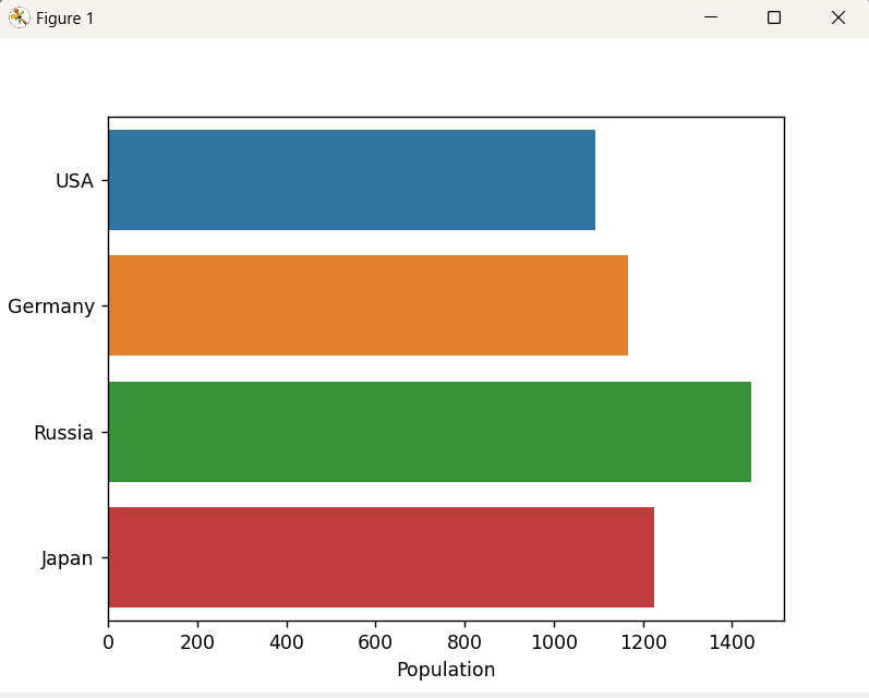
In the above output, it can be seen that the horizontal bar plot has been plotted successfully.
Example 2: Creating a Grouped Horizontal Bar Plot Using “seaborn”
We can also create a grouped horizontal bar plot using the “hue” parameter as an argument of the “seaborn.barplot()” function. Let’s understand it by the following example:
import matplotlib.pyplot as plt
import pandas
data = pandas.DataFrame({
'Gender': ['Male', 'Female', 'Male', 'Female', 'Male', 'Female'],
'Age-Group': ['10-14', '10-14', '15-24', '15-24', '35-44', '35-44'],
'Salary': [25000, 28000, 32000, 38000, 41000, 47000]
})
seaborn.barplot(x='Salary', y='Age-Group', hue='Gender', data=data)
plt.show()
In the above lines of example code:
-
- Likewise, the discussed libraries are imported right at the beginning.
- The “pandas.DataFrame()” function is used to create the dataset.
- Lastly, the “seaborn.barplot()” function takes the “hue” parameter and plots the grouped horizontal bar plot.
Output
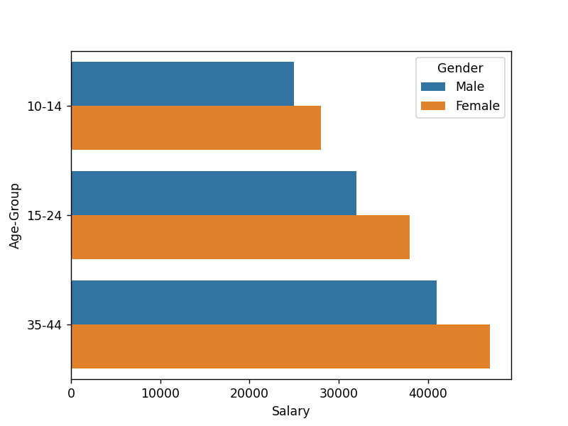
In the above output, the horizontally grouped plots have been plotted appropriately.
How to Customize Horizontal Bar Plot in Python?
We can also customize the horizontal bar plot by changing the color of the bar, adjusting the width of the bar, adding bar labels, or adding plot titles.
Example 1: Customizing the Horizontal Bar by Changing the Bars Color
We can change the color of bars using the color parameter. Here is an example code:
import pandas
import matplotlib.pyplot as plt
data = pandas.DataFrame({'Country': ['USA', 'Germany', 'Russia', 'Japan'],
'Population': [1093, 1166, 1444, 1226]})
seaborn.barplot(x="Population", y="Country", data=data, color="yellow")
plt.show()
In the above code, the “seaborn.barplot()” function takes the “x” and “y” labels, the created dataset, and the “color” parameter as its arguments, respectively, and plots the horizontal bar plot in accordance with the specified color.
Output
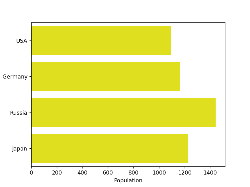
Based on the above output, the color of the bar plot has been changed accordingly.
Example 2: Customizing the Horizontal Bar by Adjusting the Bars Width
We can adjust the width of bars using the “width” parameter. In the below code example, the width of the bar is changed to the specified width:
import pandas
import matplotlib.pyplot as plt
data = pandas.DataFrame({'Country': ['USA', 'Germany', 'Russia', 'Japan'],
'Population': [1093, 1166, 1444, 1226]})
seaborn.barplot(x="Population", y="Country", data=data, color="blue", width=0.5)
plt.show()
According to the above code, the “seaborn.barplot()” function takes the “x” and “y” labels, data, color, and “width” parameters as its arguments, respectively, and customizes the horizontal bar plot based on the updated width.
Output
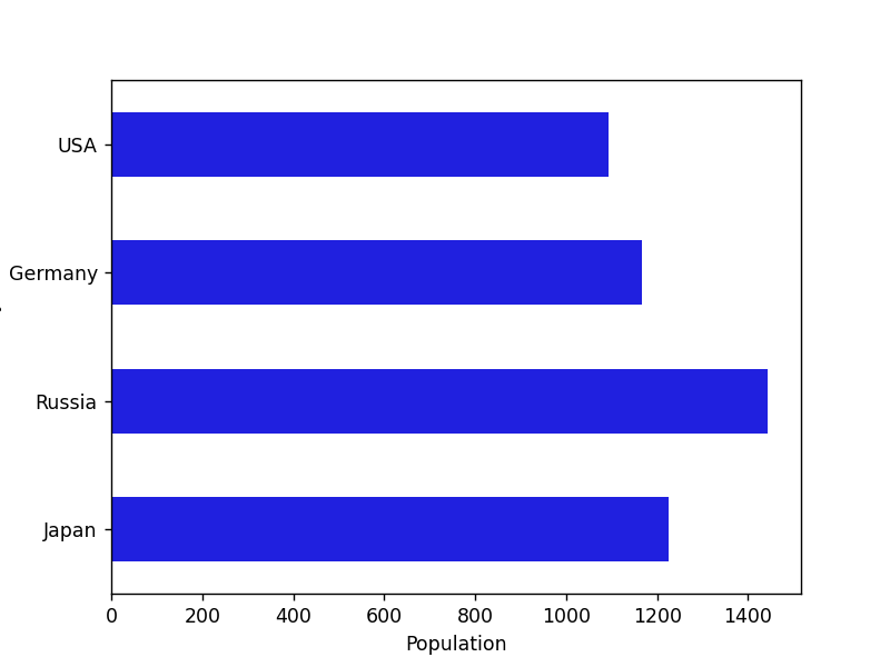
The above outcome implies that the given horizontal bar plot has been customized based on updated width and changed color.
Example 3: Customizing the Horizontal Bar by Adding the Plot Title
In the below example code, we can customize the horizontal bar by adding the specified title via the “set_title()” function:
import pandas
import matplotlib.pyplot as plt
data = pandas.DataFrame({'Country': ['USA', 'Germany', 'Russia', 'Japan'],
'Population': [1093, 1166, 1444, 1226]})
ax = seaborn.barplot(x="Population", y="Country", data=data, color="blue", width=0.5)
ax.set_title("Total Population by Countries")
plt.show()
In the above code block, the “set_title()” function of the “seaborn” library is used to set the title of the horizontal bar plot and plot it accordingly.
Output
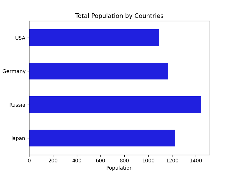
The above outcome demonstrates that the title of the horizontal bar plot has been set.
Conclusion
To create, and customize the horizontal bar plot, the “seaborn.barplot()” function of the “seaborn” module is utilized with various parameters in Python. It’s possible to create a grouped horizontal bar graph by utilizing the “hue” parameter as an argument to the “seaborn.barplot()” function. This post presented an in-depth guide to creating and customizing the horizontal bar plot using appropriate examples.
Source: linuxhint.com