Seaborn Grouped Bar Plot
For data visualization, the “seaborn” library can be used in Python. It includes multiple methods for plotting the data in the form of a graph, such as a grouped bar plot. The grouped bar plot can be used when users have multiple variables with different categories and want to visualize these values together. To do so, the “sns.barplot()” method can be used.
This guide will explain the seaborn-grouped bar plot in Python.
How to Generate a Grouped Bar Plot Using Seaborn in Python?
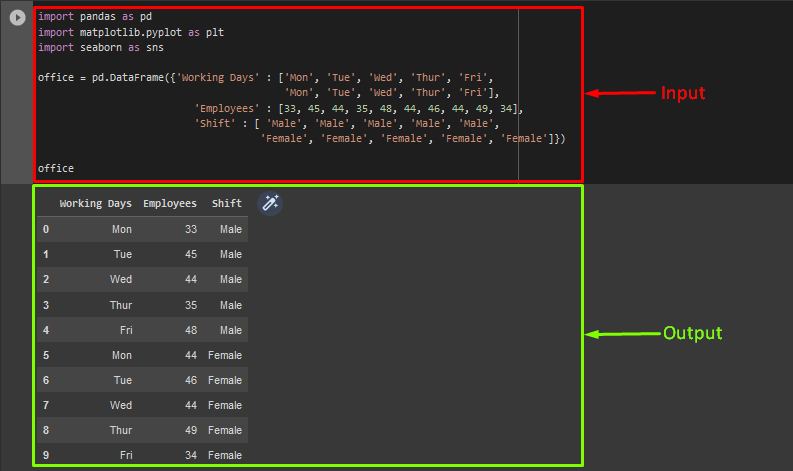
To generate a seaborn grouped bar plot in Python, first, we will create a data frame. To do so, import the “pandas” library as “pd“. Next, use the “DataFrame” method to generate a new data frame, specify the values and pass it to the data frame variable named “office”. Then, view the created data frame:
office = pd.DataFrame({'Working Days' : ['Mon', 'Tue', 'Wed', 'Thur', 'Fri',
'Mon', 'Tue', 'Wed', 'Thur', 'Fri'],
'Employees' : [33, 45, 44, 35, 48, 44, 46, 44, 49, 34],
'Shift' : [ 'Male', 'Male', 'Male', 'Male', 'Male',
'Female', 'Female', 'Female', 'Female', 'Female']})
office
According to the below-given output, we have successfully created a data frame:
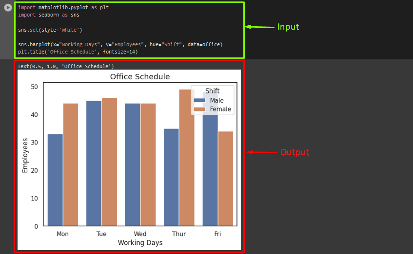
Now, to generate a grouped bar plot, import the “matplotlib.pyplot”, and “seaborn” libraries. Then, use the “set()” method and pass the “style” parameter with the value. After that, invoke the “sns.barplot()” method and pass the “x-axis”, “y-axis”, and “hue” with values as parameters. Next, specify the data frame name. Lastly, use the “plt.title()” method to add the title and adjust its font size:
import seaborn as sns
sns.set(style='white')
sns.barplot(x="Working Days", y="Employees", hue="Shift", data=office)
plt.title('Office Schedule', fontsize=14)
As you can see, the grouped bar plot has been created successfully:
That’s it! We have compiled the process of creating seaborn grouped bar plots in Python.
Conclusion
The grouped bar plot is useful when users have multiple categorical variables and need to plot them together simultaneously. For that purpose, the “sns.barplot()” method can be used for data visualization. In this post, we have described the seaborn grouped bar plot.
Source: linuxhint.com