Seaborn Cluster Map
To plot statistical graphics in Python, visualization libraries can be used, such as the “seaborn” library. By using this library, users can get the default styles and colors to make plots more understandable and attractive. It is also integrated from “pandas” into the data structure and based on the “matplotlib”.
This guide will demonstrate about:
What is a Cluster Map?
When users plot multiple data points too close to each other to determine the variation and draw a conclusion from the provided data, it becomes difficult. At that time, the interactive map is known as a “cluster map” by using the “sb.clustermap” It makes and represents a hierarchical cluster of the tuples and fields of the data.
What is the “sb.clustermap()” Function in Python?
The “sb.clustermap()” function is used to plot statistical visuals and is based on the matplotlib software that is connected with “pandas” data structures. The clustering techniques help with the acquisition of structured data in unsupervised learning.
Syntax
The general syntax of the “sb.clustermap()” function is stated below:
In the above-stated code block:
-
- “data” parameter is the rectangular data that is used for clustering. NULL values are not allowed.
- “standard_scale” parameter is used for substructuring the minimum and dividing each tuple or field by its maximum.
- “figsize” parameter is used for adjusting the overall size of the figure that contains height and width.
How to Plot Cluster Map Using the “sb.clustermap()” Function in Python?
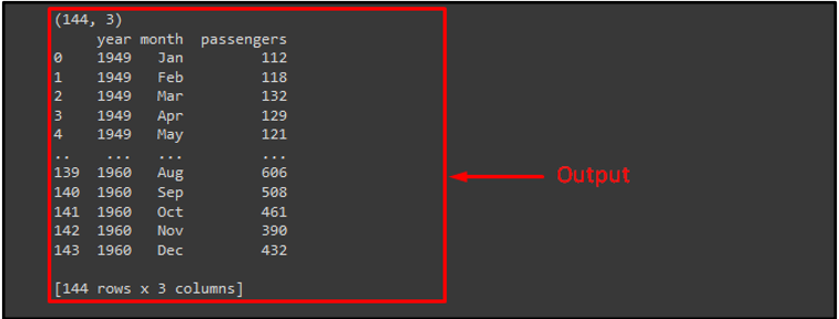
To plot a cluster map using the “sb.clustermap()” function, first, import the required libraries as “seaborn”, and “matplotlib.pyplot”. Then, load the desired data set by using the “load()” method with the “dropna()” method and pass it to the “ds” variable. We have used the “seaborn” library built-in dataset known as “flights”. After that, call the “print()” method for getting the number of rows and columns and then print the dataset.
import matplotlib.pyplot as plt
ds = sns.load_dataset('flights').dropna()
print(ds.shape)
print(ds)
It can be observed that the provided dataset is loaded successfully:
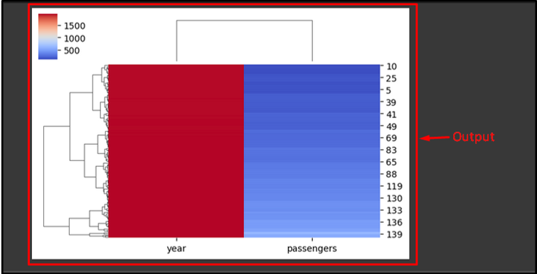
Now, use the “pop()” and pass a dataset column name that contains text values to pop while clustering the map. Then, call the “sb.clustermap()” along with the dataset, figure height and width, and cluster map color. Lastly, use the “plt.show()” method to display the plotted figure:
sb.clustermap(ds, figsize=(6, 4), cmap='coolwarm')
plt.show()
The provided figure is the output of the cluster map. It can be noticed that the dataset rows and columns are rearranged by the Seaborn:
You have learned the method for creating a cluster map in Python.
Conclusion
The “sb.clustermap()” function is used for plotting statistical visuals which are based on the matplotlib software that is connected with “pandas” data structures. The clustering techniques help with the acquisition of structured data in unsupervised learning. This post elaborated on the Seaborn cluster map in Python.
Source: linuxhint.com