Scatterplot in R
What is the Scatter Plot in the R Programming Language in Ubuntu 20.04?
Comparing variables is done using scatter plots. When we need to know what further one variable is influenced by another, we need to compare the two variables. The scatter plot is a group of dotted points on the x and y axes that represent distinct pieces of data. The layout of the generated points demonstrates a correlation between two variables when their values are displayed along the X-axis and Y-axis.
Syntax of the Scatter Plot in the R Programming Language in Ubuntu 20.04
In R, you can make a scatterplot in a variety of methods. Plot(x, y), in which x and y parameters are numerical vectors specifying the (x,y) positions to the plot, is the most basic function.
As mentioned above that, x any x parameters are mandatory to graph the scatter plot but the scatter plot also supports some optional parameters, which are described as follows:
x: The horizontal coordinates are set with this option.
y: The vertical coordinates are set with this option.
xlab: The label for the horizontal axis.
ylab: The vertical axis label.
main: The topic of the chart is defined by the parameter main.
xlim: The xlim parameter is used to depict x values.
ylim: Th ylim option is used to plot values of y.
axes: This option determines whether the plot should include both axes.
How to Construct the Scatter Plot in the R in Ubuntu 20.04?
Let’s look at an example to show how we can use the plot function to create a scatterplot. We will utilize the sample dataset in our examples, which is a preconfigured dataset in the R environment.
Example # 1: Using the Plot Method for Constructing the Scatter Plot R in Ubuntu 20.04
The plot() method in the R Programming Language can be used to make a scatter plot.
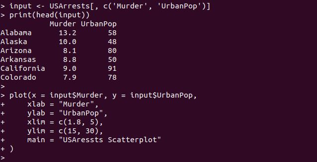
To construct the scatter plot, we need the data set. So here, we have inserted the data set USArrests from the R language. We have selected the two columns from this data set for making the scatter plot. The first few entries are shown of the data set USArrests. Then, we have the plot function where the two inputs, x, and y, are set. For x input, the column “Murder” is selected, and for the y input, we have the “UrbanPop” column. Some optional inputs are passed inside the function, like labels for x and y are set with the xlab and ylab. Within the xlim and ylim range, the values of the x and y parameters are set. Also, the title of the scatter plot is set by calling the option “main.”
The output of the scatterplot is generated below.
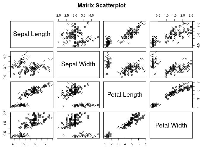
Example # 2: Using the Pair Method for Constructing the Scatter Plot Matrices R in Ubuntu 20.04
We utilize a scatterplot matrix when we have multiple variables and want to correlate one variable with the others. Scatterplot matrices are created using the pairs() method.
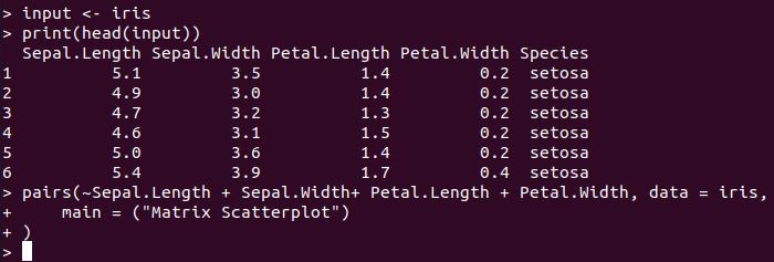
Here, we have selected the sample dataset iris from the r language. Then, print the top six entries of the iris data set. To the columns of the data set iris, we have applied the pair method. Each column will be paired with the remaining column in the pair function.
The scatterplot metrics are visualized in the following figure.
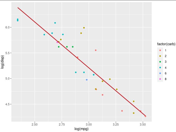
Example # 3: Using Fitted Values in a Scatterplot in R in Ubuntu 20.04
You can expand the graph by adding a new level of data. In linear regression, you can visualize the fitted value. For constructing a scatterplot, we use the ggplot2 package’s ggplot() and geom_point() methods.
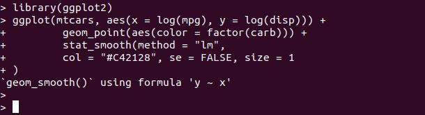
Begin with this example; we have imported the ggplot2 module from r. Then, we have utilized the ggplot method where the dataset name “mtcars” is given. The “aes” function is used inside the ggplot method for creating the logs for the x and y parameters. For linear regression, an additional set of features, “stat_smooth,” is used. The smoothing method is controlled by the stat_ smooth() option. The standard error (se) is kept false, and the line of the size is set to the value 1.
Example # 4: Using a Dynamic Name for the Scatter Plot Title in R in Ubuntu 20.04
We haven’t put any data on the plots yet. Informational graphs are required. Without resorting to extra documentation, the reader should be able to understand the message behind the analysis of data just by glancing at the plot. As a result, good labels are required when using plots. Labels can be added using the labs() function.
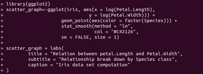
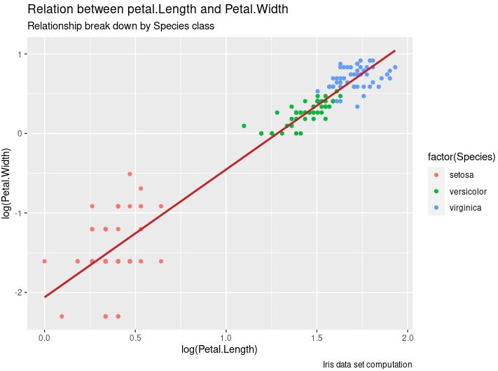
We have a variable here as scatter_graph to which the ggplot method is assigned. The ggplot set its parameter the same as the above example but for a different data set. The dataset used here is the iris. Then, we have again utilized the scatter_garph variable, and this time, we have set the dynamic names to the scatter plot.
You can see the additional information on the scatterplot inside the following figure.
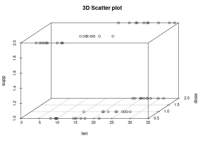
Example # 5: Using the 3dscatterplot Method for Constructing the Scatter Plot in R in Ubuntu 20.04
The scatterplot3d package lets you make a three-dimensional scatterplot. Scatterplot3d is a useful technique that uses (x, y, z) syntax.

We have included the scatterplot3d module inside our r script above. Now, we can use the scatterplot3d function. To the scatterplot3d function, we have passed three parameters which are the columns selected from the dataset ToothGrowth.
The 3D scatterplot is rendered in the following graph snap.
Conclusion
This article aims to brief you about the scatter plot in R. Scatter plots are dispersion graphs that are used to display data points from parameters (usually two, but three is possible). The primary purpose of the R scatters plot is to help visualize the data and whether numeric variables have any relationship. We have seen various approaches which help us to create the scatterplot in the very easiest way. Each method has its functionality and is very easy to understand.
Source: linuxhint.com