Pandas Series Histogram
A histogram is a visual depiction of the distribution of numerical data. It is a bar chart type that displays the frequency of values in various intervals or bins. A histogram can help us to visualize the shape, spread, and skewness of the data, as well as to identify any outliers or gaps. To create a histogram from a Series object various methods are used in Python.
This write-up will present/offer a detailed guide on creating a Pandas Series histogram.
How to Create/Plot a Pandas Series Histogram?
To create/plot a Pandas Series histogram the following methods are employed in Python:
Method 1: Create a Pandas Series Histogram Using “pd.Series.plot.hist()”
The “pd.Series.plot.hist()” method is used to create a histogram in Pandas Series.
Syntax
Here is an example of creating a Pandas Series histogram:
data = pandas.Series([80, 50, 70, 50, 80, 70, 50, 60, 90, 90])
data.plot.hist()
plt.show()
In this code, we first imported the necessary libraries and created a Pandas Series. After that, the “pd.Series.plot.hist()” method is used to create the histogram.

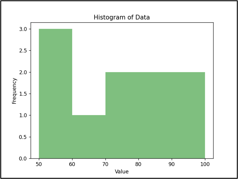
To customize the histogram, we can pass additional parameters to “pd.Series.plot.hist()”. For example, we can change the number of bins, the color of the bars, and the range of the x-axis. Here is an example:
data = pandas.Series([80, 50, 70, 50, 80, 70, 50, 60, 90, 90])
data.plot.hist(bins=5, color='green', alpha=0.5, range=(50, 100))
plt.title('Histogram of Data')
plt.xlabel('Value')
plt.ylabel('Frequency')
plt.show()
The above code will create a histogram with 5 bins, green bars with 50% transparency, and an x-axis ranging from 50 to 100. The title, x-label, and y-label are also added to the plot for better visualization:
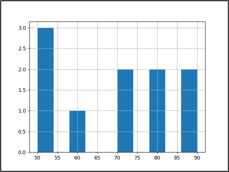
Method 2: Create a Pandas Series Histogram Using “pd.Series.hist()”
We can also use the “pd.Series.hist()” method to create the Pandas Series.
Syntax
Here is an example code that creates a Pandas Series histogram:
data = pandas.Series([80, 50, 70, 50, 80, 70, 50, 60, 90, 90])
data.hist()
plt.show()
In the above code, the “pandas.Series()” is used to create the series object. Next, the “Series.hist()” method is used to create a Pandas Series histogram.
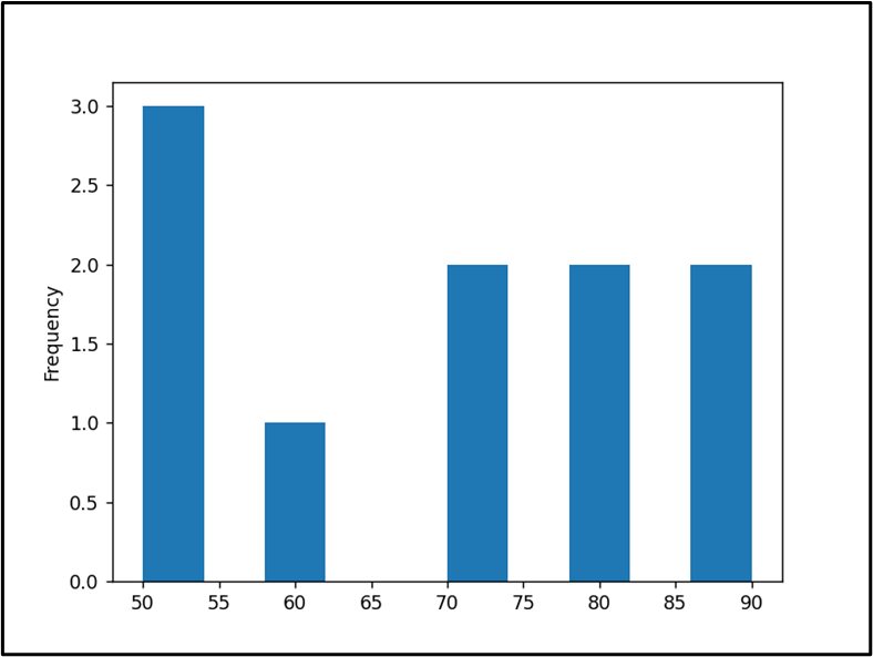
Method 3: Create a Pandas Series Histogram Using “pd.Series.plot(kind=’hist’)”
We can also use the “pd.Series.plot()” method with the “kind=hist” parameter to create a Pandas Series histogram in Python.
Syntax
Here is an example code that creates a Pandas series histogram:
data = pandas.Series([80, 50, 70, 50, 80, 70, 50, 60, 90, 90])
data.plot(kind='hist')
plt.show()
The above code displayed histogram:
Conclusion
In Python, the “Series.plot.hist()”, “Series.hist()” and “Series.plot(kind=’hist’)” methods are used to create a Pandas Series histogram. First, we need to create the Series object and then use these methods to create the series histogram. This Python tutorial provided an in-depth explanation of how to create Pandas Series objects utilizing a variety of examples.
Source: linuxhint.com