Matplotlib Pie Chart
Python has multiple packages for data visualization, and “matplotlib” is one of them that is most preferred. It can also be utilized for displaying both simple and complicated graphs with a minimal piece of code. These graphs can be modified with the help of numerous methods.
The pie chart is a quantitative layout that could only display one dataset at a time. The whole proportion of the provided data is represented by the area of the graph. For that purpose, the “pie()” function can be utilized from Python’s “matplotlib” library.
The outcomes from this post are:
- How to Generate a Pie Chart in Python?
- How to Set Pie Chart Start Angle and Auto Percentage in Python?
- How to Explode Slices of Pie Chart in Python?
How to Generate a Pie Chart in Python?
To generate a pie chart in Python, first, import the “matplotlib.pyplot” library:
Then, create data for axes and save it into the variables. For instance, we have created labels and values. After that, passed them to the “days” and “duty_hours” variables:
duty_hours = [12, 22, 16, 38, 12, 17]
Now, use the “plt.subplot()” function for creating a figure and grid it with a single call, while specifying reasonable control over how the individual plots are generated. Then, invoke the “pie()” method along with the required parameters, such as “duty_hours” as a value and “labels =days”:
ay.pie(duty_hours, labels = days)
Now, apply the “set_title()” method to set the title of the chart. Then, call the “plt.show()” method for displaying the resultant pie chart:
plt.show()
In the below-provided output, it can be seen that the pie chart has been created successfully with labels:

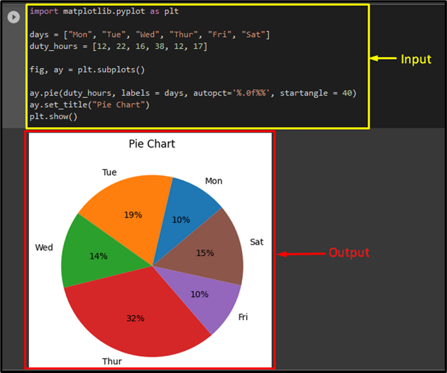
How to Set Pie Chart Start Angle and Auto Percentage in Python?
To set the start angle of the pie chart according to the desire, use the “startangle” parameter inside the “pie()” method. Then, add the “autopct” argument with value, such as “%.0f%%”. As follows:
It can be seen that the start angle of the first slice is “40” degrees and the percentages for each slice have been displayed successfully:
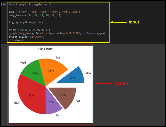
How to Explode Slices of Pie Chart in Python?
If you want to explode one or multiple slices of the pie chart, pass an array of the length of the provided data, and use the “explode” parameter. Here, we have created an array with one value representing a value for every wedge of the pie chart having the same length as the given data and passed it to the “my_ex” variable. Then, add the “explode” argument and pass the “my_ex” variable as its value:
ay.pie(duty_hours, labels = days, autopct='%.0f%%', explode = my_ex)
As a result, the specified wedge of the pie chart has exploded:
That’s it! We have explained the matplotlib pie chart in Python.
Conclusion
Python has multiple packages for data visualization, and “matplotlib” is one of them that is most preferred. By using this library, we can create a pie chart which is a quantitative layout that only displays a single dataset at a time. The “pie()” function can be utilized from Python’s “matplotlib” library. This post demonstrated the pie chart using Python’s matplotlib library.
Source: linuxhint.com