Matplotlib Colorbar
“Matplotlib” provides a wide range of tools and functions to create appealing graphs and charts. An important tool provided by Matplotlib is the “colorbar”. The “colorbar” is a chart that shows the relationship between the colors in a plot and their corresponding values. It is an essential tool for visualizing data with different colors.
This article introduces the Matplotlib “colorbar” and explores its features.
How to Create a Python Colorbar in Matplotlib?
To create a “colorbar” in Matplotlib, the “plt.colorbar()” function of the “Matplotlib” module is used in Python.
Example 1: Adding “Vertical” Colorbar
Let’s overview the following example code to create a “colorbar” using the discussed function:
import numpy
x = numpy.random.rand(50)
y = numpy.random.rand(50)
colors = numpy.random.rand(50)
plt.scatter(x, y, c=colors)
plt.colorbar()
plt.show()
In the above code, the “plt.scatter()” function is used to generate a scatter plot with random data points colored with random colors. After that, the “plt.colorbar()” function is applied to add a “colorbar” to the right of the scatter plot.
Output
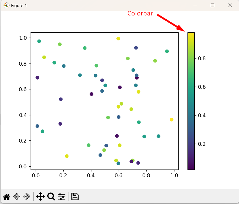
As seen, the “colorbar” has been added to the right of the scatter plot in the above output.
Example 2: Adding “Horizontal” Colorbar
In the below code, the horizontal colorbar is added to the created plot:
import matplotlib.pyplot as plt
new_x = np.random.rand(100)
new_y = np.random.rand(100)
new_colors = np.random.rand(100)
fig, ax = plt.subplots()
new_scatter = ax.scatter(new_x, new_y, c=new_colors)
new_cbar = fig.colorbar(new_scatter, orientation='horizontal')
plt.show()
In the above code snippet, the “plt.colorbar()” function takes the plotted variable and “orientation=’horizontal’ attribute as an argument, respectively to create the horizontal colorbar instead.
Output

The above output verifies that the horizontal colorbar has been added to the created plot.
How to Customize Matplotlib Colorbar in Python?
Matplotlib “colorbar” can be customized in various ways according to requirements. A few of the most common customization options are explored in the following sections.
Example 1: Setting Colorbar Title
In the below code, the “colorbar” title can be set:
import numpy
x = numpy.random.rand(50)
y = numpy.random.rand(50)
colors = numpy.random.rand(50)
plt.scatter(x, y, c=colors)
cb = plt.colorbar()
cb.set_label('Color Intensity')
plt.show()
According to the above lines of code, the “set_label()” function is used to set the colorbar title to “Color Intensity“.
Output

In the above outcome, the “colorbar” title has been set accordingly.
Example 2: Adjusting Colorbar Limits
The upper and lower limits of the colorbar can be adjusted using the “vmin” and “vmax” attributes in the scatter function via the below-stated code:
import numpy
new_x = numpy.random.rand(50)
new_y = numpy.random.rand(50)
new_colors = numpy.random.rand(50)
plt.scatter(new_x, new_y, c=new_colors, vmin=0, vmax=1)
plt.colorbar()
plt.show()
In the above code block, the “plt.scatter()” function takes the minimum “vmin” and maximum “vmax” value of the “colorbar” limits. After that, the “plt.colorbar()” function is used to add the “colorbar” based on the specified “colorbar” limits.
Output
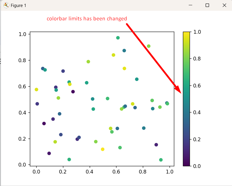
Based on the above output, the colorbar limits have been successfully changed.
Example 3: Adding Colorbar to Subplots
The “fig.colorbar()” function is used to add a single “colorbar” to all the subplots. Following is an example code snippet:
import numpy as np
fig, subplots = plt.subplots(2, 2)
x_data = np.random.rand(50)
y_data = np.random.rand(50)
colors = np.random.rand(50)
subplots[0, 0].scatter(x_data, y_data, c=colors)
subplots[0, 1].scatter(x_data, y_data, c=colors)
subplots[1, 0].scatter(x_data, y_data, c=colors)
subplots[1, 1].scatter(x_data, y_data, c=colors)
fig.colorbar(subplots[0, 0].scatter(x_data, y_data, c=colors), ax=subplots, location='right')
plt.show()
In this code, the figure with “four” subplots is generated using the same random data points using the “matplotlib” and “numpy” libraries. The “plt.colorbar()” function is used to add a color bar to the first subplot to indicate the color mapping of the data points.
Output
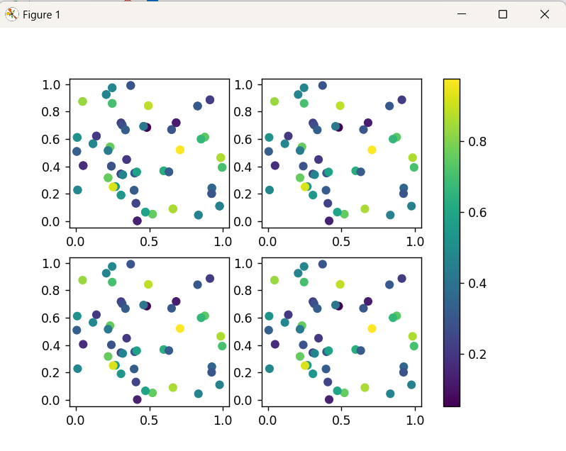
The single “colorbar” for the first subplot has been shown in the above snippet.
Note: In the above case the colorbar was plotted for all the subplots based on the range provided in the first subplot.
Conclusion
In Python, the “plt.colorbar()” function of the “matplotlib” module is used to add the vertical or horizontal colorbar in the plot to visualize data with different colors. However, the “plt.colorbar()” function can be used with several parameters/attributes to customize the colorbar of the specified plot. This Python blog illustrated a comprehensive guide on how to add a “colorbar” using matplotlib in Python.
Source: linuxhint.com