Matplotlib 2d histogram
This post will illustrate the use of the “matplotlib.pyplot.hist2d()” function to create a “2D Histogram” in Python.
How to Plot a “Matplotlib 2-Dimension Histogram” in Python?
The “hist2d()” function of the “pyplot” module in the “matplotlib” library is used to plot a 2D histogram in Python.
Syntax
Now, let’s plot a “2D histogram” using the below example code:
import numpy
x = numpy.random.randn(1000)
y = numpy.random.randn(1000)
plt.hist2d(x, y, bins=30, cmap='Blues')
plt.colorbar()
plt.show()
In the above code:
- The first step is to import the “matplotlib” and “numpy” libraries.
- The “numpy.random.randn()” function is applied twice to generate random numbers within the specified range, i.e., “0-1000”.
- The “plt.hist2d()” function is used to create a 2D histogram plot of “x” and “y” with 30 bins and a color map of “Blues”.
- Lastly, the “plt.colorbar()” function adds the color bar, and the “plt.show()” function displays the graph.
Output
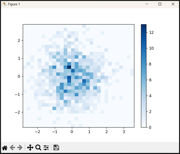
As seen, the “hist2d()” function creates a two-dimensional histogram with rectangular bins.
How to Customize a 2D Histogram in Matplotlib?
We can customize the plot by adding a title, labels to the axes, and changing the color map. An example code can be found here:
import numpy
x = numpy.random.randn(1000)
y = numpy.random.randn(1000)
plt.hist2d(x, y, bins=30, cmap='jet')
plt.colorbar()
plt.title('2D Histogram')
plt.xlabel('X')
plt.ylabel('Y')
plt.show()
In the above lines of code:
- The “hist2d()” function is used to create a 2D histogram of the two random number arrays “x” and “y” within the defined range, i.e., “0-1000”.
- The “plt,title()”, “plt.xlabel()” and “plt.ylabel()” functions are used to add title and label the “x” and “y” axes, respectively.
Output
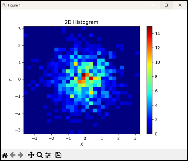
The above output implies that the “2D Histogram” is customized appropriately by setting the title and labeling the “x” and “y” axes.
Conclusion
In Python, the “plt.hist2d()” function of the “pyplot” module in the “matplotlib” library is used to plot a 2D histogram in Python. To customize the histogram, the “plt.title()”, “plt.xlabel()” and “plt.ylabel()” functions can be used by setting the title and labeling of the “x” and “y” axis, respectively. This post presented an in-depth guide on how to create a 2D histogram using the discussed function in the matplotlib library in Python.
Source: linuxhint.com