LibreOffice’s New App Icons Make a Bold Impression
The upcoming LibreOffice 7.5 release features a sled-load of improvements — as you’d expect.
But the most instantly noticeable change hits you in the face, before you even open the app.
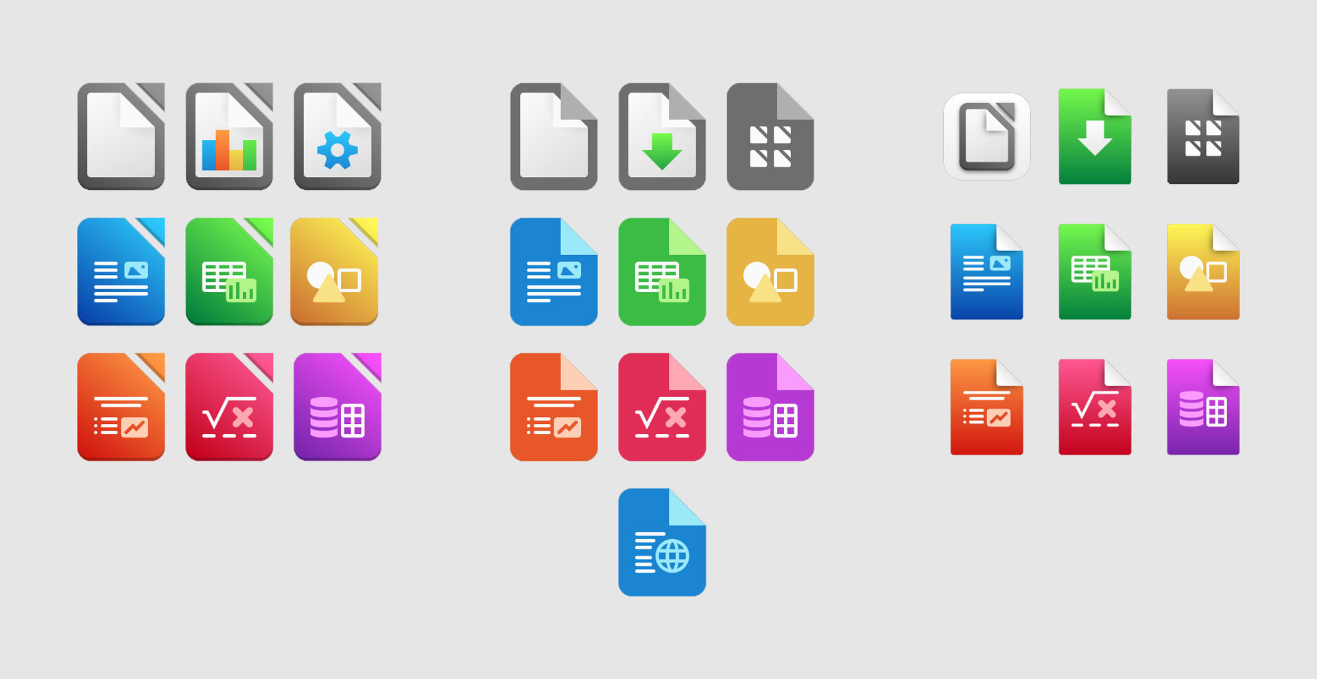
Yes, LibreOffice has a new set of application icons — and they’re a bold departure from the somewhat “office-y” look most of us are used to.
I’ll state the obvious: icons don’t affect the usability of an app. They do, however, play a psychological role in setting expectations. An app with a low-quality, out-dated icon is more likely to make someone expect a low-quality, out-dated software experience.
I’m happy to say neither of those apply to LibreOffice 7.5’s new icons:

These bright, vivid glyphs are both more in your face, yet less fussy than the incumbent set, with the signature color of each app within the suite is now front-and center, rather than applied as a more subtle accent.
The revamp also extends to new document and mime type icons, each colour tying the respective file or format back to its respective element in the productivity suite.
While this isn’t the only icon-related change in the new release (LibreOffice devs have also updated the Safir icon set used throughout the application’s actual interface) it’s certainly going to be the one that gets people talking.

As a cross-platform piece of software with a loyal (if every-growing) fan base, LibreOffice hasn’t taken the step of changing its application icons idly. Various designs were proposed, iterated on, and explored, resulting in the striking new set.
I think most people who use LibreOffice are gonna love the new icons. They’re a better fit/representation for the productivity suite, and show it’s every-bit a match for the closed-source office suites.
Let me know what you think of the new icons down in the comments!
The post LibreOffice’s New App Icons Make a Bold Impression is from OMG! Linux and reproduction without permission is, like, a nope.
Source: OMG! Linux
