HTML5 input required Attribute
This manual will explain the input “required” attribute and its usage.
What is the HTML input “required” Attribute?
The “required” attribute is a boolean attribute that indicates a condition, which is that the input field needs to be filled out before operating the form submission. The input fields that are specified for important data must be set with the required attribute. This attribute works on various inputs: URL, password, date pickers, number, checkbox, tel, text, radio, email, search, and file.
How to Use “required” Attribute in HTML5?
To utilize the “required” attribute in the HTML5, follow the below-given instructions:
- Add a div element with the class “main”.
- Inside this div, add another div element having the class name “form-content”.
- Within the form-content div, two <label> tags are added for first and last names.
- Then, the “<input>” element with the attributes “type” is set to text, “name” f-name, and l-name for the first name and the last name, respectively. The placeholder attribute will be shown in the text field. We have used the attribute “required” in the first input tag only to see its functionality.
HTML
<div class="form-content">
<label>
<p> Enter your first name<p>
<input type="text" name="f_name" placeholder="First Name..." required>
</label>
<label>
<p> Enter your last name <p>
<input type="text" name="l_name" placeholder="Last Name...">
</label><br><br>
<button>Submit</button>
</div>
</div>
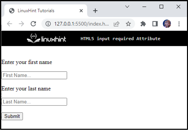
The above code generates the result as shown in the below image:
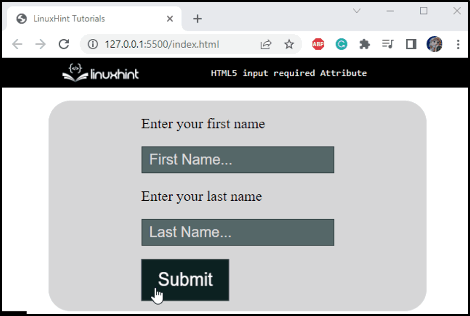
Let’s go to the CSS section, where we will style the HTML file and then see how the required attribute works.
Style “main” div
background-color: rgba(0, 0, 0, 0.159);
max-width: 500px;
margin: auto;
height: 270px;
border-radius: 30px;
padding: 10px;
}
According to the given code snippet, the following CSS properties are applied to the “main” container:
- “background-color” property specifies the element’s background color.
- “max-width” property defines an HTML element’s maximum width.
- “margin” property specifies space across the selected HTML element.
- “height” property defines an HTML element’s height.
- “border-radius” property adjusts the edges of the element round.
- “padding” property defines the required space around the content.
Style “form-content” div
display: flex;
justify-content: center;
align-items: center;
height: 100%;
font-size: 20px;
}
To style the “form-content” div, apply the enlisted CSS properties:
- “display” property sets the element’s layout.
- “justify-content” property adjusts the element horizontally.
- “align-items” property sets the items of flexible items.
- “height” property is utilized to set an element’s height.
- “font-size” property indicates the size of the text font.
Style “input” Element of “form-content” div
border: 1px solid rgb(47, 63, 63);
padding: 6px 10px;
font-size: 20px;
background-color: rgb(85, 104, 104);
color: #ffffff;
outline: none;
}
According to the provided CSS styling:
- “color” property defines the color of the font.
- “outline” with the value “none” removes the element’s outline when selected.
Style “placeholder” of “input” Element
color: #dadada;
}
The placeholder font color of the input field is set as “#dadada”.
Style “button” Element of “form-content” div
border: 1px solid rgb(47, 63, 63);
padding: 10px 20px;
font-size: 22px;
background-color: rgb(12, 33, 33);
color: #a3a3a3;
cursor: pointer;
margin-left: 5px;
transition: all 0.3s ease;
}
According to the given properties:
- “cursor” property is set with the value pointer. When the mouse hovers, a hand with a pointed finger will be displayed.
- “margin-left” property adds space to the left of the content.
- “transition” property is set with the value “all 0.3s ease”, where all represents all properties, 0.3s is the transition duration, and ease represents the motion of the transition.
Style “button” Element on “hover
transform: scale(1.1, 1.2);
color: white;
}
The button element is applied to the “transform” scale(1.1, 1.2) transform element on a 3D plane.
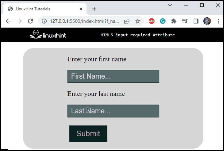
The required attribute is attached to the first input element. When the field is empty, it will display a message as shown below in the image:
It can be seen from the below image that we cannot leave the first input element empty:
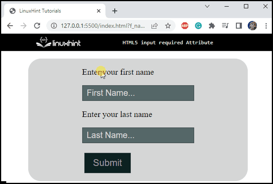
The second input element is not associated with the required attribute. So, whether it is submitted as empty doesn’t affect the operation of the form submission. When the first input element is filled, the URL indicates the form is successfully submitted:
That’s how the input required attribute works in HTML5.
Conclusion
The CSS input element is associated with many attributes, such as type, placeholder, required, or more. The required attribute is a boolean that indicates that the input field needs to be filled out before operating the form submission. This manual has demonstrated the usage of the HTML “required” attribute with a practical example.
Source: linuxhint.com