How to Use the Place Content Utility in Tailwind CSS?
In the process of creating a website design, alignment and spacing are the most crucial concepts. These two properties help the developers to make their website responsive. However, it is quite difficult to handle both of them separately which also increases the size of the code. To encounter these terms side by side the tailwind CSS offers the “place content” class.
How to Use the Place Content Utility in Tailwind CSS?
The “place content” utility offers many child classes which are used to set the alignment and spacing of the residing HTML element. This class combines the behavior of “align-content” and “justify-content” properties that generate or declare a separate class for each possible scenario. The classes provided by the “place content” parent class are stated below:
- place-content-center class
- place-content-start class
- place-content-end class
- place-content-between class
- place-content-around class
- place-content-evenly class
- place-content-stretch class
Now, let’s implement each class to get a better understanding.
Example 1: Use of “place-content-center” Class
The “place-content-center” class automatically aligns all flexbox grid layout elements towards the center of the parent HTML element or in a simple container, as shown below:
<p><b>Tailwind CSS Place Content Class</b></p>//creating grid layout and utilizing the place content utility class
<div class="grid grid-cols-3 gap-2 place-content-center bg-teal-200 border-solid border-4 border-green-900">
//Styling first box using Tailwind CSS classes
<div class="bg-teal-900 w-3/4 h-12">One</div>
//Styling second box using Tailwind CSS classes
<div class="bg-teal-800 w-3/4 h-12">Two</div>
//Styling third box using Tailwind CSS classes
<div class="bg-teal-700 w-3/4 h-12 ">Three</div>
//Styling fourth box using Tailwind CSS classes
<div class="bg-teal-600 w-3/4 h-12">Four</div>
//Styling fifth box using Tailwind CSS classes
<div class="bg-teal-500 w-3/4 h-12">Five</div>
//Styling sixth box using Tailwind CSS classes
<div class="bg-teal-400 w-3/4 h-12">Six</div>
</div>
</body>
Explanation of the above code snippet:
- First, the parent “div” element is created inside the “<body>” tag and the required Tailwind CSS classes are assigned to this “div” element to enhance the visualization factor.
- Along with these classes, the “place-content-center” class is also assigned to this parent div. It will now align all the residing elements towards the center.
- After that, create six child “div” elements and assign them height, width, and background color to enhance visibility.
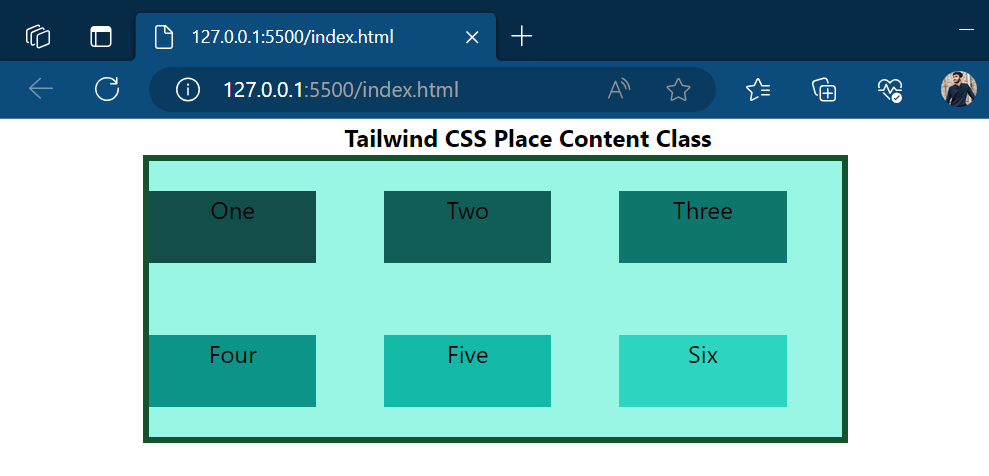
After the execution, the alignment of the child elements looks like this:
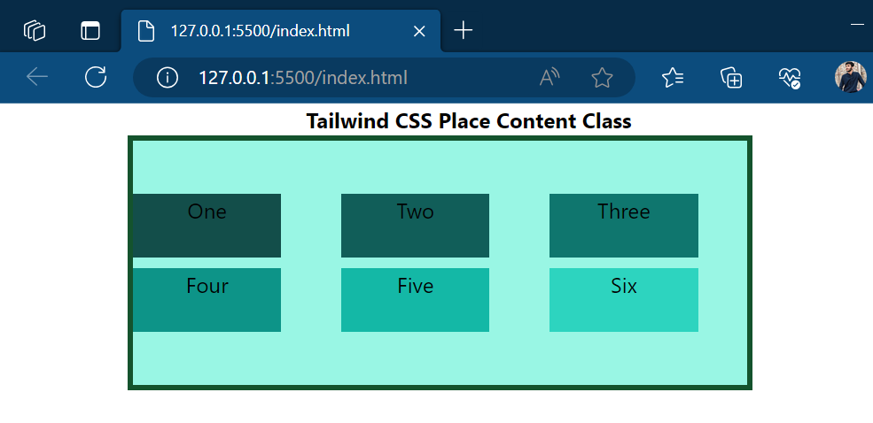
The output shows all elements are aligned toward the center of the parent div element.
Example 2: Use of “place-content-start” Class
The “place-content-start” class aligns the residing elements of the flexbox or grid layout towards the top left corner or at the start position of the parent HTML element, as shown below:
<p><b>Tailwind CSS Place Content Class</b></p>//creating grid layout and utilizing the place content utility class
<div class="grid grid-cols-3 gap-2 place-content-start bg-teal-200 border-solid border-4 border-green-900">
//Styling first box using Tailwind CSS classes
<div class="bg-teal-900 w-3/4 h-12">One</div>
//Styling second box using Tailwind CSS classes
<div class="bg-teal-800 w-3/4 h-12">Two</div>
//Styling third box using Tailwind CSS classes
<div class="bg-teal-700 w-3/4 h-12 ">Three</div>
//Styling fourth box using Tailwind CSS classes
<div class="bg-teal-600 w-3/4 h-12">Four</div>
//Styling fifth box using Tailwind CSS classes
<div class="bg-teal-500 w-3/4 h-12">Five</div>
//Styling sixth box using Tailwind CSS classes
<div class="bg-teal-400 w-3/4 h-12">Six</div>
</div>
</body>
In the above code, the same HTML elements and Tailwind CSS classes are utilized for the creation of a basic structure. In addition, the class “place-content-start” is assigned to the parent “div” element by replacing the “place-content-center” class.
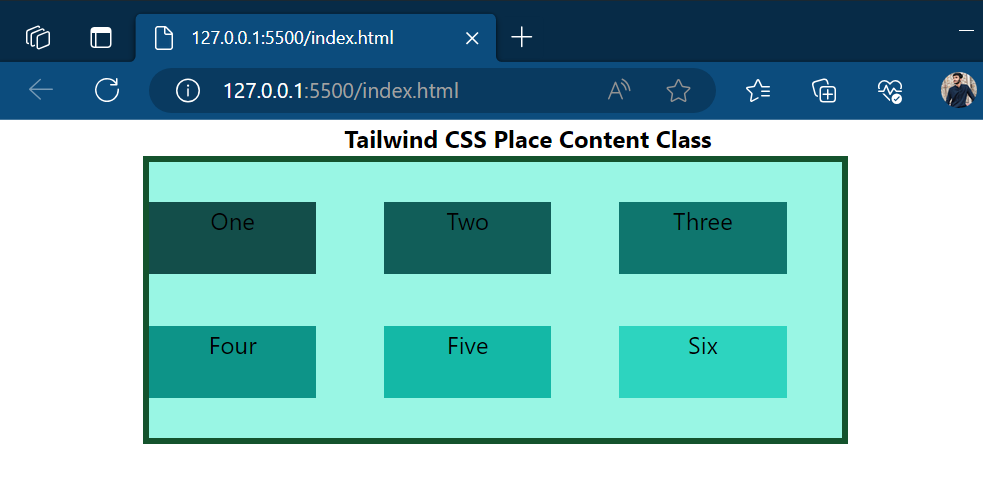
Now, let’s have a preview of the webpage after executing the above code:
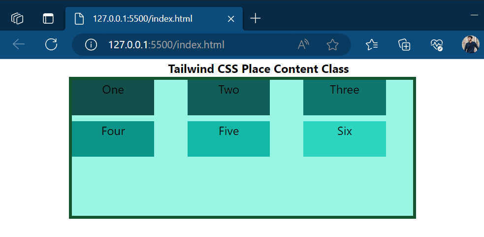
The output shows that all elements are moved toward the top left corner of the parent div element.
Example 3: Use of “place-content-end” Class
The “place-content-end” class aligns the elements towards the bottom left corner or at the end of the parent div element, the code is shown below:
<p><b>Tailwind CSS Place Content Class</b></p>//creating grid layout and utilizing the place content utility class
<div class="grid grid-cols-3 gap-2 place-content-end bg-teal-200 border-solid border-4 border-green-900">
//Styling first box using Tailwind CSS classes
<div class="bg-teal-900 w-3/4 h-12">One</div>
//Styling second box using Tailwind CSS classes
<div class="bg-teal-800 w-3/4 h-12">Two</div>
//Styling third box using Tailwind CSS classes
<div class="bg-teal-700 w-3/4 h-12 ">Three</div>
//Styling fourth box using Tailwind CSS classes
<div class="bg-teal-600 w-3/4 h-12">Four</div>
//Styling fifth box using Tailwind CSS classes
<div class="bg-teal-500 w-3/4 h-12">Five</div>
//Styling sixth box using Tailwind CSS classes
<div class="bg-teal-400 w-3/4 h-12">Six</div>
</div>
</body>
Just like the above examples, utilize the same HTML elements and apply the same tailwind classes for both parent and child elements. Only add a new class of “place-content-end” by replacing the “place-content-start” class for the parent div element.
The preview of the webpage looks like this:
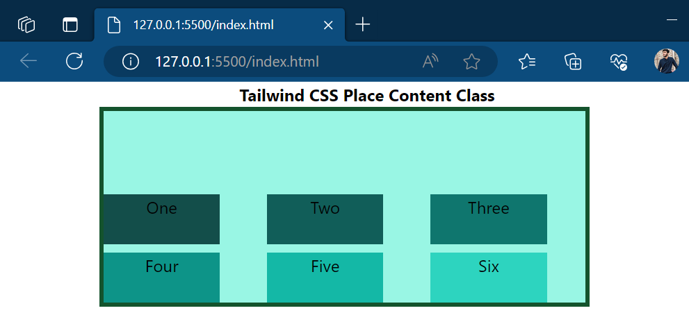
The output shows that all elements are now aligned towards the bottom left corner of the containing element.
Example 4: Use of “place-content-between” Class
The “place-content-between” class allows developers to insert space between each UI element covering all possible space of the containing element as illustrated in code stated below:
<p><b>Tailwind CSS Place Content Class</b></p>//creating grid layout and utilizing the place content utility class
<div class="grid grid-cols-3 gap-2 place-content-between bg-teal-200 border-solid border-4 border-green-900">
//Styling first box using Tailwind CSS classes
<div class="bg-teal-900 w-3/4 h-12">One</div>
//Styling second box using Tailwind CSS classes
<div class="bg-teal-800 w-3/4 h-12">Two</div>
//Styling third box using Tailwind CSS classes
<div class="bg-teal-700 w-3/4 h-12 ">Three</div>
//Styling fourth box using Tailwind CSS classes
<div class="bg-teal-600 w-3/4 h-12">Four</div>
//Styling fifth box using Tailwind CSS classes
<div class="bg-teal-500 w-3/4 h-12">Five</div>
//Styling sixth box using Tailwind CSS classes
<div class="bg-teal-400 w-3/4 h-12">Six</div>
</div>
</body>
In the above code, the “place-content-between” class gets assigned to the parent “div” element to add equal space between the elements, the remaining code remains the same as in the above example.
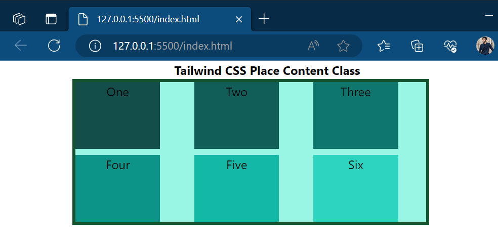
After the compilation of the above code, the view of the webpage looks like this:
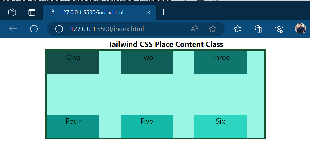
The snapshot of output shows that equal space has now been inserted between the components residing inside the parent element.
Example 5: Use of “place-content-around” Class
The “place-content-around” class adds available space equally around each UI or HTML element residing inside the parent div element, the implementation code is stated below:
<p><b>Tailwind CSS Place Content Class</b></p>//creating grid layout and utilizing the place content utility class
<div class="grid grid-cols-3 gap-2 place-content-around bg-teal-200 border-solid border-4 border-green-900">
//Styling first box using Tailwind CSS classes
<div class="bg-teal-900 w-3/4 h-12">One</div>
//Styling second box using Tailwind CSS classes
<div class="bg-teal-800 w-3/4 h-12">Two</div>
//Styling third box using Tailwind CSS classes
<div class="bg-teal-700 w-3/4 h-12 ">Three</div>
//Styling fourth box using Tailwind CSS classes
<div class="bg-teal-600 w-3/4 h-12">Four</div>
//Styling fifth box using Tailwind CSS classes
<div class="bg-teal-500 w-3/4 h-12">Five</div>
//Styling sixth box using Tailwind CSS classes
<div class="bg-teal-400 w-3/4 h-12">Six</div>
</div>
</body>
In the above-stated code, the class of “place-content-around” is assigned to the parent “div” elements to re-assign the spacing to child elements.
After re-rendering the webpage looks like this:
The above snapshot shows that space has been inserted around the residing HTML element of the container.
Example 6: Use of “place-content-evenly” Class
<p><b>Tailwind CSS Place Content Class</b></p>//creating grid layout and utilizing the place content utility class
<div class="grid grid-cols-3 gap-2 place-content-evenly bg-teal-200 border-solid border-4 border-green-900">
//Styling first box using Tailwind CSS classes
<div class="bg-teal-900 w-3/4 h-12">One</div>
//Styling second box using Tailwind CSS classes
<div class="bg-teal-800 w-3/4 h-12">Two</div>
//Styling third box using Tailwind CSS classes
<div class="bg-teal-700 w-3/4 h-12 ">Three</div>
//Styling fourth box using Tailwind CSS classes
<div class="bg-teal-600 w-3/4 h-12">Four</div>
//Styling fifth box using Tailwind CSS classes
<div class="bg-teal-500 w-3/4 h-12">Five</div>
//Styling sixth box using Tailwind CSS classes
<div class="bg-teal-400 w-3/4 h-12">Six</div>
As from the name, this class sets the containing element spaces to evenly proportion, making each element around and between spaces equal to each other, the code is stated below:
The class of “place-content-evenly” is added to the parent div elements to assign equal space to all child or containing elements.
After the compilation, the webpage looks like this:
The output confirms that now each element has equal space.
Example 7: Use of “place-content-stretch” Class
The “parent-content-stretch” class stretches the residing elements of the container to cover all available space, the implementation code is stated below:
<p><b>Tailwind CSS Place Content Class</b></p>//creating grid layout and utilizing the place content utility class
<div class="grid grid-cols-3 gap-2 place-content-stretch bg-teal-200 border-solid border-4 border-green-900">
//Styling first box using Tailwind CSS classes
<div class="bg-teal-900 w-3/4 ">One</div>
//Styling second box using Tailwind CSS classes
<div class="bg-teal-800 w-3/4 ">Two</div>
//Styling third box using Tailwind CSS classes
<div class="bg-teal-700 w-3/4 ">Three</div>
//Styling fourth box using Tailwind CSS classes
<div class="bg-teal-600 w-3/4 ">Four</div>
//Styling fifth box using Tailwind CSS classes
<div class="bg-teal-500 w-3/4 ">Five</div>
//Styling sixth box using Tailwind CSS classes
<div class="bg-teal-400 w-3/4 ">Six</div>
</div>
</body>
In the above code, the class of “place-content-stretch” is assigned to the parent div element to cover all available space.
After the execution, the webpage appears like this:
The output shows the elements are stretched now to cover all available space.
Conclusion
The “place content” utility offers various child classes that are utilized for the placement of child elements at various positions according to the requirements. The “place content” utility includes “place-content-center”, “place-content-start”, and “place-content-end”, “place-content-between”, “place-content-around”, “place-content-evenly”, and “place-content-stretch” classes. This blog has explained the procedure to use the “place content” utility in Tailwind CSS.
Source: linuxhint.com