How to Use Text Indent with Breakpoints in Tailwind
Text indentation is the process of adding a space between the text block and the margin. The text indentation can be added in Tailwind by using the “indent-{value}” utility class. This utility class can also be used with the breakpoints and media queries in Tailwind. Breakpoints are the specific screen sizes or widths at which the website layout can change. Media queries are the set of conditions that will change the layout of the website according to the device screen size when these conditions are met or fulfilled.
This blog will elaborate on the method to use the text-indent with breakouts and media queries in Tailwind.
How to Use Text Indent with Breakpoints?
Breakpoints are the point at which a website changes its layout according to the screen. These are the prefixes of breakpoints:
-
- sm: It will create the breakpoint for the screens of “640px”. Typically, for small screens.
- md: It will create the breakpoint or media query for the screen size of “768px”.
- lg: This specifies the large screens and will create a breakpoint for the screen size of “1024px”.
Step 1: Include Tailwind in HTML Structure
First, include Tailwind inside the <head> section, as presented below:
<script src="https://cdn.tailwindcss.com"></script>
</head>
Step 2: Use Text Indent with Breakpoints
To add the text-indent with breakpoints in Tailwind, first, specify the class. Then,
-
- Add the “indent-8” to add the indent of width “8px”, which will be applicable on the small screen.
- Then, use the “md” to address the medium screen sizes and specify the “indent-14” to add the indent of width “14px” when the website is launched on medium screen sizes.
- Lastly, specify the “lg” with the text-indent of “20px” which will apply on the large screens, when the website is launched on large screens:
Linuxhint is a leading e-learning platform.
</p>
Output
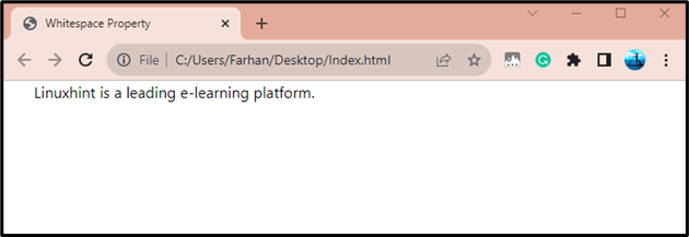
Here is the output when the browser size is “640px” or “sm” or less than. As it can be observed the text-indent is “8px”:
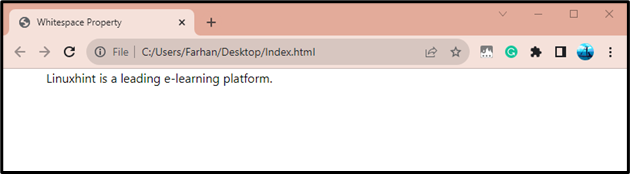
The below output is the browser screen size of “768px” or “md” or less than it and the text-indent is “14px”:
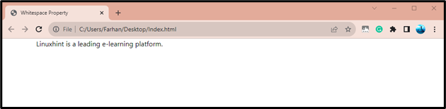
This is the output when the screen size meets the size of “1024px” or “lg”. As it can be observed that the text-indent of “20px” has been added:
Conclusion
To use the text-indent with breakpoints in Tailwind, first, add the “Tailwind” in the <head> section. After that create a class in the element section. Then, specify the “md” breakpoint and specify the text-indent using “indent-{width}”. After that, use the “lg” for a larger screen and specify the text-indent for it. This blog has practically explained the procedure to utilize the text-indent with breakpoints.
Source: linuxhint.com