How to Use Max-width Breakpoints in Tailwind?
In Tailwind CSS, max-width breakpoints are specific points in a responsive web design where the maximum width of the viewport is defined. These breakpoints define different layouts or styles for various screen sizes. It permits users to specify the maximum width at which a particular layout or style should be applied.
This blog will illustrate the method to use max-width breakpoints in Tailwind.
How to Use Max-width Breakpoints in Tailwind?
To use max-width breakpoints in Tailwind, look at the given-provided steps:
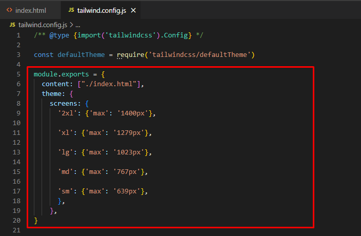
Step 1: Configure Max-width Breakpoints in “tailwind.config.js” File
First, define the maximum width for the desired breakpoints. Here, we have specified the max-width for the “2xl”, “xl”, “lg”, “md”, and “sm” breakpoints:
content: ["./index.html"],
theme: {
screens: {
'2xl': {'max': '1400px'},
'xl': {'max': '1279px'},
'lg': {'max': '1023px'},
'md': {'max': '767px'},
'sm': {'max': '639px'},
},
},
}
When the maximum width of the screen(viewport) is “1400px”, the styling for the “2xl” breakpoint will be applied. Similarly, for the other screens, the maximum width is defined which can be seen below:
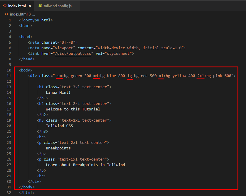
Step 2: Utilize Defined Max-width Breakpoints in HTML Program
Next, use the specified max-width breakpoints in the HTML program:
<div class="sm:bg-green-500 md:bg-blue-800 lg:bg-red-500 xl:bg-yellow-400 2xl:bg-pink-600">
<h1 class="text-3xl text-center">
Linux Hint!
</h1>
<h2 class="text-2xl text-center">
Welcome to this Tutorial
</h2>
<h3 class="text-2xl text-center">
Tailwind CSS
</h3>
<br>
<p class="text-2xl text-center">
Breakpoints
</p>
<p class="text-1xl text-center">
Learn about Breakpoints in Tailwind
</p>
<br>
</div>
</body>
Here:
-
- First, the “sm:bg-green-500” class applies the background color to green for screens that match the “sm” breakpoint.
- Then, the “md:bg-blue-800” class set the blue color for the background for the “md” breakpoint screens.
- Next, the “lg:bg-red-500” class changes the background color to red when it matches the “lg” breakpoint.
- After that, the “xl:bg-yellow-400” class sets the background color to yellow when it matches the “xl” breakpoint.
- Finally, the “2xl:bg-pink-600” class applies the pink color for the background for the “2xl” breakpoint screen:
Step 3: Verify Output
Finally, run the HTML program with the live server extension to view the output:
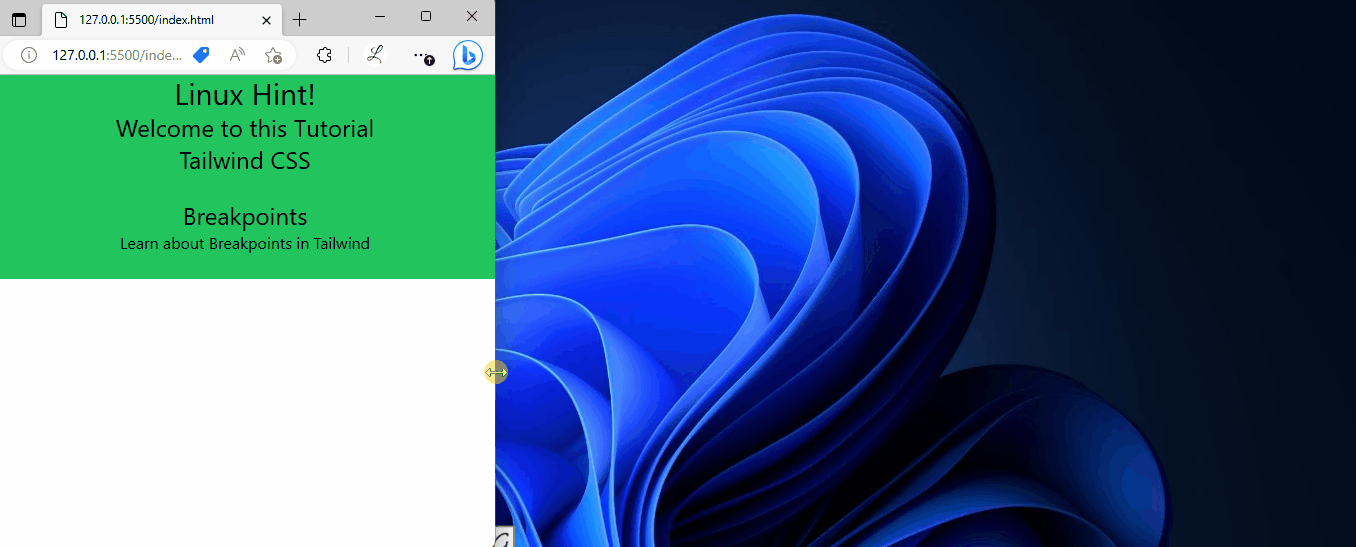
In the above output, it can be observed that the background color of the web page changes according to which the max-width breakpoints are defined.
Conclusion
To use max-width breakpoints in Tailwind, first, go to the “theme” section in the “tailwind.config.js” file, add the “screens” property, and specify the max-width for the desired breakpoints. Then, utilize the defined max-width breakpoints in the HTML program. Finally, verify the output by running the HTML program. This blog has illustrated the method to use max-width breakpoints in Tailwind.
Source: linuxhint.com