How to Use Matplotlib Trend Line
In this article, we will explore the steps to add and customize a “Trend Line” to a graph using Matplotlib in Python by covering the following aspects:
How to Add a Trend Line to the Python Graph?
To add a trend line to the graph using “matplotlib”, the following steps are used in Python:
Step 1: Import the Required Libraries
Firstly, we need to import the required libraries, i.e., “matplotlib” and “numpy”. Here is a code:
import numpy
Step 2: Generate the Data
Next, we need to create/generate sample data that we can utilize to create/make a graph. We can create a “numpy” array containing the “X” and “Y” coordinates of the data points. Here is an example code:
y = np.array([2, 4, 5, 4, 5])
Step 3: Plot the Data Points
Now, we can plot the data points utilizing the “Matplotlib” library function named “scatter()”. We can also customize the appearance of the graph, such as the “color” and “size” of the data points via the following code:
Step 4: Add a Trend Line
To add a “Trend Line” to the graph, calculate the “slope” and “intercept” of the line using the numpy “polyfit()” function. We can then use these values to create a line using the Matplotlib “plot()” function. The below code can be utilized to accomplish this:
plt.plot(x, slope*x + intercept, color='blue')
plt.show()
Example: Entire Code
The final step is to combine/joined all the previous steps and execute/run the full code:
import numpy
x = numpy.array([1, 2, 3, 4, 5])
y = numpy.array([2, 4, 5, 4, 5])
mat.scatter(x, y, color='red', s=50)
slope, intercept = numpy.polyfit(x, y, 1)
mat.plot(x, slope*x + intercept, color='blue')
mat.show()
In the above code:
- The “plt.scatter()” function is used to plot a scatter plot of “x” and “y” with red dots and the size of each dot as “50”.
- The “polyfit()” function fits a line through the scatter plot data points and returns the slope, and intercept of that line which are assigned to variables slope and intercept, respectively.
- The “plt.plot()” function plots a straight line using the slope and intercept values obtained from the “polyfit()” function with blue color.
Output
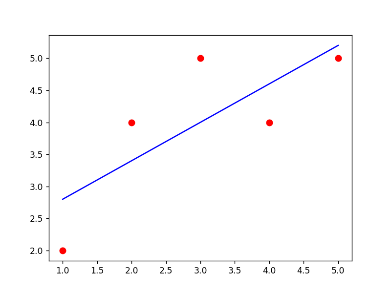
The above snippet verifies that the trend line has been added to the input graph.
How to Customize the Trend Line in Python?
To customize the appearance of the trend line, such as the “line width” and “style”, multiple arguments of “matplotlib” functions are used in Python. We can do this by passing additional arguments to the “plot()” function. Let’s customize the trend line using the following examples:
Example 1: Adding “Line Width” and “Style”
The below code is used to add “linewidth” and “style” to the specified “Trend Line”:
import numpy
x = numpy.array([1, 2, 3, 4, 5])
y = numpy.array([2, 4, 5, 4, 5])
mat.scatter(x, y, color='red', s=50)
slope, intercept = numpy.polyfit(x, y, 1)
mat.plot(x, slope*x + intercept, color='blue', linewidth=2, linestyle='dashed')
mat.show()
In the above code block, the “plt.plot()” function takes the “linewidth=2”, and “linestyle= ‘dashed’” attributes as its parameters, and customizes the created trend line.
Output
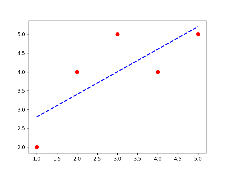
The customized trend line has been created in the above output appropriately.
Example 2: Adding “Labels” and “Title”
The specified labels to the “X” and “Y” axis, and a “title” can also be added to the graph using the matplotlib “xlabel”, “ylabel”, and “title()” functions. The below example code can be utilized to accomplish this:
import numpy
x = numpy.array([1, 2, 3, 4, 5])
y = numpy.array([2, 4, 5, 4, 5])
mat.scatter(x, y, color='red', s=50)
slope, intercept = numpy.polyfit(x, y, 1)
mat.plot(x, slope*x + intercept, color='blue')
mat.xlabel('X')
mat.ylabel('Y')
mat.title('Trend Line Graph')
mat.show()
In the above code, the “plt.xlabel()”, “plt.ylabel()” and “plt.title()” functions are used to label the x-axes and y-axes, and add a title, respectively.
Output
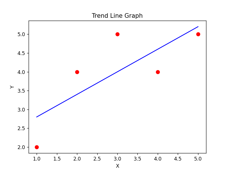
The above output shows that the trendline plot graph has been customized with the “x” and “y” labeling, and a title.
Example 3: Use Matplotlib to Create a Polynomial Trendline
In Python, a “Polynomial Trendline” is a line of best fit that represents a polynomial equation of degree “n” (where n is any positive integer) that minimizes the distance between the data points and the line.
The “polyfit()” function is used to calculate the coefficients of the polynomial equation and the “poly1d()” function is used to create a polynomial object that can be used to plot the trendline on a graph. The following code is utilized to create/make a polynomial trendline:
import numpy
x = numpy.array([1, 2, 3, 4, 5])
y = numpy.array([2, 4, 5, 4, 5])
mat.scatter(x, y, color='red', s=50)
z = numpy.polyfit(x, y, 2)
p = numpy.poly1d(z)
mat.plot(x, p(x))
mat.show()
In the above lines of code:
- The “plt.scatter()” function is used to plot a scatter plot of given “x” and “y” values with red color and a size of “50”.
- The “numpy.polyfit()” function fits a second-degree polynomial curve to the data.
- The “numpy.poly1d()” function creates a polynomial function and assigns it to a variable “p”.
- Lastly, the “plt.plot()” function plots the polynomial curve on top of the scatter plot.
Output

This snippet implies that the polynomial trendline has been added to the graph successfully.
Conclusion
In Python, the “Matplotlib” library functions “plt.polyfit()” and “plt.plot()” are used together to add a linear “Trend Line” to a graph and these functions can be applied with the “poly1d()” function to create a polynomial “Tread Line”. To customize the trend line, various arguments such as “linewidth”, “linestyle”, and “color”, etc. are passed to the “plt.plot()” function. This Python tutorial provides an in-depth guide on adding a trend line to a graph using appropriate examples.
Source: linuxhint.com