How to Use CSS flex-grow Property?
This article demonstrates the step-by-step procedure to use the “flex-grow” property.
How to Use CSS “flex-grow” Property?
The CSS flex-grow property is used to specify how much an element should grow with its siblings within a flex container. Follow the below-mentioned steps to utilize the CSS flex-grow property:
Step 1: Create a Flexbox
In the HTML file, first, create one parent div and add multiple “<div>” tag elements in it. After that, assign different classes to each “<div>” tag that are utilized for styling purposes:
Now, in the CSS file add the following CSS properties:
display: flex;
justify-content: space-around;
flex-flow: row wrap;
align-items: stretch;
padding: 20px;
color: whitesmoke;
background-color: midnightblue;
}
The explanation of above used CSS properties is written below:
- First, the “flex” and “space-around” values are set for the “display” and “justify-content” properties. It creates a parent div as flex and assigns an equal partition for each flex item.
- After that, set “row wrap” and “stretch” as a value to the “flex-flow” and “align-items” properties. It sets the direction of the flex element towards “row” and makes items covered in the available space.
- In the end, the “padding”, “background-color” and “color” properties are utilized for better visualization purposes.
After executing the above code, the webpage looks like this:
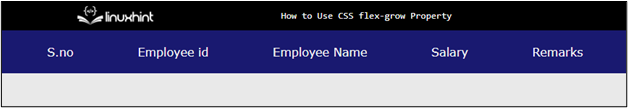
The output shows that flex has been created and the “flex-items” are aligned in the row direction.
Step 2: Use of “flex-grow” Property
Now select different classes that were assigned to each child div in the above steps. And assign the following CSS properties:
flex-grow: 1;
background-color:orangered;
padding: 5px;
}
.grow2 {
flex-grow: 2;
background-color:blue;
padding: 5px;
}
.grow3 {
flex-grow: 2;
background-color:springgreen;
padding: 5px;
}
.original {
background-color:royalblue;
padding: 5px;
}
The explanation of the above code is described below:
- First, select the class named “grow1” and set value of 1 to the “flex-grow” property. After that, “orangered” and “5px” values are provided to the “background-color” and “padding” properties, respectively.
- In the same manner, the background color and padding properties are set to other div classes. These properties are utilized for the “grow2” and “grow3” classes and assign the flex-grow property with different values.
- The “flex-grow“ property expands that div to a certain value inside the flexbox. The greater the value, the greater the size of that div in the flexbox.
After the execution of the above code, the webpage looks like this:
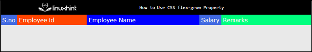
The output displays that the “flex-glow” property expands the div based on certain values inside the flexbox.
Conclusion
The CSS “flex-grow” property is used to assign extra spaces to the elements of Flexbox. The developer selects the div from the flexbox and then uses the “flex-grow” property and assigns the specific value. The greater the value, the greater the space allotted to that div element inside the flexbox. This article has successfully demonstrated how to use the CSS flex-grow property.
Source: linuxhint.com