How to Use Breakpoints and Media Queries with Truncate, Text-Ellipsis and Text-Clip
Tailwind CSS is a framework that is used to develop web layouts rapidly. Tailwind CSS framework is not like others such as Bootstrap. As it does not include the pre-defined classes for the elements. Media queries and breakpoints are also supported by Tailwind CSS. Furthermore, both of these can be used with “text-overflow” utility class properties such as “truncate”, “text-ellipsis”, and “text-clip”.
This article will overview the usage of breakpoints and media queries with “text-overflow” utility class properties.
How to Use/Utilize Breakpoints and Media Queries with Truncate, Text-Ellipsis, and Text-Clip?
Users can use the:
- Breakpoints with truncate, text-ellipsis, and text-clip.
- Media queries with truncate, text-ellipsis, and text-clip.
Method 1: Use Breakpoints with Truncate, Text-Ellipsis, and Text-Clip
Breakpoints consist of points at which the layout of the website is changed. But in this case, we will be controlling the text-overflow by using the “text-overflow” utility class. As this is the Tailwind class, so, users need to add the “Tailwind” in the <head> section, as presented below:
<script src="https://cdn.tailwindcss.com"></script>
</head>
To create breakpoints along with “text-overflow” class properties, first:
- Create a class in the <body> element and then specify the “text-center” property to center the text, use the “mx-4”, and lastly add the “space-y-2”.
- Next, create another class and specify “mx-48”, “bg-gray-300”, and “rounded-lg” to create the rounded box.
- Lastly, add the class in the <p> element, then, specify the “p-6” value and use the “truncate” value for the small screens of width “640px”.
- Next, specify the “md” for medium-size screens of “768px” and specify the value “text-clip” to it and use the “overflow-hidden” property:
<div class="mx-48 w-48 bg-gray-300 rounded-lg">
<p class="p-6 truncate md:text-clip lg:text-ellipsis overflow-hidden font-2xl">
Gerard attracts cocurricularactivitiesverymuch
</p>
</div>
</body>
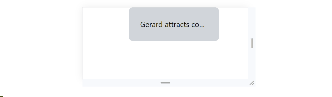
Output
The below output confirms that the breakpoints are working fine with truncate, text-ellipsis, and text clip:
Method 2: Use Media Queries with Truncate, Text-Ellipsis, and Text-Clip
Media queries can also be used with the “truncate”, “text-ellipsis”, and “text-clip”. To begin using the media query in the “text-overflow” utility classes, simply start the media query with the “@media” tag. After that, create a query for media query and set the “max-width” to “450px”. Within that query, use the “text-overflow” property and assign the value “clip” to it:
<textarea class="font-2xl" id="xyz" >
Gerard attracts cocurricularactivitiesverymuch
</textarea>
</div>
</body>
<style type="text/css">
#xyz{
text-overflow: ellipsis;
}
@media (max-width:450px) {
#xyz{
text-overflow: clip;
overflow: hidden;
}}
</style>
</body>
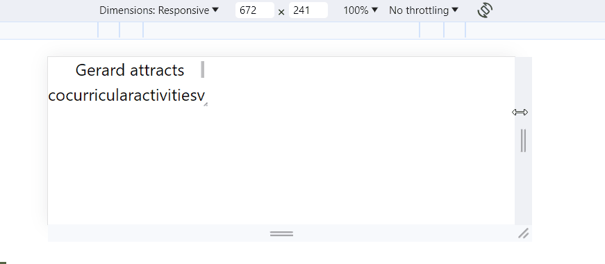
Output
It can be observed from the below output that the media queries are working fine with “text-overflow” utility properties are working fine:
Conclusion
To use the breakpoints and media queries with “truncate”, “text-ellipsis”, and “text-clip” properties, first, specify the width of the screen. In breakpoints, the width is defined using “sm”, “md”, or “lg” tags. While, in a media query, it is defined by using the “max-width” property along with width in pixels “px”. After that, specify the “truncate”, “text-ellipsis”, and “text-clip” properties. This article has presented the practical way of using breakpoints and media queries with “truncate”, “text-ellipsis”, and “text-clip”.
Source: linuxhint.com