How to Use a Plugin for Forms in Tailwind?
Tailwind is a CSS framework that permits users to make unique and custom designs. One of the features of Tailwind is that it provides a plugin system that enables users to extend the functionality of the framework with their custom components. The forms plugin adds a set of classes for styling forms and inputs. The classes provided by forms plugins are “form-input”, “form-textarea”, “form-select”, “form-multiselect”, “form-radio”, and “form-checkbox”. Users can customize and style form elements using these classes.
This post will explain the method to use plugins for forms in Tailwind.
How to Use a Plugin For Forms in Tailwind?
To use the forms plugin in Tailwind, try out the below-provided steps:
- Install the forms plugin in the project
- Add forms plugin in the “tailwind.config.js” file
- Utilize the forms plugins in the HTML program
- View the HTML web page to verify the output
Step 1: Install Forms Plugin in Tailwind Project
First, open the terminal and run the below-listed command to install the forms plugin in the project:
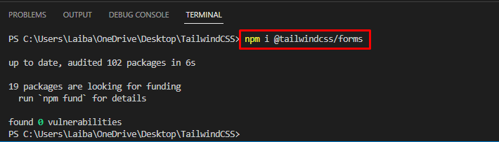
The forms plugin has been installed successfully.
Step 2: Add Forms Plugin in Tailwind Config File
Then, open the “tailwind.config.js” file and add the forms plugin in it:
content: ["./index.html"],
plugins: [
require('@tailwindcss/forms'),
],
};
Step 3: Use Forms Plugin in HTML Program
Now, make an HTML program and utilize the forms plugin classes to style the form. For instance, we have used the “form-input”, “form-textarea”, “form-select”, “form-multiselect”, “form-radio”, and “form-checkbox” classes to the equivalent HTML elements to apply some form styles:
<div class="flex justify-center items-center bg-indigo-600">
<form class="max-w-screen-lg p-6 shadow-lg bg-white rounded-md">
<label class="flex justify-center text-3xl text-blue-900">Form</label>
<label class="block">
<span class="text-black"><b>Name</b></span>
<input class="form-input m-1 block border-2 w-96" placeholder="Your Name"><span class="text-black"><b>About</b></span>
<textarea class="form-textarea m-1 block border-2" rows="3" cols="48" placeholder="Tell us something about you...!!!"></textarea>
<span class="text-black"><b>Gender</b></span>
<select class="form-select block m-1">
<option>Male</option>
<option>Female</option>
</select>
<span class="text-black"><b>Age</b></span>
<div class="m-2">
<div>
<label class="inline-flex items-center">
<input type="radio" class="form-radio" name="radio" value="1" checked/>
<span class="ml-2">10 - 20</span>
</label>
</div>
<div>
<label class="inline-flex items-center">
<input type="radio" class="form-radio" name="radio" value="2" />
<span class="ml-2">21 - 30</span>
</label>
</div>
</div>
<span class="text-black"><b>Nationality</b></span>
<div class="m-1">
<div>
<label class="inline-flex items-center">
<input type="checkbox" class="form-checkbox">
<span class="ml-2">Pakistani</span>
</label>
</div>
<div>
<label class="inline-flex items-center">
<input type="checkbox" class="form-checkbox">
<span class="ml-2">Non-Pakistani</span>
</label>
</div>
</div>
</label>
<span class="text-black"><b>Hobbies</b></span>
<select class="form-multiselect w-96 block m-2" multiple>
<option>Book Reading</option>
<option>Writing</option>
<option>Poetry</option>
<option>Painting</option>
<option>Gardening</option>
</select>
<div class="flex justify-center">
<button class="bg-blue-700 text-white opacity-100 font-bold py-2 px-4 rounded">
Submit
</button>
</div>
</form>
</div>
</body>
Here:
- First, the “form-input” class styles the input elements.
- After that, the “form-textarea” class is utilized to style textarea element.
- Then, the “form-select” class is utilized to style select elements.
- Furthermore, the “form-radio” class is used to style multiple-select elements.
- Next, the “form-checkbox” class is utilized to style checkbox elements.
- In the end, the “form-multiselect” class styles multiple-select elements.
Step 4: Verify Output
To ensure that the forms plugins are working successfully or not, run the HTML program and view the output:
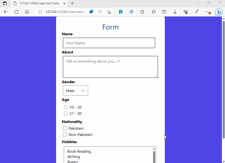
It can be observed that all the forms plugin classes are working properly.
Conclusion
To use the forms plugin form in Tailwind, first, install the forms plugin in the project. Then, add the forms plugin in the “tailwind.config.js” file. Next, use the forms plugins in the HTML program. Finally, view the HTML web page to verify the output. This post has elaborated the method to use plugins for forms in Tailwind.
Source: linuxhint.com