How to Test Responsive Designs on Multiple Devices
Responsive designs aim to create websites that are responsive and can adjust to different devices regardless of screen sizes. Responsive designs give the users the freedom to view the webpages on any device without any hassle. In the recent internet, users need to switch to desktop computers in order to view the web page properly. Normally, users test the responsiveness of the website by resizing the web browser window. However, there exists a number of tools that help users test the website’s responsiveness on various devices in one go.
This article will discuss the methods to test responsive designs on various devices.
How to Test Responsive Designs on Various/Multiple Devices?
Users can test the responsive designs by utilizing:
- Online tools.
- Browser tools.
Method 1: Test Responsive Designs Using Online Tools
Responsive designs can be tested with the help of online tools. These online tools can generate live previews of the provided website URL on multiple devices including desktops, tablets, and mobiles with different resolutions. Such online tools include:
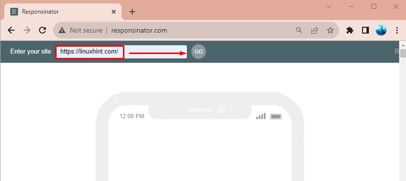
1. Responsinator
The “Responsinator” is an online that is used to test responsive designs on multiple devices. It has a built-in number of devices emulator devices that can display the screen resolutions of different devices on one web page.
To check the website’s responsiveness, first, navigate to the Responsinator website. Then, type the website URL and hit the “GO” button:
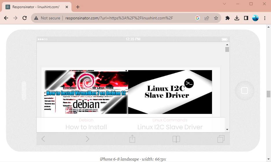
 Users can now scroll down to see the responsive design results of the responsive design tests held on multiple device emulators online:
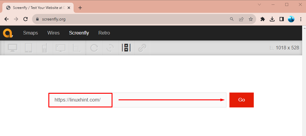
2. Screenfly
Another online tool that can test responsive designs and can present the view of the website on various devices with different resolutions is “Screenfly”.
To test the responsive designs of a website, first, navigate to the Screenfly website. Then, enter the website URL and hit the “Go” button:
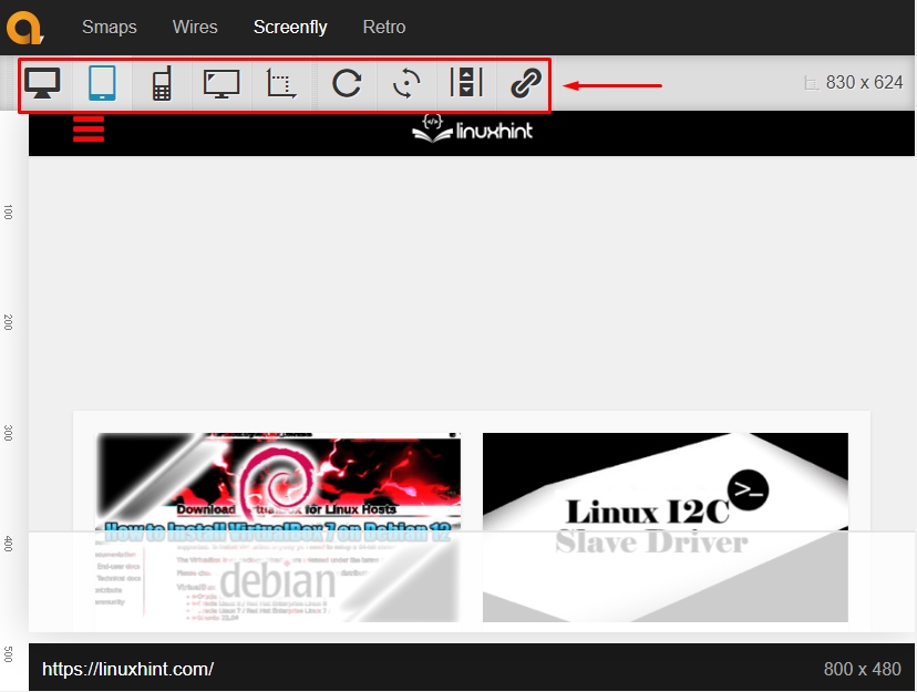
Users can click on the highlighted icons to see the responsive designs on their desired device emulators:
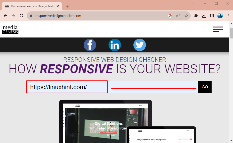
3. Responsive Design Checker
The third online tool in the list to test responsive designs on multiple devices is the “Responsive Design Checker”. It can test the website’s responsiveness on desktops, tablets, and mobile phones.
To test the website’s responsive designs, first, move to the “Responsive Design Checker” website. Then, type the URL of the web page you want to test the responsive design and hit the “Go” button:
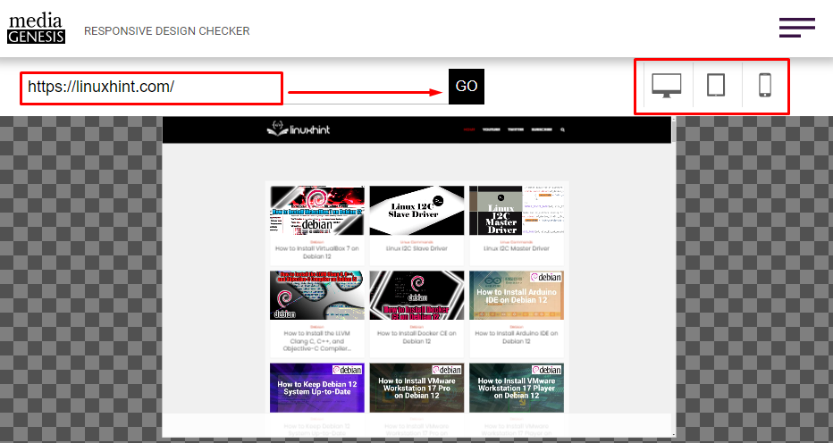
Once the web page is displayed, then, users can click on the device icon to test the responsive design on the desired devices:
Method 2: Test Responsive Designs Using Browser Tools
Users can also test the website’s responsive designs using browser tools. Browsers contain built-in tools for developers that are used to test responsive designs:
Step 1: Inspect Elements
To check the responsive design, first, navigate to the desired website. Then, right-click on the free space and hit the “Inspect” option:

Step 2: Open Device Toolbar
Open the “Device toolbar” option by clicking on the highlighted icon or press “CTRL + Shift + M” the shortcut key. After that, the web page will load in responsive mode:

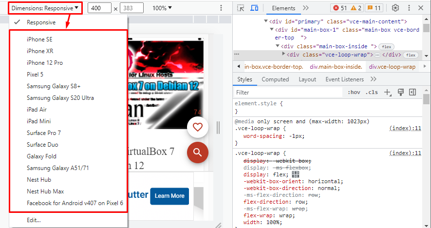
Step 3: Test Responsive Design on Multiple Devices
Click on the “Dimensions” drop-down and select the desired device to check the responsive design:
Conclusion
Responsive designs can be tested on multiple devices using various methods. These methods include testing the responsive designs using online tools, browser tools, and real devices. Some of the online tools include Responsinator, Screenfly, and Responsive Design Checker. This blog has provided in-depth details about testing responsive designs on multiple devices.
Source: linuxhint.com