How to Style the Bootstrap Modal
This write-up will describe how to style the Bootstrap modal.
How to Style the Bootstrap modal?
To learn how to style the Bootstrap modal, follow the steps below.
Step 1: Create an HTML File
First, create a modal by following the instructions given below:
- Create a “<div>” container and assign it a class “main-modal-container”.
- Then, add a button that will trigger the modal window. Assign it the “btn”, “btn-primary”, and “show-modal” classes. Set the data attributes “data-toggle” with the value “modal” and the “data-target” with the “#myModal” value. This id is pointing to the id of the modal window.
- Next, create the modal window. To do so, add a “<div>” element and assign it “modal” and “fade” classes, and set the id.
- Add a “<div>” for the dialog box of the modal and assign it the “modal-dialog” class.
- Then, specify the modal’s content in a “<div>” and assign it the class “modal-content”.
- Make a close button with the class “close”. The “data-dismiss” attribute is utilized to close the modal window.
- Then, specify the modal body with the classes “modal-body” and “row”. Inside it, take a column of 6 grids for the image and 6 for the content.
- The image is embedded using the “<img>” tag.
- Then, inside the “<div>” element with the “content” class, add the title, subtitle, and description.
- After that, place a button with the Bootstrap “btn”, “btn-danger”, and “p-2” classes:
<button class="btn btn-primary show-modal" data-toggle="modal" data-target="#myModal">view modal</button>
<div class="modal fade" id="myModal">
<div class="modal-dialog">
<div class="modal-content">
<button class="close" data-dismiss="modal">
<div class="modal-body row">
<div class="col-sm-6 modal-image"><img src="/img/cloths.jpg"></div>
<div class="content col-sm-6">
<h3 class="title">Special Offer</h3>
<span class="sub-title">20% off takeout and delivery</span>
<p class="description">Best quality shirts. Every size is available. Easily washable.</p>
<button class="btn btn-danger p-2">VIEW MORE</button>
</div>
</div>
</div>
</div>
</div>
</div>
Step 2: Style “main-modal-container” Class
The whole container is styled with the CSS “font-family” property:
font-family: 'Poppins', sans-serif;
}
Step 3: Style “show-modal” Class
The “show-modal” class is declared with the following properties:
color: #fff;
background-color: #3a97c9;
text-transform: capitalize;
padding: 10px 15px;
margin: 80px auto 0;
display: block;
}
Here:
- “color” sets the font color.
- “background-color” sets the element’s background color.
- “text-transform” capitalizes the text.
- “padding” adjusts space around the element’s content.
- “margin” produces space around the element.
- “display” with the value “block” sets the element’s width to 100%.
Step 4: Style “modal-dialog” Class on Fade
transform: scale(0);
transition: all 450ms cubic-bezier(.47, 1.64, .41, .8);
}
When the modal fades, the following CSS properties are applied to the “modal-dialog” class:
- “transform” property with the “scale()” value increases or decreases the element’s size vertically or horizontally.
- “transition” gradually moves the element. The “cubic-bezier()” function applies the cubic bezier curve. It is determined by four points.
Step 5: Style “modal-dialog” Class on Show
transform: scale(1);
}
The CSS “transform” property with the value “scale(1)” increases the size of the dialog box.
Step 6: Style “modal-content” Class
border-radius: 30px;
border: none;
overflow: hidden;
}
The “modal-content” is decorated with the following properties:
- “border-radius” rounds the element’s edges.
- “border” with the value “none” hides the border.
- “overflow” controls the content’s flow.
Step 7: Style “close” Class
color: #747474;
background-color: rgba(255, 255, 255, 0.5);
height: 27px;
width: 27px;
padding: 0;
opacity: 1;
overflow: hidden;
position: absolute;
right: 15px;
top: 15px;
z-index: 2;
}
Here:
- “opacity” defines the element’s transparency level.
- “position” with the value “absolute” sets the element’s position relative to its parent position.
- “right” and “top” set space at the right and top of the close button.
- “z-index” specifies the element’s stack order. The greater stack order brings the element to the front.
Step 8: Style “modal-body” Class
padding: 0 !important;
}
Space around the entire modal body is adjusted by CSS “padding” property. Moreover, the “!important” keyword is utilized to set the element’s importance.
Step 9: Style “img” Element
height: 100%;
width: 100%;
}
Step 10: Style the “content” Class
padding: 35px 30px;
}
By using the “padding” property, the space is added around the “content” class’s content.
Step 11: Style “title” Class
color: #fb3640;
font-family: 'Sacramento', cursive;
font-size: 35px;
}
Here:
- “font-family” defines the font’s style.
- “font-size” sets the font’s size.
Step 12: Style “sub-title” Class
font-weight: 600;
text-transform: uppercase;
margin: 0 0 20px;
display: block;
}
According to the given code snippet:
- “font-weight” sets the font’s thickness.
- “text-transform” sets the font case.
Output
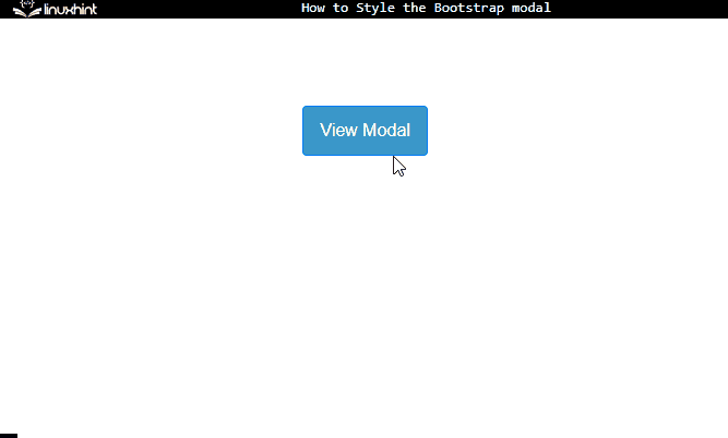
This is how you can style the Bootstrap modal.
Conclusion
To style the Bootstrap modal window, first, add the button that will trigger the modal. Then, make the modal window using HTML elements. After that, add several CSS properties, including “padding”, “margin”, “color”, “transition”, and many more to style the modal window. More specifically, the “cubic-bezier” function is used to apply the transition effect in a four points curve on the modal window. This post has explained the procedure to style the Bootstrap modal.
Source: linuxhint.com