How to Set Box Shadow Only at Bottom in CSS?
To add style and design to text and elements, the shadow effect is used. It can be added to an element with the “box-shadow” CSS property. By using commas, you can set multiple effects at once, i.e., horizontal shadow, vertical shadow, blur-radius, etc. This property provides different features of the image using color components.
This manual will provide the method related to setting “box-shadow” only at the bottom of an element.
box-shadow CSS Property
CSS offers a property named “box-shadow” that allows us to set a shadow to any element or image. This property has the following aspects:
-
- offset-x: It is used to add horizontal shadow.
- offset-y: It is used to add vertical shadow.
- color: It is used to set the color of the shadow.
Syntax
To clarify these points, let us move to the syntax of drop-shadow:
-
- offset-x and offset-y will be positive or negative.
- In horizontal, a positive value is used to add the effect on the right side, and a negative is for the left side.
- In vertical, the positive value is for the bottom side, and the negative is for the top.
- blur-radius makes the shadow brighter or lighter.
- In the place of color, you will assign any color you want to give to the image.
For better understanding, let us implement a practical example of the “box-shadow” property.
Example: How to Set Box Shadow Only at Bottom in CSS?
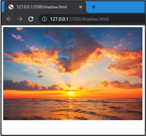
We will apply the box shadow effect to an image. For this first, we will add an image in HTML, and then we will apply the CSS property “box-shadow” to it:
<img class="image" src="image.jpg" alt="">
</body>
This will give the following output:
Let us move to add a shadow effect on the bottom of the image:
box-shadow: 0px 15px 5px orange;
}
The above values represent the following points:
-
- offset-x is “0px” because we do not want to display shadow horizontally.
- offset-y is “15px” to set the width of the shadow. It must be positive because it displays a shadow at the bottom of the image.
- blur-radius is “5px”. It makes the shadow lighter.
- The color of the shadow is “orange”.
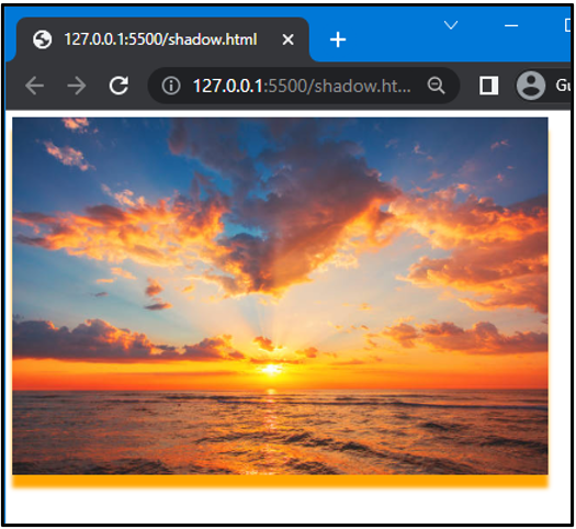
In this image, we can see shadow at the bottom.
Conclusion
To display the shadow at the bottom of the image, the “box-shadow” property is used. For this purpose, offset-x is set as “0”, offset-y is any positive value, and the color you want to display is also set. With the help of an example, this article has explained how to display shadows only at the bottom of the image.
Source: linuxhint.com