How to Reset the Width of Tailwind Elements
Tailwind is a responsive CSS framework and uses a mobile-first breakpoint approach. It provides different classes for the designing of the layout such as “w-auto” for “Resetting the Width” of a Tailwind element. This class usually comes with a breakpoint prefix that works as a condition. A breakpoint refers to a particular screen width at which the design of the layout can change.
This article will provide the procedure for resetting the width of Tailwind elements.
How to Reset the Width of Tailwind Elements?
Resetting class in Tailwind can be used with a specific breakpoint of an element. A breakpoint is used to adapt a layout for a particular screen size. Let’s understand the syntax to reset the width of an element in Tailwind.
Syntax
The syntax is shown below:
Let’s understand it better through an example.
In the below-provided code, an element is provided a “50%” width as default using the Percentage-Based Width class. This width is then reset for the breakpoint “md” i.e. the screen size having min-width 768px.
In the above code, the “div” element is created and various classes are applied to it that help in the designing of the layout. The explanation of these classes is as follows:
- First, create a “div” element and assign multiple classes for styling.
- The percentage width class “w-1/2” sets the width parameter of the element to “width: 50%;”.
- The “rounded-xl” class sets the corners of the element rounded to the extent of the provided radius size. Here, the radius size is set to “xl”.
- The “bg-{color}-{number}” class is responsible for setting the background of the element to the designated color. The number written after the color name varies for different shades of the color.
- The “text-center” class sets the text in the div element to the center.
- The “md:w-auto” class is responsible for resetting the element’s width upon the breakpoint of “md” screens i.e. min-width of 768px.
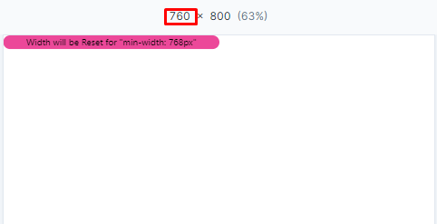
Here is the output when the screen is smaller than 768px. Note that the element has a “50%” width at the moment:
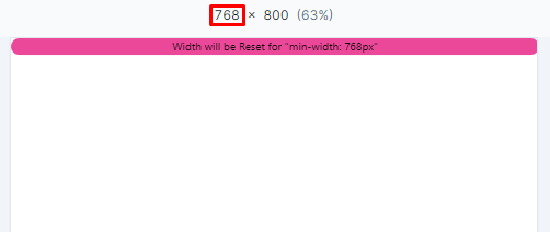
As soon as the pixel amount reaches 768, the width of the element resets as follows:
Additional Info: The following table provides the corresponding minimum screen width for the breakpoint prefixes used in Tailwind:
| Breakpoint Class | Min-Width |
|---|---|
| sm | 640px |
| md | 768px |
| lg | 1024px |
| xl | 1280px |
| 2xl | 1536px |
That is all about resetting the width of an element in Tailwind.
Conclusion
By using the “{breakpoint prefix}:w-auto” class, the width of an element can be reset in Tailwind. For example, the “md:w-auto” class will reset the width of the element as soon as the “md” breakpoint screen width is met. There are five default breakpoints in Tailwind i.e. “sm”, “md”, “lg”, “xl”, and “2xl” having the minimum screen width of “640px”, “768px”, “1024px”, “1280px”, and “1536px” respectively. This article has provided the procedure for resetting the width of an element in Tailwind.
Source: linuxhint.com