How to Justify Items With Breakpoints and Media Queries in Tailwind?
This article will exemplify the method to justify the grid items with breakpoints and media queries in Tailwind CSS.
How to Justify Grid Items With Breakpoints and Media Queries in Tailwind?
To justify the grid items with breakpoints and media queries in Tailwind, make an HTML file. Then, use the “sm”, “md” or “lg” breakpoints with the “justify-items” utilities in the HTML program and define the desired justify property for various screen sizes. Lastly, adjust the screen size of the web page to ensure changes.
Look at the provided steps for its practical implementation:
Step 1: Use Breakpoints and Media Queries Justify Item Utilities in HTML Program
Create an HTML program, use the desired breakpoints, and define the justify property for different screen sizes with the “justify-items” utility. For instance, we have used the “md” breakpoint with the “justify-items-center” utility and “lg” breakpoints with the “justify-items-end” utilities to justify the grid items on various screen sizes:
Here:
- “grid” class defines a grid container.
- “justify-items-start” class aligns the grid items to the start of the container horizontally.
- “md:justify-items-center” class aligns the grid items to the center horizontally on medium screen size.
- “lg:justify-items-end” class aligns the grid items to the end horizontally on the large screen size.
- “gap-3” class adds a gap of 3 units between grid items.
- “m-2” class adds a margin of 2 units around the grid container.
- “text-center” class aligns the text content inside the grid items to the center horizontally.
- “bg-teal-500” class sets the teal color to the background of grid items.
- “p-4” class adds a padding of 4 units to the content inside the child
items.
Step 2: Verify Output
View the HTML web page and change the screen size to ensure that the grid items have been justified with breakpoints and media queries: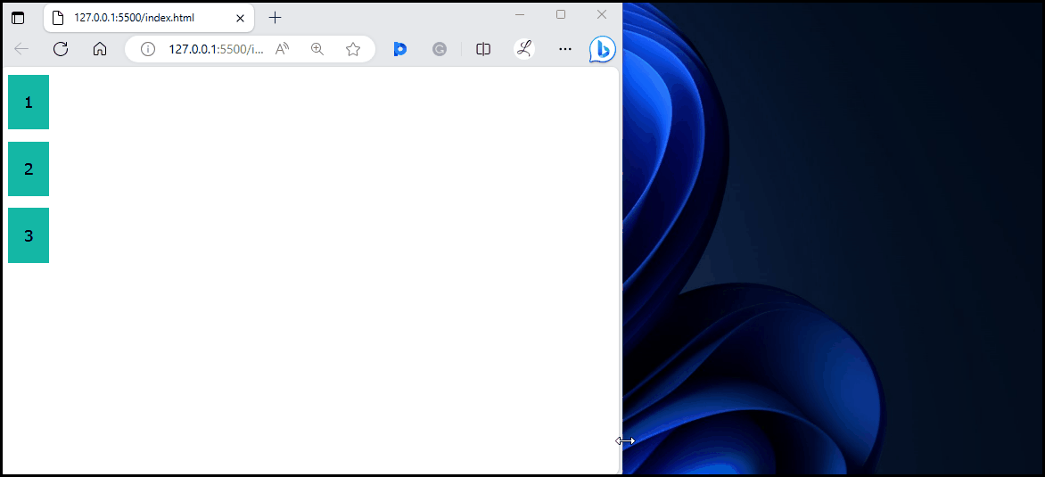
It can be observed that the grid items are aligned successfully on different screen sizes.
Conclusion
To justify the grid items with breakpoints and media queries in Tailwind, use the “sm”, “md” or “lg” breakpoints with the desired “justify-items” utilities for various screen sizes in the HTML program. To ensure changes, view the HTML web page by changing the screen size. This article has exemplified the method to justify the grid items with breakpoints and media queries in Tailwind CSS.
Source: linuxhint.com