How to Justify Grid Items in Tailwind?
This article will explain the method to justify grid items in Tailwind CSS.
How to Justify Grid Items in Tailwind?
To justify grid items in Tailwind, users can use different “justify-items” utility classes in the HTML program to align the grid items. The “justify-items-start” utility aligns the grid items to the start/beginning of the container, “justify-items-end” aligns the grid items to the end or right side of the container, and “justify-items-center” centers the grid items horizontally within the container. Also, the “justify-items-stretch” utility stretches the grid items to cover the entire width of the container. Then, view the HTML web page to ensure changes.
Check out the given-provided steps for a better understanding:
Step 1: Use Justify Item Utilities in HTML Program
Make an HTML program and use the desired “justify-items” utility in the specific containers. For instance, we have used the “justify-items-start”, “justify-items-end”, “justify-items-center” and “justify-items-stretch” utilities in the HTML program:
<div class="grid justify-items-start gap-3 m-2 text-center">
<div class="bg-teal-500 p-3">1</div>
<div class="bg-teal-500 p-3">2</div>
</div>
<div class="grid justify-items-center gap-2 m-2 text-center">
<div class="bg-yellow-500 p-3">3</div>
<div class="bg-yellow-500 p-3">4</div>
</div>
<div class="grid justify-items-end gap-2 m-2 text-center">
<div class="bg-red-500 p-3">5</div>
<div class="bg-red-500 p-3">6</div>
</div>
<div class="grid justify-items-stretch gap-2 m-2 text-center">
<div class="bg-purple-500 p-3">7</div>
<div class="bg-purple-500 p-3">8</div>
Here:
- “grid” class is used to create a grid layout.
- “justify-items-start” utility aligns the grid items to the beginning or left side of the container.
- “justify-items-end” aligns the grid items to the end or left side of the container.
- “justify-items-center” centers the grid items within the container.
- “justify-items-stretch” utility stretches the grid items to cover the entire width of the container.
- “gap-3” class sets a gap or spacing of 3 units between each element.
- “m-2” class applies a margin of 2 units around the grid container.
- “text-center” class sets the text of each grid item to the center.
Step 2: Verify Output
To ensure that the grid items have been justified, view the HTML web page:
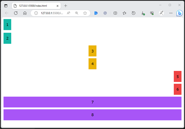
The above output shows all the justified grid items according to which they were specified.
Conclusion
To justify grid items in Tailwind, different “justify-items” utility classes can be used in the HTML program to align the grid items. This includes the “justify-items-start”, “justify-items-end”, “justify-items-center” or “justify-items-stretch” utilities. For verification, view the changes on the HTML web page. This article has exemplified the method to justify grid items in Tailwind CSS.
Source: linuxhint.com