How to Flip Background Image Using CSS?
This blog will explain:
How to Insert a Background Image?
To insert the background images into the webpage, follow the step-by-step instructions.
Step 1: Insert Heading
First, create a heading with the help of any heading tag available in HTML. In this scenario, the h1 heading tag is utilized.
Step 2: Create Main div Container
Next, create a div container using the “<div>” element. Furthermore, insert an id attribute with a specific name for identifying the div.
Step 3: Make Nested div Containers
After that, make nested div containers by following the same procedure stated in the previous step.
Step 4: Add an Image
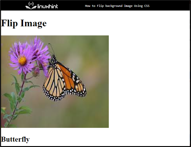
Now, add an image by utilizing the “<img>” tag. Then, define the following attributes inside the image tag:
- “src” attribute is used for adding the media file.
- “alt” is utilized for showing the text when the image is not displayed due to some reason.
- “style” attribute is used for inline styling. To do so, the CSS properties width and height to set the image size according to the specified values.
Step 5: Create backflip Container
Next, create a div container with the class name “backflip”.
Step 6: Add Heading for Image
Now, add a heading with the help of the “<h2>” heading tag to display along the image:
Output
Move toward the next section to learn about flipping the background image.
How to Flip Background Images Using CSS?
To flip background images using CSS, apply the “transform” property with the “scaleX” and “scaleY” transform after accessing the added image.
To do so, follow the mentioned procedure.
Step 1: Style Main div Container
Access the main div container with the help of the “id” selector along id name as “#main-flip”:
background-color: transparent;
width: 400px;
height: 300px;
margin: 30px 150px;
}
According to the above code snippet, the following CSS properties have been applied to the container:
- “background-color” property is utilized for setting an image at the backside of the defined element.
- “width” property specifies the width size of an element.
- “height” is used for setting the element’s height.
- “margin” property allocates space on the outer side of the defined boundary.
Step 2: Apply CSS Styling on inner Container
Access the inner container with the help of the class name “.inner-flip”:
position: relative;
width: 100%;
height: 100%;
text-align: center;
transition: transform 0.7s;
transform-style: preserve-3d;
}
Then, apply the following CSS properties:
- “position” property specifies the type of positioning method used for an element
- “text-align” is utilized for setting the alignment of the text.
- “transition” properties permit elements for changing the values over a particular animation and duration.
- “transform-style” is utilized for specifying the elements rendered in 3D space which are nested.
Step 3: Apply “transform” Property
Access the main div element with the id name along the “:hover” selector and inner div with the help of class name as “.inner-flip”:
transform: rotateY(180deg);
}
Then:
- Apply the “transform” property for setting the transformation and sets the value of this property as “rotateY(180deg)”
- “rotateY()” function is used to rotate the image in the Y axis at 180deg.
Step 4: Set “backface-visibility”
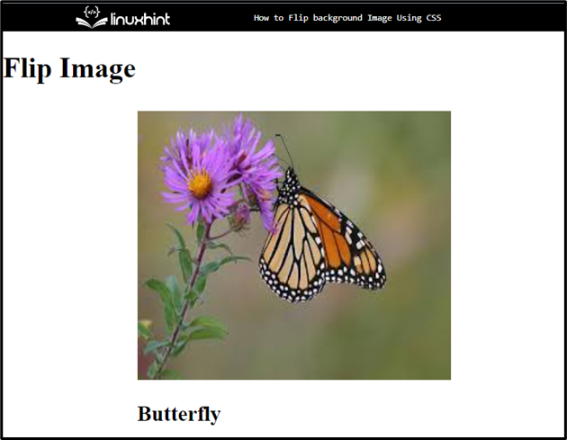
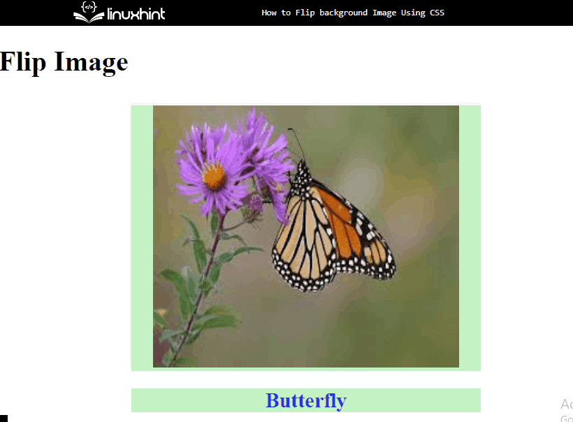
Access both div containers with their name as “#front-flip” and “.back-flip” to set the visibility:
backface-visibility: inherit;
color: rgb(39, 39, 243);
background-color: rgb(196, 243, 196);
}
To do so, apply the mentioned properties:
- “backface-visibility” defines whether or not the back face of an element should be visible when facing the user.
- “color” specifies the color for the added text.
- “background-color” sets the color at the backside of the defined element.
Output
That’s all about flipping a background image using CSS.
Conclusion
To flip the background image using CSS, first, add an image using the “<img>” element. Then, apply the CSS properties “transition” and set the value. After that, apply the “transform” property for setting the transformation and set the value of this property as “rotateY(180deg)”, which rotates the image according to the stated value. This post is all about flipping the background image using CSS.
Source: linuxhint.com