How to Create Flexible Multi-Column Layouts
Website development has evolved so much with the passing of time. In today’s world, almost every website is enriched with responsive design. A responsive website is one which is capable of adapting to the different screen sizes on different devices. A responsive website has a number of layouts that help in effective web design. One such layout is a multi-column layout. Multi-column layout refers to a layout that has more than one column. It allows the developers to divide the content across multiple columns.
This post will illustrate the creation of flexible multi-column layouts.
How to Create Flexible Multi-Column Layouts?
Users can create multi-column layouts using:
Method 1: Create Flexible Multi-Column Layouts Using CSS Grid
The first method to create flexible multi-column layouts is by using “CSS Grid”. A grid is basically a set of horizontal and vertical lines that go through each other. However, in HTML, the grid layout provides a grid-based layout having rows and columns.
Let’s create flexible multi-column layouts using a CSS grid. For that reason, first create an HTML structure and then apply CSS.
Create HTML Structure
First, create a <div> with a class “grid-container” within the <body> section. Inside the <div> section, create three more grids with the “grid-item” class name and add some text inside each <div>:
Apply CSS
Now, in the external CSS file or inline CSS, design the “grid-container” class. To do so, start it with the “.” sign concatenated by the class name and add curly braces to add some CSS inside it. Inside the curly braces, first, add the “display: grid;” in order to design a grid layout. After that, add “grid-template-columns: repeat(3, 2fr);” to create three equal columns. Then, create a space between columns by placing the “grid-gap: 15px;” property.
Next, design the “grid-item” class. First, create padding by setting the “padding” value to “15px”. Then, add a border and set its color to red by specifying the “border” property value to “2px solid red”:
display: grid;
grid-template-columns: repeat(3, 2fr);
grid-gap: 15px;
}
.grid-item {
padding: 15px;
border: 2px solid red;
}
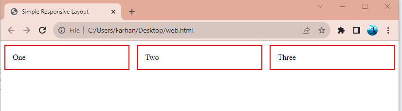
As it can be observed that the flexible multi-column layout has been created using CSS grid.
Method 2: Create Flexible Multi-Column Layouts Using CSS Flexbox
Flexbox or flexible box layout module helps the users to create flexible layout structure without losing positioning or float. The flexible multi-column layouts can also be created using the CSS Flexbox module. For that purpose, follow the below-provided instructions.
Create HTML Structure
First, create a <div> with the name “flex-container” and create three more div inside it with the “flex-item” name:
Apply CSS
Now, apply CSS to the “flex-container” <div>. First, set the “display” property to the “flex” value to create a “Flexbox”. After that, add the “justify-content” property and specify the “space-between” value to distribute columns evenly. Next, design the other three div by first setting the “flex” property value to “1” to equally create width for columns. Then, set the “padding” to “15px” and “border” to “1px solid blue”:
display: flex;
justify-content: space-between;
}
.flex-item {
flex: 1; /* Equal width for all columns */
padding: 15px;
border: 1px solid blue;
}
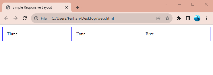
It can be observed from the above output that the flexible multi-column layout has been created successfully.
Conclusion
To create flexible multi-column layouts, users can utilize two methods, one is by using a “CSS grid” and the other is “Flexbox”. Users can create the “CSS grid” by setting the “display” property’s value to “Grid” of the <div>. While “Flexbox” can be created by setting the property “display” to the “flex” value. This article has proposed methods to create flexible multi-column layouts.
Source: linuxhint.com