How to Create a Semi Circle with CSS
While designing a website, adding semi-circles instead of circles give a better look. Moreover, the formation of semi-circles is easy as well as interesting.
In this article, we will provide a guide on how to create a semi-circle using CSS.
How to Create a Semi Circle with CSS?
To make a semi-circle, we will use the “border-radius” property. This property will help us make a semi-circle in the following ways:
- Semi circle from the top
- Semi circle from the bottom
- Semi circle from the left
- Semi circle from the right
Let’s elaborate on each one by one!
Example 1: Create a Semi Circle from Top with CSS
To create a semi-circle from the top, first, we will specify the “<div>” element inside the body tag of our HTML file.
HTML
Now, set the suitable dimensions for the div, such as we will assign the “width” property value as “180px” and “height” property with value “90px”. In the next step, set the “border-radius” property value “12rem 12rem 0 0”; where the first digit 12rem will trim the top left side of the div, the second 12rem will trim the top right side, third and fourth digit 0 will cut out the all-bottom part of the div. Lastly, to give a color to the circle, utilize the “background-color” property with the value “purple”.
CSS
width: 180px;
height: 90px;
border-radius: 12rem 12rem 0 0;
background-color: purple;
}
Save the HTML file with the mentioned code and open it in your browser:
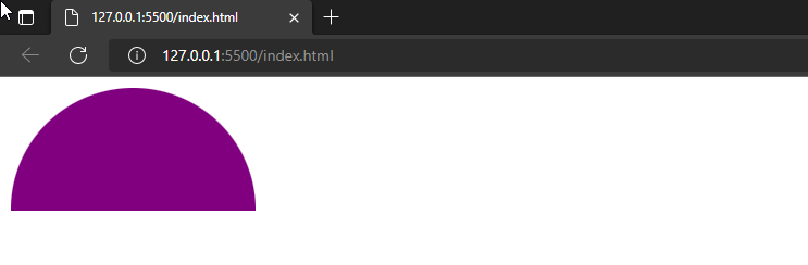
As you can see, we have successfully created a semi-circle with CSS border-radius property.
Example 2: Create a Semi Circle from Bottom with CSS
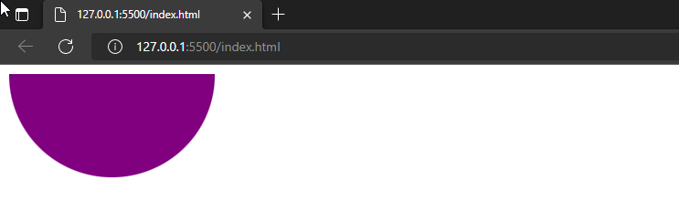
For the formation of a semi-circle from the bottom, we will set border-radius property values as “0 0 12rem 12rem”, where the first two values represent the top left and top right-side border-radius. We have set them to 0 to make the top half of the div disappear completely. For the bottom, we have only trimmed a little bottom left and bottom right side by setting the values to 12rem.
CSS
width: 180px;
height: 90px;
border-radius: 0 0 12rem 12rem;
background-color: purple;
}
Output
Example 3: Create a Semi Circle from Right with CSS
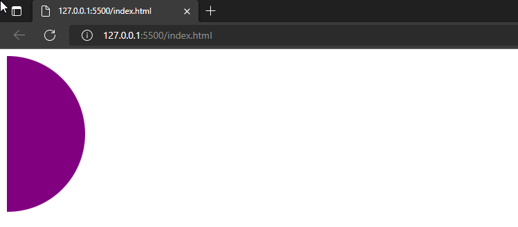
To make a CSS semi-circle to the right, first, adjust the height and width of the container as it is necessary to get the proper shape of the circle. Set the “width” as “90px” and “height” as “180px” this time. Again, utilize the border-radius property with the value “0 12rem 12rem 0”, where the first value 0 is for the top left side, the last value 0 is for the bottom left side, and the second and third values are added to trim the top right and bottom right side. Applying these values will form a semi-circle from the right.
CSS
width: 90px;
height: 180px;
border-radius: 0 12rem 12rem 0;
background-color: purple;
}
Output
Example 4: Create a Semi Circle from Left with CSS
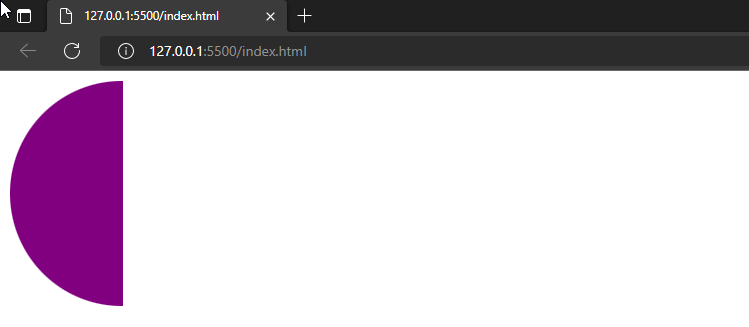
This time, specify the border-radius property along value “12rem 0 0 12rem”; the first and last value 12rem will trim the top left and bottom left side of the div, setting the second and third value to 0 will make clear out the top right and bottom right side of the circle. Eventually, our left-sided semi-circle will be created.
CSS
width: 90px;
height: 180px;
border-radius: 12rem 0 0 12rem;
background-color: purple;
}
Output
We have offered different methods for creating a semi-circle with CSS.
Conclusion
To create a semi-circle, we can simply utilize the CSS “border-radius” property. The semi-circle can be created from side to side, such as to the left, right, top and bottom. In the border-radius property, the initial value is for the top left, the second one is for the top right, the third is for the bottom right, and the fourth value is for the bottom left side. This write-up has explained how to create a semi-circle with CSS.
Source: linuxhint.com