How to Create a Mobile-Optimized Sidebar
A sidebar is a navigation menu on the right or left side of the web page that contains bookmark links for ease of access. It lets users access the important sections of the website quickly. A mobile-optimized sidebar is specially designed for mobile screens, where all the important links can be accessed conveniently. Moreover, all the page elements and links are always in view. A mobile-optimized sidebar adapts the screen.
This article will present a method to create a mobile-optimized sidebar.
How to Create a Mobile-Optimized Sidebar?
The mobile-optimized sidebar can be created using HTML, CSS, and media query. Below, the practical demonstration is provided and is explained thoroughly:
Step 1: Create an HTML Structure
First, create an HTML structure. Inside the HTML structure:
- Create a <div> with the class name “sidebar-class”.
- Inside that div, add a <button> having the class name of “button” and also create a navigation bar with the class name of “nav-bar”.
- Lastly, create another <div> having the class name “content-class”.
- Inside that class, add the text content:
<div class = "sidebar-class">
<button class = "button">Menu</button>
<ul class = "nav-bar">
<li><a href = "#">Home</a></li>
<li><a href = "#">About Us</a></li>
<li><a href="#">Our Services</a></li>
<li><a href="#">Contact Us</a></li>
</ul>
</div>
<div class = "content-class">
<h1>Linux Hint</h1>
<p>Linux Hint is the best e-learning platform.</p>
</div>
</body>
Step 2: Apply CSS
- First, apply CSS on the body to create a style that is suitable for all screen sizes.
- Specify the “sans-serif” font family using the “font-family” property.
- Furthermore, set the “margin” and “padding” values to “0”:
font-family: sans-serif;
margin: 0;
padding: 0;
}
Style the CSS for “sidebar-class” class:
- Set its height to “100%” and width to “240px”.
- Set the position to “fixed”, which means the content will remain in the same place even if the page is scrolled.
- Specify the value of “left” to the “-250px”. With this, the menu will slide from left to right having a width of “250px”.
- Specify the “overflow-x” property the value “hidden” to overflow the existing content and specify the sidebar:
height: 100%;
width: 240px;
position: fixed;
left: -250px;
top: 0;
transition: 0.3s;
background-color: #333333;
overflow-x: hidden;
}
Apply CSS on the menu button by following the below code:
font-size: 20px;
background-color: #333333;
color: #ffffff;
border: none;
padding: 10px;
cursor: pointer;
}
Apply CSS on the navigation menu by following the below code:
list-style: none;
padding: 0;
}
.nav-bar li {
padding: 10px;
}
.nav-bar a {
text-decoration: none;
color: #fff;
display: block;
padding: 8px;
}
Here is the CSS for the “content-class” class div:
margin-left: 0;
padding: 20px;
transition: 0.3s;
}
To create a mobile-optimized responsive design, apply the media query provided below in the CSS file:
.sidebar-class {
left: 0;
}
.content-class {
margin-left: 250px;
}
}
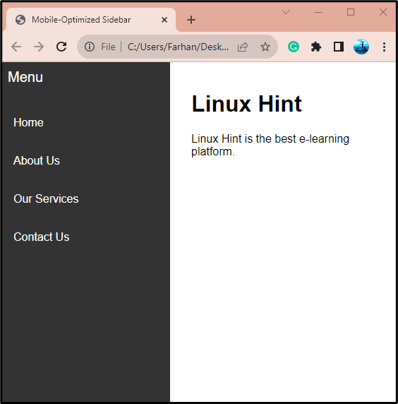
Output
Here is an output of the mobile-optimized responsive sidebar:
Conclusion
To create a mobile-optimized sidebar, first, create an HTML structure and create a sidebar hamburger menu. After that style the hamburger sidebar menu using CSS. Then, implement media query so that the sidebar can be created mobile optimized. This write-up has elaborated on the detailed procedure to create a mobile-optimized sidebar menu.
Source: linuxhint.com