How to Create a Fixed-Width Layout With CSS
This blog will demonstrate the procedure of creating a fixed-width layout with CSS.
How to Create Fixed-Width Layout Using CSS?
For the purpose of creating a fixed-width layout, firstly, inside the body element of the HTML, add a div element with a class name “fixed-width”. Then, add <h1> and <p> elements to add some content.
HTML
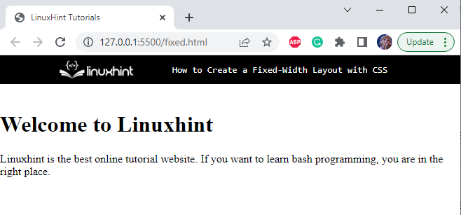
The markup structure has been completed and can be seen in the below-given image:
Now, let’s apply CSS styling properties to the above HTML elements.
Style All Elements
margin: 0px;
padding: 0px;
}
As we know, the fixed-width layouts use exact pixel width, so, the width property will be set in “pixels”. It defines that the element’s width will remain the same as in every screen size.
Style fixed-width div
background-color: rgb(238, 238, 238);
margin: auto;
max-width: 400px;
height: 100vh;
}
The “.fixed-width” is referring to the div class fixed-width. The following properties are applied to the div fixed-width:
- “background-color” specifies the color of the element’s background.
- “margin” specifies the space around the element.
- “max-width” sets the maximum width of the element.
- “height” property sets the element’s height.
The output of the mentioned code is displayed below:
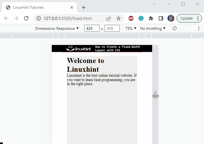
It can be observed that the width of the div fixed-width is fixed. It does not change according to the screen sizes.
That’s how the fixed-width layout is created in CSS.
Conclusion
The fixed-width layouts set the width of the element fixed. They remain the same in every screen size. If the browser window’s width is less than the layout’s width, a horizontal scroll bar will appear, and the element’s width will not change. To make the layout fixed, the width of the element must be specified in “pixels”. With the help of a practical example, this blog has demonstrated how to create a fixed-width layout in CSS.
Source: linuxhint.com