How to Apply Content Property with Hover, Focus, and Active States in Tailwind
While testing a web page or site, there can be a requirement for the programmer to analyze a target functionality based on different user actions. This enables users to analyze the response of functionality upon multiple applied states i.e., “hover”, “focus”, “active” etc.
This tutorial covers the below-listed content areas:
- How to Apply Content Property with the Tailwind Hover, Focus, and Active States?
- Applying Content Property with the “hover” State in Tailwind.
- Applying Content Property with the “focus” State in Tailwind.
- Applying Content Property with the “active” State in Tailwind.
How to Apply Content Property with the Tailwind Hover, Focus, and Active States?
The “content-{value}” utilities are used in combination with the “before” and “after” modifiers to assign the contents of the before and after elements(pseudo). This utility/property can be implemented with the discussed states to identify and display the specified content before or after the element’s content on mouse hovering the element, the element getting focused, or the element being active.
Example 1: Applying Content Property with the “hover” State in Tailwind
The following code example uses the “content” property to display the specified message before the content on mouse hovering the element:
<html>
<head>
<meta charset="utf-8">
<meta name="viewport" content="width=device-width, initial-scale=1">
<script src="https://cdn.tailwindcss.com"></script>
</head>
<body>
<div class="before:content-['NO-HOVER'] hover:before:content-['HOVER-APPLIED'] text-2xl">
Tailwind CSS is a great feature that assists in appending appealing features effectively on the site which improves the site traffic.
</div>
</body>
</html>
In this snippet of code:
- First, include the CDN path to implement the Tailwind functionalities.
- Next, create a “<div>” element that includes the “before” modifier along with the “content” property such that the message “NO-HOVER” is displayed by default before the “div” content.
- Also, upon hovering the element, the latter message “HOVER-APPLIED” is displayed.
- The “text-2xl” class represents the font size.
Output
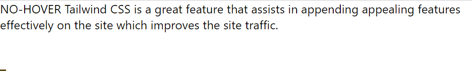
From this outcome, it is clear that the specified message is displayed accordingly before the content upon the mouse hover.
Example 2: Applying Content Property with the “focus” State in Tailwind
This demonstration uses the “content” property such that the provided message is displayed before the element’s content upon the element getting focused via the “Tab” key:
<html>
<head>
<meta charset="utf-8">
<meta name="viewport" content="width=device-width, initial-scale=1">
<script src="https://cdn.tailwindcss.com"></script>
</head>
<body>
<button class="before:content-['NO-FOCUS'] focus:before:content-['FOCUS-APPLIED'] text-2xl">
Click Me
</button>
</body>
</html>
According to this block of code:
- Recall the approaches for incorporating the CDN path and specifying the “before” modifier with the “content” property that displays the message(in square brackets) before the element’s content on user action.
- Note: Here, the “<button>” element is used to get it focussed.
Output
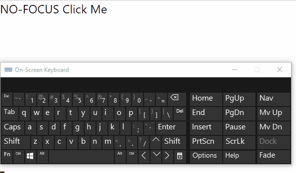
Here, it is proven that upon the element getting focused, the stated message is transitioned before the element’s content.
Example 3: Applying Content Property with the “active” State in Tailwind
This particular demonstration associates the “content” property with the “active” state such that the specified message displays before the content upon the element being active i.e., clicking on it:
<html>
<head>
<meta charset="utf-8">
<meta name="viewport" content="width=device-width, initial-scale=1">
<script src="https://cdn.tailwindcss.com"></script>
</head>
<body>
<div class="before:content-['NO-ACTIVE'] active:before:content-['ACTIVE-APPLIED'] text-2xl">
Tailwind CSS is a great feature that assists in appending appealing features effectively on the site which improves the site traffic.
</div>
</body>
</html>
Based on these code lines:
- Repeat the methodologies for specifying the CDN path and creating the “<div>” element.
- After that, associate the “content” property with the “before” modifier such that the specified message displays before the “div” content upon the element being active.
Output
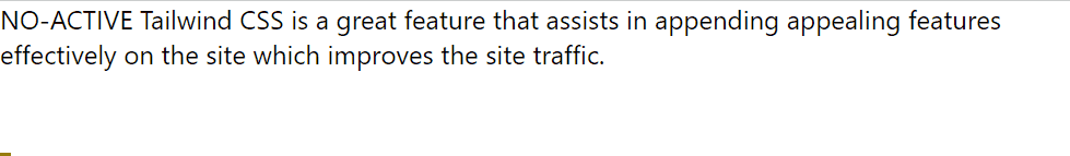
This output implies that upon clicking the content, the message before it (content) is transitioned accordingly.
Conclusion
The “content-{value}” utilities can be used with the “hover”, “focus”, and “active” states to transition the specified message before/after the element’s content on mouse hover, the element getting focused, or the lament benign active, respectively.
Source: linuxhint.com