How to Apply Content Property with Breakpoints and Media Queries in Tailwind
Most websites are based on the content appended in different ways. Therefore, to manage this content responsively i.e., on mobile, and desktop, it is crucial to use the Tailwind “Breakpoints” and “Media Queries” that assist the developer to format and manage the content for multiple devices appropriately.
This article explains the following content:
- How to Apply Content Property with Breakpoints and Media Queries in Tailwind?
- Applying the Content Property with Tailwind Breakpoints.
- Applying the Content Property with Tailwind Media Queries.
How to Apply Content Property with Breakpoints and Media Queries in Tailwind?
The “content-{value}” utilities are utilized combined with the “before” and “after” variant modifiers to allocate the contents of the “::before” and “::after” pseudo-elements. These utilities can be used with the “Breakpoints” via the “md” or “lg” classes. Also, these can be applied with the “Media Queries” using the “@media” rule and the set parameter value.
Example 1: Applying the Content Property with Tailwind Breakpoints
This example applies the “content-{value}” utilities such that the value “MOBILE” displays upon the smaller screen sizes and “DESKTOP” on medium-sized screens:
<html>
<head>
<meta charset="utf-8">
<meta name="viewport" content="width=device-width, initial-scale=1">
<script src="https://cdn.tailwindcss.com"></script>
</head>
<body>
<div class="before:content-['(MOBILE)'] md:before:content-['(DESKTOP)'] text-2xl">
Tailwind CSS is a great feature that assists in appending appealing features effectively on the site which improves the site traffic.
</div>
</body>
</html>
In this snippet of code:
- Specify the CDN path to apply the Tailwind functionalities.
- Now, create a “<div>” element that comprises the “content-{value}” utility along with the “before” modifier that displays the specified value i.e., “MOBILE/DESKTOP” before the “div” content upon the smaller and medium-sized screens(via “md” class), respectively.
- The “text-2xl” class represents the font size.
Note: Upon specifying the “value” with the “after” modifier, this value is displayed after the “div” content.
Output
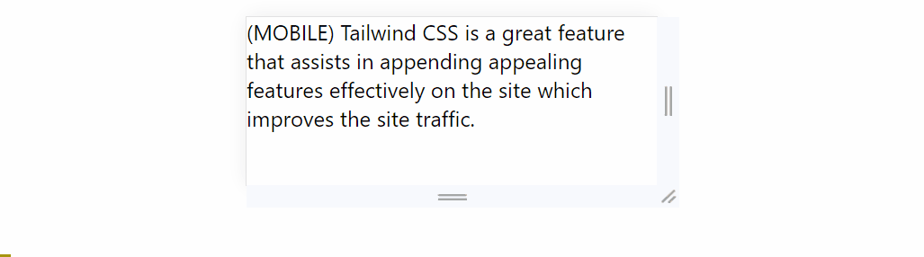
From this output, it is verified that upon expanding the screen size/width, the corresponding value representing the device is transitioned appropriately.
Example 2: Applying the Content Property with Tailwind Media Queries
The following code example uses the “content-{value}” utilities to hide the content based on the set “@media” rule parameter:
<html>
<head>
<meta charset="utf-8">
<meta name="viewport" content="width=device-width, initial-scale=1">
<script src="https://cdn.tailwindcss.com"></script>
</head>
<body>
<div id="temp" class = "text-2xl">
Tailwind CSS is a great functionality.
</div>
</body>
</html>
<style type="text/css">
@media (max-width:500px){
#temp{
content-visibility: hidden;
}}
</style>
According to this snippet of code:
- Repeat the methodologies for incorporating the CDN path and creating the “<div>” element comprising the given content.
- After that, in the CSS code, apply the “@media” rule with the stated parameter such that as long as the screen’s width is “500” pixels, the accumulated content remains hidden via the “content-visibility” property.
Output
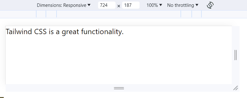
This output signifies that the content is dealt in accordance with the applied “@media” rule.
Conclusion
The “content-{value}” utilities can be used with the “Breakpoints” via the “md” or “lg” classes and with the “Media Queries” using the “@media” rule and the set parameter value to make the web page responsive. These utilities can be associated with the “before” and “after” modifiers to include the specified value before or after the element’s content, respectively.
Source: linuxhint.com