How to Adjust Columns with CSS Grid for Responsiveness
CSS (Cascading Style Sheet) is a language that is used to design, or describe, how elements in the HTML web page will be presented. The CSS grid is a two-layout module, which can handle rows and columns together. The CSS grid provides a grid-based module. It comes with rows and columns, which makes it easier to develop web pages without using floats. A grid can have a maximum of 12 columns. A responsive CSS grid changes its layout dynamically according to the screen size.
This article will observe the methods to adjust the columns with CSS grids.
How to Adjust Columns with CSS Grid for Responsiveness?
The columns with CSS for responsiveness can be adjusted by:
Method 1: Create a Responsive Grid Layout by Utilizing the “auto-fill” Value
The first method to create a responsive grid layout is by the use of the “auto-fill” value. The “auto-fill” value helps the users to fill the rows with a maximum number of columns. It is one of the most important properties in CSS, as it can help the users create a layout without media query.
To create the responsive grid layout to adjust the columns with CSS grid for responsiveness go through the given procedure.
Create HTML
First, create an HTML page and then create a “<div>” element having an id “grid-layout”, within the “body” section. After that, create six <div> elements with alphabetic numbers as demonstrated below:
Add CSS
Create an external CSS file and link it inside the <head> tag. Write the id “#grid-layout” and start the curly braces. Then, apply the grid layout by placing the “display: grid;”. After that. Set the “grid-template-columns” to “repeat (auto-fill, minmax(125px, 2fr))”. This will set the minimum column size to “125px” and set “2fr” of the maximum space remaining. Moving on, add the gap between the grids by setting the “grid-gap” property value to “10px”.
In the next section, set the “font-size” of <div> to “40px”, “padding” to “.5em”, “color” to “#ffffff”, “background” to “#FFA500”, and “text-align” to “center”:
display: grid;
grid-template-columns: repeat (auto-fill, minmax(125px, 2fr));
grid-gap: 10px;
}
#grid-layout > div {
font-size: 40px;
padding: .5em;
color: #ffffff;
background: #FFA500;
text-align: center;
}
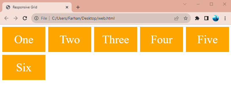
Now, by expanding and minimize will adjust the columns automatically for responsiveness:
Method 2: Create a Responsive Grid Layout by Utilizing the “auto-fit” and “auto-fill” Values
Another method to create a responsive grid layout is by using the “auto-fit” and “auto-fill” values. The “auto-fit” properties fill the available space by expanding to its maximum size. Let’s create the responsive grid layout by using the “auto-fit” and “auto-fill” properties.
Create HTML
First of all, create an HTML page having two div with their respective class names. Make sure to add two class names to the “class” property separated by space. So, that they can be styled accordingly:
Add CSS
Now, create a CSS file and add it to the head section. Inside the CSS file, add the provided code with their respective class IDs:
display: grid;
grid-gap: 5px;
border: 2px solid #000000;
margin: 5px;
}
.grid-layout > div {
font-size: 20px;
padding: .5em;
background: #ADD8E6;
text-align: center;
}
.auto-fit {
grid-template-columns: repeat (auto-fit, minmax(125px, 2fr));
}
.auto-fill {
grid-template-columns: repeat (auto-fill, minmax(125px, 2fr));
}
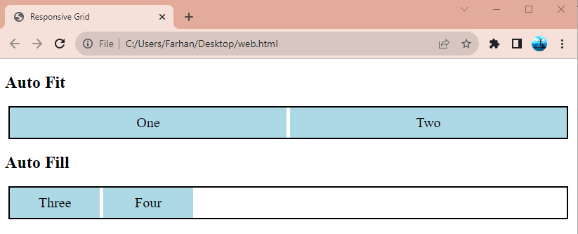
Now, by expanding and minimizing will adjust the columns automatically. Moreover, it will demonstrate both “auto-fill” and “auto-fit” properties:
Conclusion
To adjust the columns with a CSS grid for responsiveness, various CSS properties can be utilized. One such CSS property is the “auto-fill” and the other is “auto-fit”. The property “auto-fill” fills the rows with maximum number of columns. On the other hand, the property “auto-fit” fills the currently available space maximum to its size. This article has given multiple methods to adjust the columns with a CSS grid for responsiveness.
Source: linuxhint.com