How to Add Space Between Images in CSS?
In this article, we will learn:
- Add space between images using “grid”
- Add space between images using “flex”
- Add space between images using “margin”
To create space between images, first, check out the method to add images in HTML, and then we will create space between them.
So, let’s get started!
How to Add Images in Div?
To add images in the div, first, we will create a container using the “<div>” tag and assign the class name as “div”. Inside the <center> tag, we will add a heading <h1>. Next, create a sub-div class name as “img” in which we will add six images by using the <img> tag and specify the image source in it.
HTML
In the CSS file, use “div” to access the created container in HTML. We will adjust the height of the div as “auto” to allow the div to arrange itself automatically according to its elements. To style the div, add the background color as “rgb(170, 138, 172)” and set the border width as “10px”, style as “groove”, and color as “rgb(77, 0, 80)”. We will also set the color of the heading as “rgb(77, 0, 80)”.
css
height: auto;
background: rgb(170, 138, 172);
border: 10px groove rgb(77, 0, 80);
color: rgb(77, 0, 80);
}
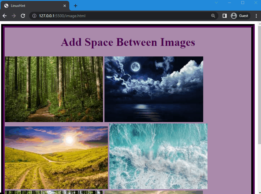
Here, you can see that the images are added in the div but they are not organized and do not have equal space in between them:
Now, we will create space between these images using three different methods.
Method 1: Add Space Between Images Using “grid”
In order to add space between images, use the CSS “display” property and set its values as “grid”, which will adjust the element in a grid container.
Syntax
The syntax of the display property is:
Let’s continue the previous example and create space between images.
Example
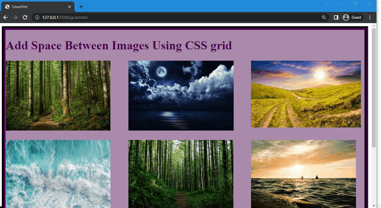
We will set the value of the display property as “grid” to display images in a grid form. Then, create three columns by using the “grid-template-columns” property and three rows using the “grid-template-rows”. Then, set the fractions as “1fr”, “1fr”, and “1fr” for both rows and columns, which means they have acquired equal space. After that, utilize the “column-gap” and “row-gap” properties to create a space and set its value as “25px”:
display: grid;
grid-template-columns: 1fr 1fr 1fr;
grid-template-rows: 1fr 1fr 1fr;
row-gap: 25px;
column-gap: 25px;
}
Here, you can see that the space is created between images, but when we resize the browser it effect the layout of the images:
Let’s move to the second method!
Method 2: Add Space Between Images Using “flex”
As part of CSS, the display property can be set to “flex”. This feature enables the flexibility and adjustability of the content or elements. It also creates equal space between elements, allowing elements to be arranged efficiently.
Syntax
According to the syntax above, the value of the display property is set as “flex”.
So, let’s check out the example to add space between images using flex.
Example
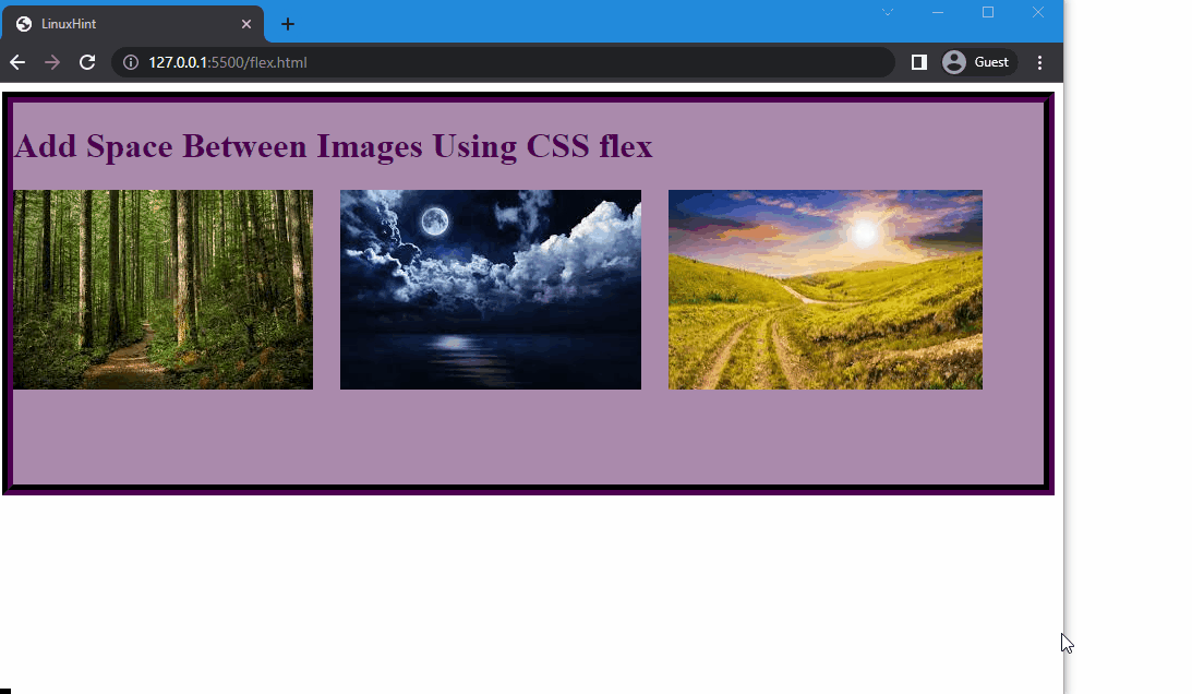
We will continue the previous example and set three images in the div. After that, set the value of the display property as “flex” and the gap between icons as “25px” using the “gap” property:
display: flex;
gap: 25px;
}
You can observe that the images are separated by space, but when the browser is resized, the images get cut off from the edges:
To overcome the above-mentioned limitation, the “margin” property is used.
Method 3: Add Space Between Images Using “margin”
Using the “margin” property, you can create space between images in CSS. It adds a transparent area around an element. You can set the margin from an element’s left, right, top, and bottom sides. More specifically, it is a shorthand property for “margin-left”, “margin-right”, “margin-top”, and “margin-bottom”. All of the values of the given properties can be set in one line.
Syntax
Syntax of the margin property is:
The description of the above-provided syntax is given below:
- auto: It is utilized to adjust elements according to the browser.
- top: It specifies the margin from the top.
- right: It is used to set the margin from the right.
- button: It is used to adjust the margin from the bottom.
- left: It specifies the margin from the left.
Note: Adding two values will specify the margins from the top and bottom, as well as from the left and right; however, adding one value will apply the margin to all four sides.
Continuing the previous example, we will now create space between images.
Example
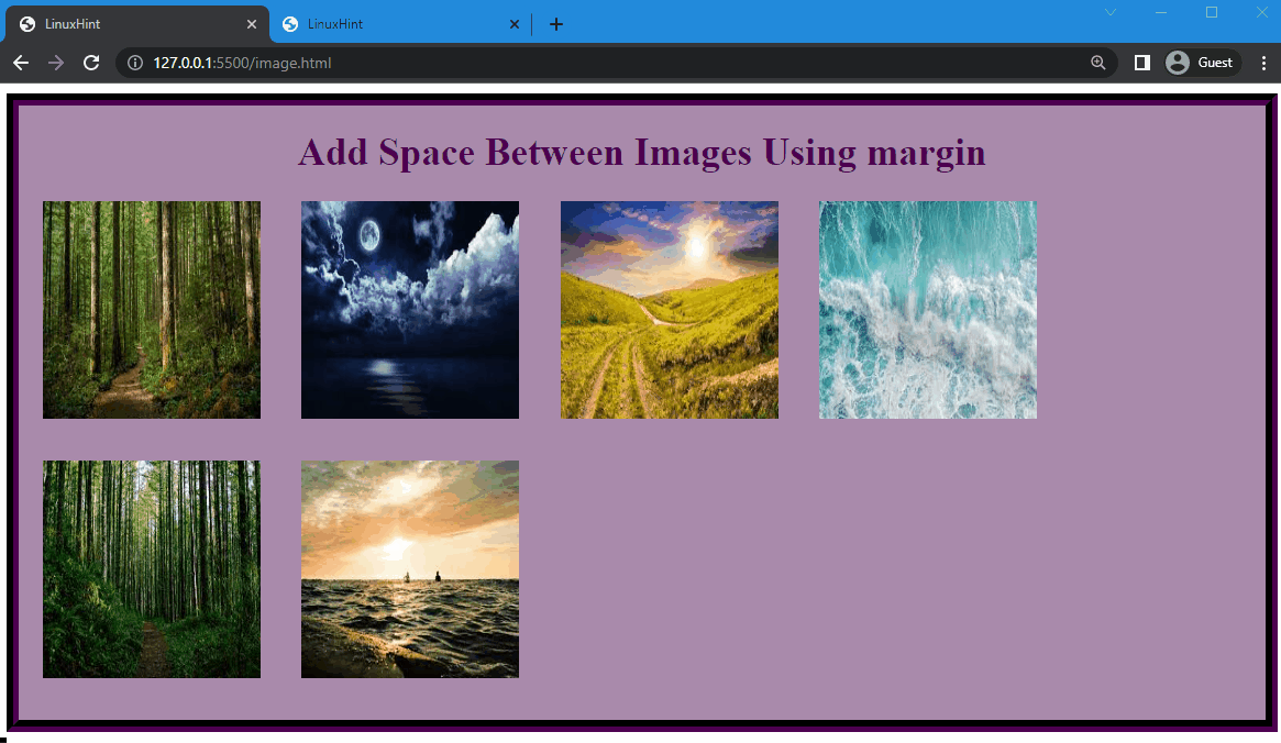
Here, we will use “img” to access the images added in the HTML and set the width and height of the images as “150px”. After that, we will set the margin-top as “0px”, margin-right as “10px”, margin-bottom as “30px” and margin-left as “20px”:
width: 180px;
height: 180px;
margin: 0px 10px 30px 20px;
}
The given output demonstrates that the space is created and the layout of the images does not get disturbed, or the images are not cut off when the browser is resized:
That’s it! We have explained the method to add space between images using three different methods.
Conclusion
Three different methods of CSS can be used to create spacing between images, namely the “grid” and “flex” values of the display property and the “margin” property. With these properties, you can create spaces between images. However, the CSS margin property works the best. In this manual, we have explained these three methods in detail and provided examples for each method.
Source: linuxhint.com