Flip/Mirror an Image Horizontally + Vertically With CSS
Images are an essential and entertaining application component. They contribute to the application’s design and give it a beautiful layout. Many of the properties offered by CSS are beneficial in various ways. More specifically, it provides features that allow image adjustment in any direction, such as flipping vertically or horizontally, rotating, and more.
This write-up will guide you on how to flip or mirror an image horizontally and vertically with CSS.
How to Flip/Mirror an Image Horizontally and Vertically With CSS?
There are various methods that can be used to flip or rotate the images in CSS. We will discuss the following:
Method 1: How to Flip/Mirror an Image Horizontally and Vertically Using “transform: scale()” Property?
The “transform: scale()” property resizes the image in the 2D plane. The scale() specifies two coordinate values for the x-axis and y-axis. The amount of scaling done in each direction is determined by its coordinates. The “transform: scaleX()” property scales the image horizontally.
Example
Add two images in the HTML file. The first one will be kept as original throughout the example. While the other one will be applied with the CSS properties:
- The “<img>” tag is utilized to include an image.
- The “src” attribute specifies the image’s URL.
- The “alt” is utilized to specify the text if the image does not load to the web page.
- The “width” attribute sets the image’s breadth.
- The “class” is set with a name to access the image in CSS.
Here is the HTML code of the scenario as mentioned earlier:
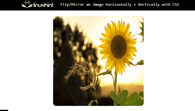
<img src="/images/sunflower-g7.jpg" class="flip" alt="sunflower" width="280">
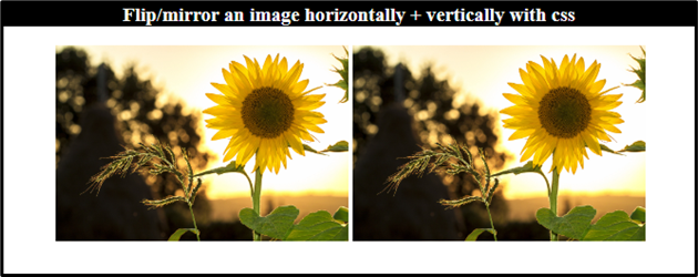
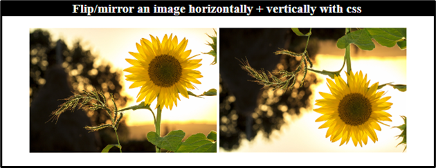
Initially, the web page will look like this:
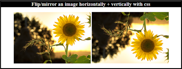
Example 1: Flipping the Image Horizontally Using the “transform: scaleX()” Property
In CSS, add the “transform: scaleX()” property to scale the image horizontally:
transform: scaleX(-1);
}
Output
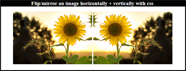
Example 2: Flipping the Image Vertically Using the “transform: scaleY()” Property
To scale the image vertically in CSS, use the “transform: scaleY()” property:
Output
Method 2: How to Flip/Mirror an Image Horizontally and Vertically Using “transform: rotate()” Property?
The CSS “transform: rotate()” rotates the image around the fixed point in a 2D plane. The “rotateX()” function rotates the image on the x-axis, and the “rotateY()” is utilized to rotate on the y-axis.
Example 1: Flipping the Image Horizontally Using the “transform: rotateY()” Property
In CSS, add the “transform” property with the value “rotateY()” in the “flip” class to flip the image horizontally at “180” degrees:
Output
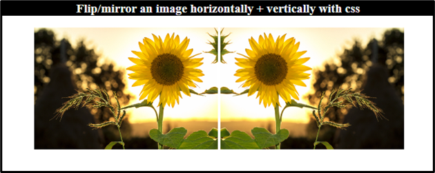
Example 2: Flipping the Image Vertically Using the “transform: rotateX()” Property
Add the CSS “transform” property with the value “rotateX()” to flip the image vertically:
Output
How to Flip/Mirror an Image Vertically or Horizontally on Hover?
To learn how to flip an image vertically or horizontally on hover, try out the following steps.
Step 1: Create an HTML File
First, follow the provided steps to create an HTML file:
- Add a “<div>” element and assign it a class “flip-box”.
- Inside this card, add another “<div>” with the class “flip-card”.
- Then, add an “<img>” tag with the “src”, “alt”, and “style” attributes.
Here is the HTML code:
<div class="flip-card">
<img src="/images/sunflower-g7.jpg" alt="sunflower" style="width: 300px; height: 300px;">
</div>
</div>
Step 2: Style “flip-box” Class
The “.flip-box” used to access the container with the class “flip-box”:
position: relative;
width: 300px;
height: 300px;
margin: auto;
}
The properties that are mentioned in the above code snippet are described below:
- “position” property with the value “relative” sets the element’s position according to its current location.
- The “width” and “height” properties are utilized to set the element’s area.
- “margin” property adds spaces around the element.
Step 3: Style “flip-card” Class
Now, style the “flip-card” class:
position: absolute;
width: 100%;
height: 100%;
transition: all 0.5s ease;
}
The description of the above-provided properties is mentioned below:
- “position” with the “absolute” value sets the element’s location relative to the nearly positioned element.
- “transition” property adjusts the slow movement of the elements within a specified duration.
Step 4: Style “img” Element
The “<img>” element is styled with the CSS “border-radius” property:
border-radius: 10px;
}
Here, the “border-radius” property sets the image corners as round.
Step 5: Flip an Image Vertically on Hover
To flip the image on hover, the CSS “:hover” pseudo-class has been utilized:
transform: rotateX(180deg);
}
Output
Step 6: Flip an Image Horizontally on Hover
The “transform: rotateY()” property can be utilized to flip the image horizontally:
transform: rotateY(180deg);
}
Output

We have compiled the approaches to flip/mirror an image horizontally and vertically with CSS.
Conclusion
To flip an image in HTML, the CSS “transform” property with the values “scale()” and “rotate()” are utilized. The “scaleX()” and “rotateY()” are adjusted to flip the image horizontally. The “scaleY()” and “rotateX()” are set to flip the image vertically. To add a hover effect, the CSS “:hover” pseudo-class is applied. This post has explained multiple procedures on how to flip an image horizontally and vertically in CSS.
Source: linuxhint.com