CSS Gradient
In this article, we will discuss CSS gradients. So, let’s start!
What are CSS Gradients?
In CSS, the “gradient” allows you to smoothly display the transition between different colors. You can also display different colors at once to enhance the look of the HTML elements. There are three types of gradients that are:
Now, we will explore each of the mentioned gradient types one by one! For this purpose, first, we will create a div in the HTML and then apply a “gradient” to it.
Example
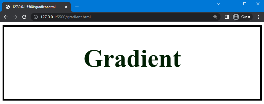
In HTML, we will create a container or a div with the class name “div” and inside the “<center>” tag, add a heading <h1>.
HTML
Now, we will move to the CSS file and use “div” to access the created container in HTML and set the height of the div as “200px”. After that, set the color of the heading as “rgb(1, 32, 4)” and the font size as “35px”. Next, add the border around the div, width as “5px”, style as “ridge”, and color as “rgb(0, 0, 0)”.
CSS
height: 200px;
color: rgb(1, 32, 4);
font-size:35px;
border: 5px ridge rgb(0, 0, 0);
}
Using the code above, the following output is obtained:
Now, we will apply the types of the gradient in the div.
What are CSS Linear Gradients?
To generate a linear gradient, the “linear-gradient()” function of the CSS is used as a value of the “background-image” or “background” property. With this function, an image that is composed of a line-like progression of different colors can be created. There are various types of linear gradients, such as repeating linear gradients, gradients from left to right, and gradients from right to left.
Syntax
The syntax of the “linear-gradient()” function is:
Here, the “direction” parameter is used to set the direction of the linear gradient from which transition will start such as to top, right, left, and bottom. You can add multiple colors to this function.
As a continuation of the previous example, we will apply a simple “linear-gradient()” function to the div.
Example
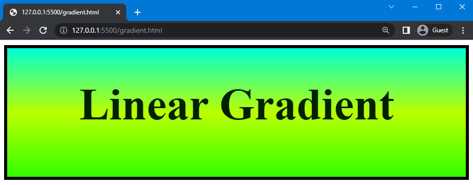
Here, we will use the “linear-gradient()” function in the “background-image” property and add direction as “to top”; this is the default direction of the function. After that, we will add three color as “rgb(0, 255, 213)”, “rgb(187, 255, 0)”, and “rgb(51, 255, 0)” for our gradient:
...
background-image: linear-gradient(to top, rgb(0, 255, 213), rgb(187, 255, 0),rgb(51, 255, 0));
}
In the below-provided image, you can see that a linear gradient is generated:
Now, move to the next type in which we will change the direction of the linear gradient as “to right”.
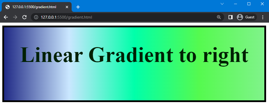
Linear Gradient to right
To generate a linear gradient to right, we will change the direction from “to top” to “ to right” and set five different colors as “rgb(32, 42, 134)”, “rgb(202, 231, 255)”, “rgb(0, 255, 170)”, “rgb(85, 250, 79)”, and “rgb(128, 243, 138)”:
...
background-image: linear-gradient(to right, rgb(32, 42, 134), rgb(202, 231, 255),rgb(0, 255, 170),rgb(85, 250, 79) ,rgb(128, 243, 138));
}
In the output below, you can see that the linear gradient is created in the right direction:
Next, we will change the direction of the linear gradient to “to left”.
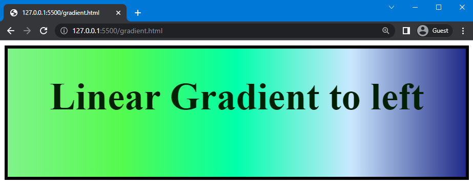
Linear Gradient to left
Here, we will change the direction to “to left”. The colors will be used the same as in the above example:
...
background-image: linear-gradient(to left, rgb(32, 42, 134), rgb(202, 231, 255),rgb(0, 255, 170),rgb(85, 250, 79) ,rgb(128, 243, 138));
}
You can see from the output below that the linear gradient to left is created perfectly:
You can also create a repeating transition of colors. So, let’s do this!
Repeating Linear Gradients
To create repeating linear gradients, the “repeating-linear-gradients()” function is used. In this type of linear gradient, the sequence of the color is repeated according to the given value.
Syntax
The syntax of the “repeating-linear-gradients()” is:
In the above syntax, “color-stop-length” is utilized to set the distance between the first and last color stops that determines the length of the gradient that repeats.
Let’s continue with the previous example.
Example
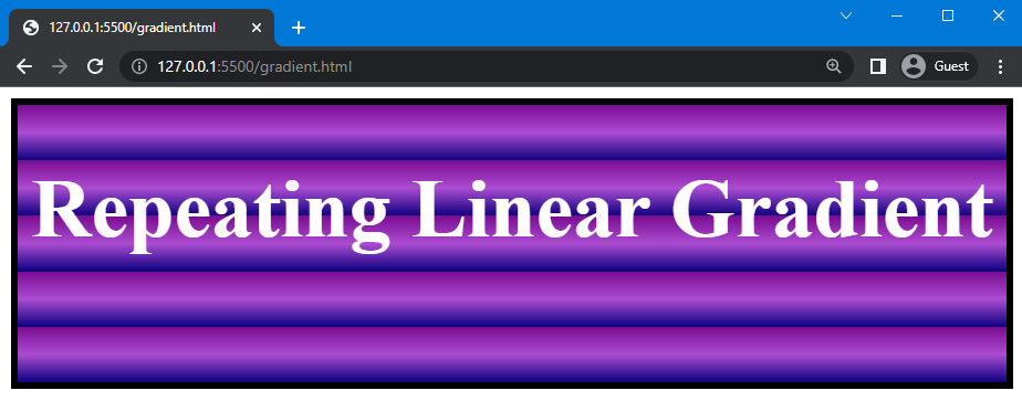
Here, we will set the color of the text as “white” and add the value of gradient colors in the “repeating-linear-gradients()” functions. Besides every color, we will specify the “color stop length” as “0px”, “20px”, and “40px”. It is used to repeat the colors after the given length:
...
color: white;
background-image: repeating-linear-gradient(rgb(122, 12, 145) 0px, rgb(171, 76, 209) 20px, rgb(13, 0, 128) 40px);
}
Note: Without the “color-stop-length” value, the linear gradient cannot be set for repetition.
In the below-provided image, you can see that the linear gradient is repeated:
What are CSS Radial Gradients?
A radial gradient is a transition of colors where the transition starts from the origin of the element. To create a radial gradient, the “radial-gradient()” function is used in which you can specify the shape of the transition and colors.
Syntax
The syntax of the “radial-gradient()” function is:
You can set the shape of the “radial-gradient()” function as an “ellipse” or “circle”.
Example
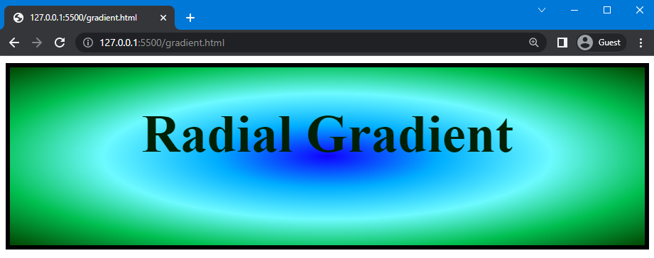
Here, we will continue the previous example and use the “radial-gradient()” function to set the shape of transition as an “ellipse”. Next, we will add five different colors as “rgb(17, 0, 255)”, “rgb(0, 174, 255)”, “rgb(109, 250, 255)”, “rgb(0, 190, 79)”, and “rgb(2, 70, 2)”:
...
background-image: radial-gradient(ellipse, rgb(17, 0, 255), rgb(0, 174, 255), rgb(109, 250, 255), rgb(0, 190, 79), rgb(2, 70, 2) );
}
The below-provided image indicates that the transition of color successfully started from the origin of the element:
Now, we will move to the last type of gradient.
What are CSS Conic Gradients?
The “conic-gradient()” function is used to create a conic gradient. It is a gradient where the transitions of colors are rotated around a center point. In order to create a conic gradient, at least two colors must be defined.
Syntax
The syntax of the “conic-gradient()” function is:
You can set multiple colors in the function of the “conic-gradient()”.
Let’s move to the example in which we will create the conic gradient.
Example
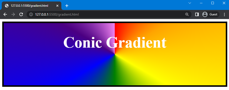
We will now set the color of the heading as “white”. Next, use the “conic-gradient()” function and create a rainbow conic gradient by adding rainbow colors, such as “red”, “orange”, “yellow”, “green”, “blue”, “indigo”, and “violet”:
color: white;
background-image: conic-gradient(red, orange, yellow, green, blue, indigo, violet);
}
Here is the result that demonstrates that the conic gradient is created successfully:
That’s it! We have explained the CSS gradient in detail.
Conclusion
The CSS “gradient” allows you to display smooth transitions between two or more specified colors. There are three types of gradient functions used as a value of “background” property in CSS, such as “linear-gradient()”, “radial-gradient()”, and “conic-gradient()”. In this manual, we have explained CSS gradient and its types in detail.
Source: linuxhint.com