CSS Flex Shrink
Among several properties, there exists a flex CSS property that is applied to the flexbox. A flexbox is a container that contains further boxes or blocks known as flex. A flex property deals with flexibility. It is the property that is used to apply flexible lengths on flexible items. This flexibility is related to expanding and shrinking of the flex. In this article, we will see the flex shrink property to see the extent a flex can be shrunk in comparison with the other items in the containers.
Implementation of the flex shrink property involves HTML and CSS codes. The basic tools that are essential for the implementation of the codes are: a text editor in which we write the HTML and CSS tags, and a browser that is used to execute the text file and a web page is shown. First, we will understand the flex creation by using HTML and CSS. Two basic approaches of CSS are used here: inline or written inside the HTML tags and the internal CSS which is declared inside the head portion of the CSS style tag. They can be accessed by creating ids and classes that are mentioned at the time of content creation. Similarly, the syntax that is given below is written inside the style tag of the head section in the HTML code.
Syntax of the flex shrink property:
<style>
Flex-shrink: value (number);
</style>
The ‘number’ is the value that is added to the property to determine how the item will shrink as compared to other items. 1 is the default value of this property. This means by using 1, the shrink to the flex will be zero.
Flex creation:
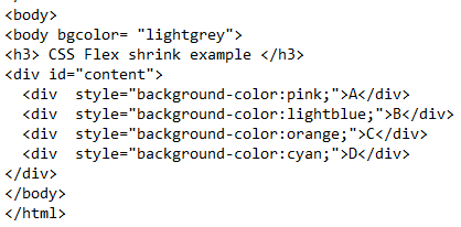
HTML tags are responsible for developing the contents of the webpage. In the body, we will create a flexbox that will be designed through CSS. First, we have changed the background default color to an optional effect. A simple heading is declared. A div is created to contain the content inside it. Inside the div, there is a further div present that makes it a nested div. All these inside declared div are styled through inline styling having the background color property to add colors to the flex. Moreover, we have also used simple alphabets as text to name each flex block. The outer div is accompanied by the CSS class. This class is declared in the CSS and will have some properties to be applied to the div making it a flexbox.
HTML body code:
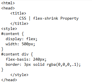
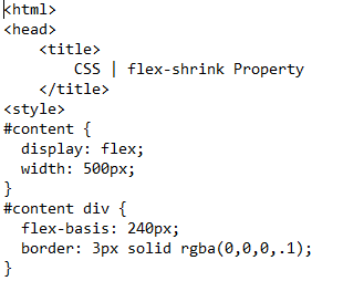
All the div inside the outer div will create separate containers known as flex. Each will have a different color. This whole code will work by using CSS, as till now in the HTML, we have not provided any alignment or dimensions to the flexbox or the inner blocks as well. Let us consider the style sheet first.
Inside the style tag, we will now explain all those ids that were declared inside the tags of HTML contents. As the ‘content’ tag is declared in the outer div. Width is given with a display value that is flex. This will form a block known as the flexbox. Now, we will style the inner blocks. The id name will follow the inner div. The inner div will contain a base property. This flex-base is the distance or the area of a single flex inside the box. A border is applied to each box with a color given in the code.
flex-basis: 240px;
border: 3px solid rgba(0,0,0,.1);
}
Each flex will have an area of 240 pixels. After that style tags, close all the tags including the head tag.
HTML CSS code:
Save the code in the text editor file with html extension and after that execute the file on the browser. You will see that a static web page is formed with small flexes formed with different colors and alphabets.
Output:
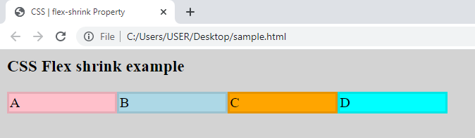
This is done mainly by using the width dimensions to the outer and the inner div blocks to get adjusted. This way, a simple flex is created.
Now, we will see how a single block of the flex will shrink.
Flex shrink:
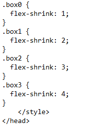
The html body part for the flex shrink will be the same, as the number of div blocks in the flexbox is the same with the same color effect and the text that is added to it. Whereas, the CSS style property will have a different ratio for every flex area. In the HTML body, each inner div that causes a flex is assigned to a class. Each class name has its property effect that is applied to the inner div.
In the head portion, inside the style tag, each class will have a description of the effects that are applied to cause the flex shrink.
HTML body code:
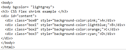
The details that are present under the id of contents and div contents will be the same as we have explained above in the flex creation. The flexbox will be given an appropriate width and the flex area is also given in pixels that apply a border to it with the same color of the flex.
HTML CSS code:
Some extra information that is added to cause the flex shrink is the explanation of the class. Each class contains a flex-shrink value. The first block or flex has 1 value, the second one has 2, and the 3rd and 4th flex have these values correspondingly.
Flex-shrink: 1;
}
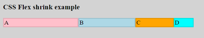
The first box has a size approximately closer to the original size of the flex. We have used ‘1’ to the value which causes the size of the flex without any change. You will notice that the size will shrink from 1st to 4th flex. The last 4th one is the smallest one from the 3rd one.
Save the code with the change. Then, execute to see the changes in the web browser. You will see that as the flex goes from the left side to the right, the flex goes on shrinking.
Output:
Conclusion
CSS flex shrink article is written to describe the CSS shrink property that is applied to the flex. This property is used to shrink the flex inside the flexbox by increasing the flex property value in numbers. By default, 1 is the number that is used to keep the flex without any change. As the number increases, the shrinkage of the flex also increases. First, in the article, we gave an overview of HTML and CSS dependencies on each other. After that, we explained the creation of a simple flex box having four flexes inside it. At that time, we did not apply any flex property. But then on the same code, we added an internal styling to add the flex-shrink property to each flex of the block.
Source: linuxhint.com