Creating Bubble Chart with D3.js
Introducing Bubble Chart
D3.js (stands for Data-Driven Documents) is available and free which is an open-source JavaScript library for 3D interactive data visualizations with Scalable Vector Graphics (SVG). In a two-dimensional plot, bubble chart displays multiple circles (known as bubbles). It is a generalization to the scatterplot which places the bubbles on the plot instead of dots in the scatterplot.
To construct a bubble chart, three variables are mandatory. One variable specifies the x-axis, another variable specifies the y-axis, and the last variable shows the size of the bubble.
Building a Basic Bubble Chart
Let’s build a basic bubble chart by following the given steps. We consider the city_data with four entries – “total_shops”, “total_companies”, “city”, and “total_lakes”. Only “city” is the categorical variable and the rest all are numeric values. In the first example, we include all three numeric variables.
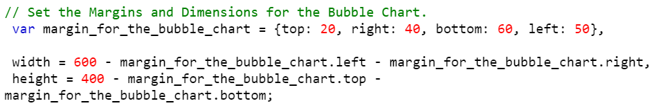
Step 1: Set the Margins, Dimensions, and Radius for the Bubble Chart
The first step is to set up the margins and dimensions to the bubble chart which is going to be created.
1. Create a dictionary that holds four entries – top, right, bottom, and left. These variables are used with bubble chart’s width and height. The width and height of the bubble chart are computed from the previous dictionary. The calculation is shown in the following with the example:
Example:
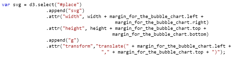
Step 2: Append the SVG (Scalable Vector Graphics) Object
In this step, we need to append the SVG by creating the “div” container and then select the container to inject the SVG.
Create a div (with the following syntax) container in the body of the HTML template by passing the ID.
Example:
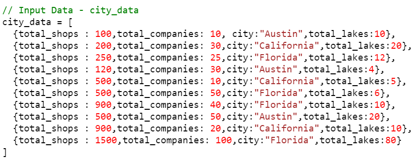
Step 3: Define the Data
Next, we have to declare the data for the bubble chart. Let’s create an array of 10 “products” objects with four key-value pairs.
Example:
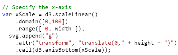
Step 4: Set Up the Scales (xScale, yScale, zScale)
1. Use the scaleLinear() function to construct a new linear scale for the x-axis with the domain and the range provided to it.
- It takes the input_data as a domain. Let’s set the [0,100] domain.
- The [0, width] range is the output.
- Call the axisBottom() function to place the axis bottom of the line. Basically, it constructs a new bottom-oriented axis generator for the xScale.
Example:
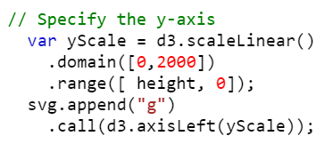
1. Use the scaleLinear() function to construct a new linear scale for the y-axis with the domain and the range provided to it.
- It takes the input_data as a domain. Let it be [0, 2000].
- The [height, 0] range is the output.
- Call the axisLeft() function to place the axis on the left of the line. Basically, it constructs a new left-oriented axis generator for the yScale.
Example:
1. Use the scaleLinear() function to construct a new linear scale to specify the size of the bubble with the domain and the range provided to it.
- It takes the input_data as a domain. Let it be [0, 100].
- The [1, 40] range is the output (size of the bubbles).
Example:

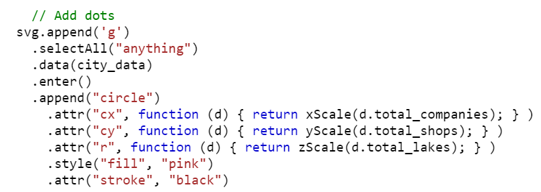
Step 5: Add Circles
1. Get the data using the data() function.
2. Append the circle to the SVG.
- cx – The position of the circle that takes the “x” position refers to the numeric element.
- cy – The position of the circle that takes the “y” position refers to the numeric element.
- r – It specifies the circle radius that takes the “z” position (Bubbles) which refers to the numeric element.
Example:
Complete Example:
Create the bubble chart by combining all the examples that are discussed in the previous steps.
<head>
<script src="https://d3js.org/d3.v4.js"></script>
</head>
<body>
<script>
// Set the Margins and Dimensions for the Bubble Chart.
var margin_for_the_bubble_chart = {top: 20, right: 40, bottom: 60, left: 50},
width = 600 – margin_for_the_bubble_chart.left – margin_for_the_bubble_chart.right,
height = 400 – margin_for_the_bubble_chart.top – margin_for_the_bubble_chart.bottom;
var svg = d3.select("#place")
.append("svg")
.attr("width", width + margin_for_the_bubble_chart.left + margin_for_the_bubble_chart.right)
.attr("height", height + margin_for_the_bubble_chart.top + margin_for_the_bubble_chart.bottom)
.append("g")
.attr("transform","translate(" + margin_for_the_bubble_chart.left + "," + margin_for_the_bubble_chart.top + ")");
// Input Data – city_data
city_data = [
{total_shops : 100,total_companies: 10, city:"Austin",total_lakes:10},
{total_shops : 200,total_companies: 30,city:"California",total_lakes:20},
{total_shops : 250,total_companies: 25,city:"Florida",total_lakes:12},
{total_shops : 120,total_companies: 30,city:"Austin",total_lakes:4},
{total_shops : 500,total_companies: 10,city:"California",total_lakes:5},
{total_shops : 500,total_companies: 50,city:"Florida",total_lakes:6},
{total_shops : 900,total_companies: 40,city:"Florida",total_lakes:10},
{total_shops : 500,total_companies: 50,city:"Austin",total_lakes:20},
{total_shops : 900,total_companies: 20,city:"California",total_lakes:10},
{total_shops : 1500,total_companies: 100,city:"Florida",total_lakes:80}
]
// Specify the x-axis
var xScale = d3.scaleLinear()
.domain([0,100])
.range([ 0, width ]);
svg.append("g")
.attr("transform", "translate(0," + height + ")")
.call(d3.axisBottom(xScale));
// Specify the y-axis
var yScale = d3.scaleLinear()
.domain([0,2000])
.range([ height, 0]);
svg.append("g")
.call(d3.axisLeft(yScale));
// Specify the scale for the bubble size
var zScale = d3.scaleLinear().domain([0,100]).range([1, 40]);
// Add dots
svg.append(‘g’)
.selectAll("anything")
.data(city_data)
.enter()
.append("circle")
.attr("cx", function (d) { return xScale(d.total_companies); } )
.attr("cy", function (d) { return yScale(d.total_shops); } )
.attr("r", function (d) { return zScale(d.total_lakes); } )
.style("fill", "pink")
.attr("stroke", "black")
</script>
</body>
</html>
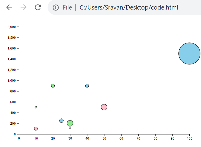
Output:

Colored Bubble Chart
If you want to categorize the bubbles based on categories with different colors, use the color scale. The scaleOrdinal() function is used to create the color scale.
Syntax:
The domain input is the unique categories that are present in the input data and the output is the range of colors (range output).
Also, this categorical variable is mapped to the style() function with the “fill” attribute.
Example:
Utilize the previous example and add the color scale. There are three unique categories that are present in the city_data input: “Austin”, “California”, and “Florida”. Specify these in the domain() and give the colors to the “#FFC0CB”, “#90EE90”, and “#87CEEB” range.
- The data with “Austin” – #FFC0CB is the bubble color.
- The data with “California” – #90EE90 is the bubble color.
- The data with “Florida” – #87CEEB is the bubble color.
<head>
<script src="https://d3js.org/d3.v4.js"></script>
</head>
<body>
<script>
// Set the Margins and Dimensions for the Bubble Chart.
var margin_for_the_bubble_chart = {top: 20, right: 40, bottom: 60, left: 50},
width = 600 – margin_for_the_bubble_chart.left – margin_for_the_bubble_chart.right,
height = 400 – margin_for_the_bubble_chart.top – margin_for_the_bubble_chart.bottom;
var svg = d3.select("#place")
.append("svg")
.attr("width", width + margin_for_the_bubble_chart.left + margin_for_the_bubble_chart.right)
.attr("height", height + margin_for_the_bubble_chart.top + margin_for_the_bubble_chart.bottom)
.append("g")
.attr("transform","translate(" + margin_for_the_bubble_chart.left + "," + margin_for_the_bubble_chart.top + ")");
// Input Data – city_data
city_data = [
{total_shops : 100,total_companies: 10, city:"Austin",total_lakes:10},
{total_shops : 200,total_companies: 30,city:"California",total_lakes:20},
{total_shops : 250,total_companies: 25,city:"Florida",total_lakes:12},
{total_shops : 120,total_companies: 30,city:"Austin",total_lakes:4},
{total_shops : 500,total_companies: 10,city:"California",total_lakes:5},
{total_shops : 500,total_companies: 50,city:"Florida",total_lakes:6},
{total_shops : 900,total_companies: 40,city:"Florida",total_lakes:10},
{total_shops : 500,total_companies: 50,city:"Austin",total_lakes:20},
{total_shops : 900,total_companies: 20,city:"California",total_lakes:10},
{total_shops : 1500,total_companies: 100,city:"Florida",total_lakes:80}
]
// Specify the x-axis
var xScale = d3.scaleLinear().domain([0,100]).range([ 0, width ]);
svg.append("g")
.attr("transform", "translate(0," + height + ")")
.call(d3.axisBottom(xScale));
// Specify the x-axis
var yScale = d3.scaleLinear().domain([0,2000]).range([ height, 0]);
svg.append("g")
.call(d3.axisLeft(yScale));
// Specify the scale for the bubble size
var zScale = d3.scaleLinear().domain([0,100]).range([1, 40]);
// Add a scale for bubble color
var color_scale = d3.scaleOrdinal()
.domain(["Austin", "California", "Florida"])
.range(["#FFC0CB","#90EE90","#87CEEB"]);
// Add dots
svg.append(‘g’)
.selectAll("dot")
.data(city_data)
.enter()
.append("circle")
.attr("cx", function (d) { return xScale(d.total_companies); } )
.attr("cy", function (d) { return yScale(d.total_shops); } )
.attr("r", function (d) { return zScale(d.total_lakes); } )
.style("fill", function (d) { return color_scale(d.city); } )
.attr("stroke", "black")
</script>
</body>
</html>
Output:
Adding Tooltip to the Bubble Chart
Let’s implement the tooltip functionality that displays the name of the city with mouseover on a specific bubble.
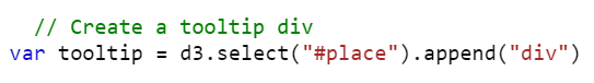
Create a tooltip and append the “div” tag to it.
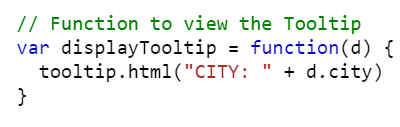
Write a function that displays the created tooltip. Use tooltip.html() to hold the city name.
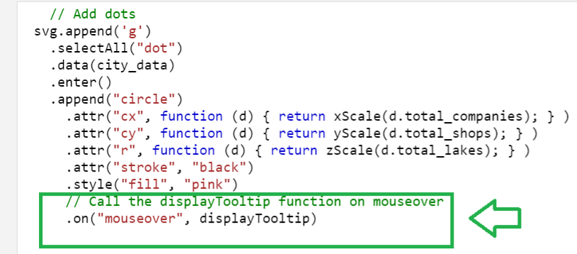
Call the previous function on mouseover by specifying it in the following snippet using the on() function. The “mouseover” should be specified:
Complete Example:
Utilize the first example and add the previous tooltip.
<head>
<script src="https://d3js.org/d3.v4.js"></script>
</head>
<body>
<script>
// Set the Margins and Dimensions for the Bubble Chart.
var margin_for_the_bubble_chart = {top: 20, right: 40, bottom: 60, left: 50},
width = 600 – margin_for_the_bubble_chart.left – margin_for_the_bubble_chart.right,
height = 400 – margin_for_the_bubble_chart.top – margin_for_the_bubble_chart.bottom;
var svg = d3.select("#place")
.append("svg")
.attr("width", width + margin_for_the_bubble_chart.left + margin_for_the_bubble_chart.right)
.attr("height", height + margin_for_the_bubble_chart.top + margin_for_the_bubble_chart.bottom)
.append("g")
.attr("transform","translate(" + margin_for_the_bubble_chart.left + "," + margin_for_the_bubble_chart.top + ")");
// Input Data – city_data
city_data = [
{total_shops : 100,total_companies: 10, city:"Austin",total_lakes:10},
{total_shops : 200,total_companies: 30,city:"California",total_lakes:20},
{total_shops : 250,total_companies: 25,city:"Florida",total_lakes:12},
{total_shops : 120,total_companies: 30,city:"Austin",total_lakes:4},
{total_shops : 500,total_companies: 10,city:"California",total_lakes:5},
{total_shops : 500,total_companies: 50,city:"Florida",total_lakes:6},
{total_shops : 900,total_companies: 40,city:"Florida",total_lakes:10},
{total_shops : 500,total_companies: 50,city:"Austin",total_lakes:20},
{total_shops : 900,total_companies: 20,city:"California",total_lakes:10},
{total_shops : 1500,total_companies: 100,city:"Florida",total_lakes:80}
]
// Specify the x-axis
var xScale = d3.scaleLinear().domain([0,100]).range([ 0, width ]);
svg.append("g")
.attr("transform", "translate(0," + height + ")")
.call(d3.axisBottom(xScale));
// Specify the x-axis
var yScale = d3.scaleLinear().domain([0,2000]).range([ height, 0]);
svg.append("g")
.call(d3.axisLeft(yScale));
// Specify the scale for the bubble size
var zScale = d3.scaleLinear().domain([0,100]).range([1, 40]);
// Create a tooltip div
var tooltip = d3.select("#place").append("div")
// Function to view the Tooltip
var displayTooltip = function(d) {
tooltip.html("CITY: " + d.city)
}
// Add dots
svg.append(‘g’)
.selectAll("dot")
.data(city_data)
.enter()
.append("circle")
.attr("cx", function (d) { return xScale(d.total_companies); } )
.attr("cy", function (d) { return yScale(d.total_shops); } )
.attr("r", function (d) { return zScale(d.total_lakes); } )
.attr("stroke", "black")
.style("fill", "pink")
// Call the displayTooltip function on mouseover
.on("mouseover", displayTooltip)
</script>
</body>
</html>
Output:
Conclusion
In this guide, first we discussed about the bubble chart. Then, we discussed how to build a basic bubble chart in D3.js by providing the simple steps. The code snippets are given at each step and a complete code is also provided after explaining all the steps. We specified the color scale using the scaleOrdinal() function to color the bubbles for each category with a different color. Then, we learned how to add a tooltip that displays the category on mouseover.
Source: linuxhint.com