Control the Size of Implicitly-Created Grid Columns and Rows in Tailwind
This blog exemplifies the method to control the size implicitly for a grid column and rows.
Control the Size of the Implicitly-Created Grid Column in Tailwind
The grid column’s size can be adjusted by specifying a fixed value or using the specified classes and utilities provided by Tailwind. The “auto-cols-auto” class automatically adjusts the column size according to the container’s dimensions.
Let’s understand it with a simple demonstration.
Step 1: Apply the “auto-cols-auto” Class to the Grid
Create an HTML file and apply the “auto-cols-auto” class to the grid, so that the column size is adjusted automatically. The code to perform this operation is:
<div class="m-8 p-8 grid bg-black grid-rows-2 grid-flow-col gap-4 auto-cols-auto">
<div class="p-4 bg-orange-500">
HyperText Markup language
</div>
<div class="p-4 bg-orange-500">
Cascading Style Sheet
</div>
<div class="p-4 bg-orange-500">
LiveScript Become JavaScript
</div>
<div class="p-4 bg-orange-500">
Tailwind becomes replacement of CSS
</div>
</div>
</body>
In this code:
- “text-center” sets the alignment of text towards the center.
- “m-8” adds a margin of 8px.
- “p-8” adds a padding of 8px.
- The “grid” class creates a grid.
- “bg-black” sets the background color to black.
- “grid-rows-2” creates 2 rows in the grid.
- “grid-flow-col” sets the flow direction to columns in the grid.
- “gap-4” sets the gap to 4px.
- “auto-cols-auto” implicitly controls the column size in the grid.
- “p-4” adds a padding of 4px.
- “bg-orange-500” sets the background color to orange.
Step 2: Output
Save the above code in an HTML file and after running it over the browser, the output looks like this:

It can be seen that the left side column has a smaller size than the right columns due to the position of text present residing in the container.
Control the Size of the implicitly created Grid Row in Tailwind
The “auto-rows-auto” class can be used to control the size of the implicitly-created grid row in Tailwind. This class sets the default value and the size of the row is determined implicitly according to the size of the container.
Follow the below steps for practical implementation.
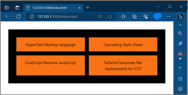
Step 1: Apply the “auto-rows-auto” Class Over a Grid
In an HTML file create a grid and apply the “auto-rows-auto” class to the grid to control the size implicitly. The code to perform this operation is:
<div class="m-8 p-8 grid bg-black grid-cols-2 grid-flow-row gap-4 auto-rows-auto">
<div class="p-4 bg-orange-500">
HyperText Markup language
</div>
<div class="p-4 bg-orange-500">
Cascading Style Sheet
</div>
<div class="p-4 bg-orange-500">
LiveScript Become JavaScript
</div>
<div class="p-4 bg-orange-500">
Tailwind becomes the replacement for CSS
</div>
</div>
</body>
In this code
- “text-center” aligns the text towards the center.
- “m-8” adds a margin of 8px.
- “p-8” adds a padding of 8px.
- The “grid” class creates a grid.
- “bg-black” sets the background color to black.
- “grid-cols-2” creates 2 columns in the grid.
- “grid-flow-row” sets the flow direction to rows in the grid.
- “gap-4” sets the gap to 4px.
- “auto-rows-auto” implicitly controls the row size in the grid.
- “p-4” adds a padding of 4px.
- “bg-orange-500” sets the background color to orange.
Step 2: Output
After the execution of the above code, the output confirms that the second row has a greater size than the first one due to the text in the container:
Conclusion
To control the size of the created grid column implicitly, users can use the “auto-cols-auto” class and for controlling the size of created grid rows, the class of “auto-rows-auto” will be used. Both classes adjust the size according to the size of the container. This post has demonstrated the method to Control the Size of Implicitly-Created Grid Columns and Rows in Tailwind.
Source: linuxhint.com