Bootstrap Forms | Explained
This write-up will cover:
- How to Create an Inline Form in Bootstrap?
- How to Set Spacing in Inline Form?
- How to Create a Stacked Form in Bootstrap?
- How to Create a Form Using Grid Rows?
- How to Create a Compact Layout Form?
- How to Create a Horizontal Form?
- How to Set the Label Sizing of the Form?
How to Create an Inline Form in Bootstrap?
Inline forms are created using the “.form-inline” class. This class has a pre-defined CSS “display” property with the value “flex” with other properties.
Example
Check out the example that demonstrates how to create an inline form in Bootstrap:
- First, add a “<form>” element with the class “form-inline”.
- Within it, add two “<div>” elements with the “form-group” class.
- Each “<div>” element contains the “<label>” and “<input>” elements.
- Lastly, add a “<button>” element to create a button:
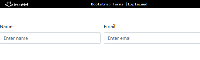
<div class="form-group">
<label for="email">Email</label>
<input type="email" id="email" class="form-control" placeholder="Enter email">
</div>
<div class="form-group">
<label for="pwd">Password</label>
<input type="password" id="pwd" class="form-control" placeholder="Enter password"></div>
<button type="submit" class="btn btn-primary">Submit</button>
</form>
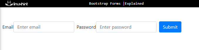
Output
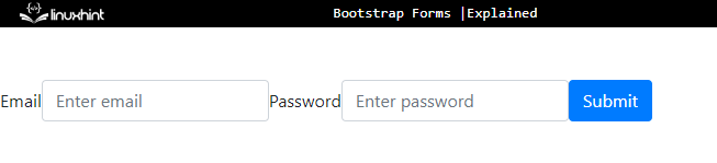
How to Set Spacing in Inline Form?
The Bootstrap spacing utilities adjust the spacing of an inline form. These include “ml-*” for margin-left, “mr-*” for margin-right and many more. The “*” represents the size.
For a practical demonstration, check out the example below.
Example
In the ongoing example, add the class “ml-2” to the “<label>” element. It will generate space at the left of the label:
<div class="form-group">
<label for="email" class="ml-2">Email</label>
<input type="email" id="email" class="form-control" placeholder="Enter email">
</div>
<div class="form-group">
<label for="pwd" class="ml-2">Password</label>
<input type="password" id="pwd" class="form-control" placeholder="Enter password"></div>
<button type="submit" class="btn btn-primary ml-2">Submit</button>
</form>
Output
How to Create a Stacked Form in Bootstrap?
The stacked forms refer to the vertical forms. This is a default form.
Check out the example below.
Example
Follow the given instructions to create a vertical form:
- Add a “<form>” element.
- Inside it, add a “<div>” tag and assign it a class “form-group”.
- This “<div>” element contains the “<label>” and “<input>” elements. You can add the form elements according to your preferences.
- At the end, add a “<button>” to the form:
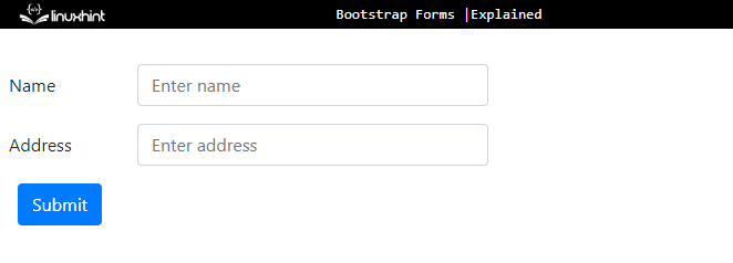
<div class="form-group">
<label for="email">Email</label>
<input type="email" id="email" class="form-control" placeholder="Enter email">
</div>
<div class="form-group">
<label for="pwd">Password</label>
<input type="password" id="pwd" class="form-control" placeholder="Enter password"></div>
<button type="submit" class="btn btn-primary">Submit</button>
</form>
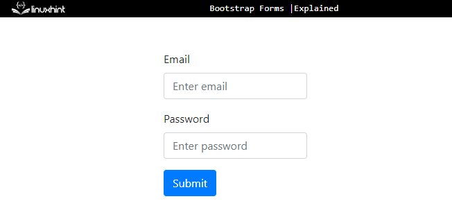
Output
How to Create a Form Using Grid Rows?
To make a form using Bootstrap grid is very simple. First, specify a row and create columns for the form inputs inside it.
Analyze the example below.
Example
Follow the instructions to create a form using Bootstrap grid:
- Add a “<form>” element.
- Inside it, add a “<div>” container with the class “row”.
- Inside this “row” container, specify two more “<div>” elements with the “col” class.
- Add the “<label>” and “<input>” elements within each “<div>” element:
<div class="row">
<div class="col">
<label for="name">Name</label>
<input type="text" class="form-control" id="name" placeholder="Enter name">
</div>
<div class="col">
<label for="email">Email</label>
<input type="email" id="email" class="form-control" placeholder="Enter email">
</div>
</div>
</form>
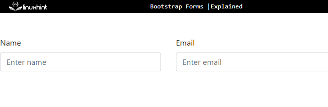
Output
How to Create a Compact Layout Form?
For compact and tighter layouts, the “form-row” class is utilized instead of the “row” class:
<div class="form-row">
<div class="col">
<label for="name">Name</label>
<input type="text" class="form-control" id="name" placeholder="Enter name">
</div>
<div class="col">
<label for="email">Email</label>
<input type="email" id="email" class="form-control" placeholder="Enter email">
</div>
</div>
</form>
Output
How to Create a Horizontal Form?
The horizontal forms are created by using the “row” and “col-*-*” classes. The “row” class specifies a row, and the “col-*-*” classes define the width of labels and controls, such as “col-sm-2”, “col-md-6” or more. The “col-form-label” must also be added to the “<label>” element.
Example
To create a horizontal form, try out the given instructions:
- First, add a “<form>” element.
- Within it, add a “<div>” element with the classes “form-group” and “row”.
- Specify the form groups within this “<div>” element. In our case, the “<label>” and the “<input>” elements are specified.
- The “<input>” element is placed within another “<div>” having class “col-sm-6”. It will specify 6 grid columns for the “<input>” element:
<div class="form-group row">
<label for="name" class=" col-form-label col-sm-2">Name</label>
<div class="col-sm-6">
<input type="text" id="name" class="form-control " placeholder="Enter name">
</div>
</div>
<div class="form-group row">
<label for="add" class=" col-form-label col-sm-2">Address</label>
<div class="col-sm-6">
<input type="text" id="add" class="form-control" placeholder="Enter address">
</div>
</div>
<button type="submit" class="btn btn-primary ml-2">Submit</button>
</form>
Output
How to Adjust the Label Sizing of Form?
The size of the “<label>” element can be adjusted easily by using the “col-form-label-sm” and “col-form-label-lg”. The “col-form-label-sm” has a predefined CSS “font-size” property with the value “0.875rem” with other properties. The “col-form-label-lg” has a predefined CSS “font-size” property with the value “1.25rem” with other properties.
Example
In the ongoing example, add the “col-form-label-sm” to the first “<label>” element and “col-form-label-lg” to the second one to see the difference:
<div class="form-group row">
<label for="name" class="col-form-label-sm col-sm-2">Name</label>
<div class="col-sm-6">
<input type="text" id="name" class="form-control" placeholder="Enter name">
</div>
</div>
<div class="form-group row">
<label for="add" class="col-form-label-lg col-sm-2">Address</label>
<div class="col-sm-6">
<input type="text" id="add" class="form-control" placeholder="Enter address">
</div>
</div>
<button type="submit" class="btn btn-primary ml-2">Submit</button>
</form>
Output
You have successfully learned about how to create forms using Bootstrap.
Conclusion
Bootstrap offers a simple method for producing responsive and consistent forms. There are mainly three types of Bootstrap forms: inline, stacked, and horizontal forms. An inline form is created using the “form-inline” class. To specify general styles to the group of form controls, the “form-group” class is used. More specifically, there are several classes that help in adjusting the size of the form components, such as “col-sm-4”, “col-form-label-sm”, and many more. This write-up has demonstrated how to create forms using Bootstrap.
Source: linuxhint.com