Bootstrap Disabled Text Input fields
This write-up will cover the following topics:
- How to Disable Text input Field?
- How to Disable the select Box option?
- How to Disable checkbox input Element?
- How to Disable button input Element?
Prerequisite: Create a Form
First, create a form by utilizing the HTML “<form>” element:
Then, add a “<fieldset>” element and assign it a class “col-12”. Within the <legend> element specify the form caption:
Output
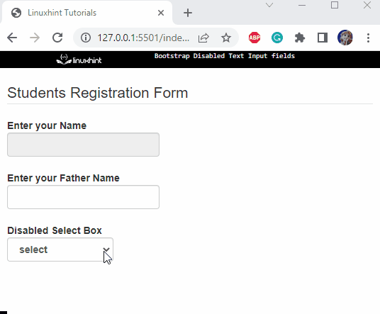
How to Disable Text input Field?
For the ongoing example, follow the given instructions:
- Inside the “<fieldset>” element, after the legend element, add a <div> tag and assign it a class “form-group”.
- Then, include “<label>” and “<input>” elements for the caption and input fields, respectively. Assign the input element a class “form-control”.
- After that, allocate the “disabled” attribute to make the input field disabled:
Following is the explanation of the classes mentioned above:
- “form-group” is a flexible class that provides the simplest way to include structure in forms.
- “form-control” automatically adds styling to the form elements.
Output

Add another input field without the “disabled” attribute:
It can be observed that the first input field is disabled and the second one is enabled:

How to Disable select Box option?
To create a select box in the form, utilize the HTML “<select>” element. The “<option>” elements are then added to select box items.
In this example, notice that the second option is set as disabled using the “disabled” attribute:
Output
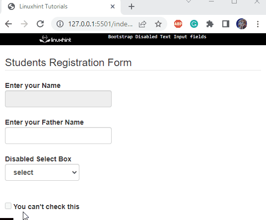
How to Disable checkbox input Element?
Let’s make another form control checkbox. To make the checkbox disabled, the “disabled” attribute is specified as follows:
Output
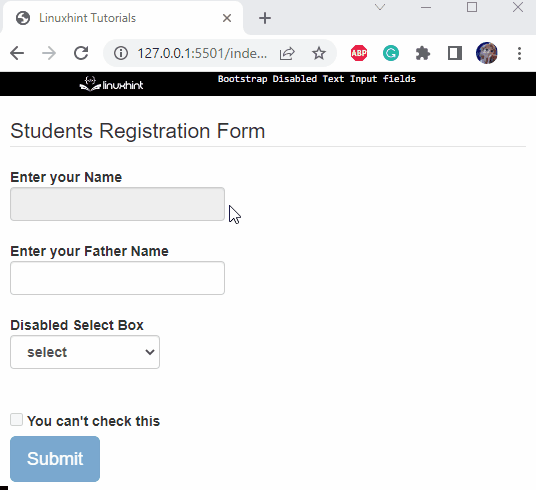
How to Disable button input Element?
You can also add an HTML button element for the form submission. Now, let’s make this button disabled by utilizing the “disabled” class:
Output
That was all about making the input fields disabled in Bootstrap.
Conclusion
In Bootstrap, the form controls can be made disabled using the “disabled” attribute or class. The attribute is placed inside the starting tag of the element. On the other hand, the “disabled” class is placed within the “class” attribute. This article has provided examples to illustrate how to disable the form controls in Bootstrap.
Source: linuxhint.com